One of the most well-known and loved game consoles, PlayStation has the sort of logo that sticks in the mind and makes consumers remember it. In spite of the fact that the product is comparatively new, its logo has been tweaked several times, including the color scheme and shape.
Meaning and history
The original Playstation was released by Sony in December 1994. It belongs to the fifth generation of game consoles. The main competitors of PlayStation were Sega Saturn and the Nintendo 64, which appeared two years later. The peculiarity of this generation is the transition to three-dimensional graphics, as before that the games were flat, two-dimensional. Another feature is that games in the fifth generation of consoles (except for the Nintendo 64) began to be released on discs, not on cartridges.
The new version of the game console, PlayStation 2, was released six years later. Sales began in March 2000, production ended only in January 2013. During this time, Sony sold 155 million consoles, which is a record figure among all game consoles.
The next console from Sony was released in November 2006. Production was completed in May 2017. About 90 million copies of the console were sold.The PlayStation 3 already had a hard drive. Initially, there were 20 and 60 GB versions, then 40 and 80 GBoptions were added.
The PlayStation 4 started being sold in November 2013. Interestingly, this is the first version of Sony’s game console to be sold later in Japan than in the rest of the world.
What is PlayStation?
PlayStation is a video game console, produced by Sony. The first PlayStation was released in 1994, and by today the company has already created the fourth generation of the console. PlayStation is the best-selling brand of game consoles in the world.
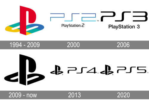
1994 – 2009

The product’s history can be tracked back to 1988. It was created by Nintendo and Sony in collaboration. The companies had a controversy about this project, and eventually Nintendo broke the deal as the two parts could not agree upon the way the revenue was to be divided. It took several years to develop the product, until eventually it was introduced in 1993.
The original PlayStation logo, which was unveiled in 1994, featured the familiar incorporated PS symbol. Interestingly enough, the company had not less than 20 versions of the logo to choose from. We can mention three oval shapes colored yellow, red, and blue, as well as several versions focusing around stylized letters “S” and “P”.
One more version featured a blue “S” placed almost horizontally, with two dots (yellow and red) above and under the emblem. In another version, the company returned to the original color scheme of yellow, red, and blue, yet the shapes were completely new. The range of alternative logos that the company could have taken, was also the one representing the letter “P” inside of which a negative (white) “S” could be seen.
2000
For the release of PlayStation 2, the new logo was created in 2000. It was a gradient blue “PS2” monogram in a stylized geometric font with both characters and a digit executed in one line, drawing the square contours. The fancy insignia was underlined by the full name of the console, set in black and written in custom narrowed sans-serif with opened contours of the “A”s.
2006
The badge for PlayStation 3, released in 2006, was drawn in plain black, with no additional colors or ornaments, and just the “PS3” inscription written in smooth bold lines with softened contours. The composition was underlined by the “PlayStation 3” inscription in a full-shaped sans-serif font, also in black.
2009 – Today
The emblem was designed by the Japanese artist Manabu Sakamoto who is also the author of several other Sony badges (including VIAO, for instance).
From the point of view of the color scheme, the PlayStation logo used today is the most minimalistic one. The classic combination of black and white creates an elegant and eye-catching contrast. However, in terms of shape, the current emblem is an almost identical copy of its predecessor.
2013
Another version of the PlayStation badge was introduced in 2013 for the 4th version of the iconic console. It was the same style of the monogram, as on the logo of PlayStation 3, but with the new digit after the letters, and an iconic emblem of the brand, drawn in black and placed on the left from the insignia.
2020
In 2020 the company has launched PlayStation 5, with a refined badge. The only difference between the new logo and the previous one was in the digit “5”, which replaced the “4”, keeping all the other elements and their style completely untouched.
Icon
The icon of the most famous video game console in the world, PlayStation, is funny, meaningful, though also minimalist and powerful. The official version of the icon is executed in monochrome, with four black symbols placed inline or two, on a white background.
The symbols used for the icon are as follows: triangle, x-cross, circle, and square. All these marks you can see and press on the remote controls of PlayStation. Those are the most recognizable graphical elements, associated with the brand.
Except for, maybe, only the iconic intertwined PS monogram, which is still used by the company as a secondary icon, and can be seen both in monochrome and multicolor execution, on white background.
Font
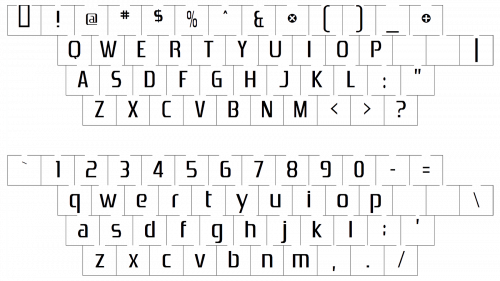
The custom type was created by Sakamoto specifically for the PlayStation project. The letters look simple yet unique, “T” and “P” being especially recognizable.
Color
For most of its history, the PlayStation logo revolved around three colors: yellow, red, and blue. However, the current version of the emblem gets rid of this diversity and sticks to the simple black-and-white color scheme. Before the company stuck to a single version of the emblem, it had a choice of logos created using other color palettes.


