Platinum Data Recovery is an American data recovery company established in 1996. The company has emerged as the leading name in the data recovery industry. They specialize in recovering lost, corrupted, deleted, or inaccessible data from hard drives, flash drives, RAID, all types of memory cards, NAS, and more data storage media. Platinum Data Recovery claims to provide the fastest turnaround time and has the highest data recovery success rate.
Logo Meaning and History
The visual identity of Platinum Data Recovery has always reflected their core service. Since the beginning, its logotype has remained a disk platter with a flash of light highlighting the company’s name. The main component of the logo is a disk platter that symbolizes “data”. A platter is a circular magnetic plate that is used for storing data on a hard disk. The company specializes in recovering data from hard drives of all makes and models. The light emerging from the platter represents “flash” which is used to indicate flash technology. Flash memory is used in a wide range of consumer devices such as SSDs, USB flash drives, SD cards, mobile phones, digital cameras, as well as enterprise data center servers. So, the platter with a flash of light is symbolic of the data recovery services available for all types of media.
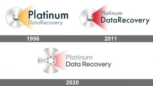
Over the years, all the three elements of the logotype have remained constant- disk platter, flash, and company’s name. The font Open-Sans has also remained the same. However, the color scheme has been changed to represent a change in the company’s philosophy.
1996 – 2011
The very first logo of Platinum Data Recovery was designed in February 1996. This one has a disk platter, flash of light, and the company’s name. The color of the light was yellow and the design was flat. Initially, the color of the light was yellow to indicate hope and optimism. It represented optimism to recover lost data. It was on a black background and a dark color was used for “Platinum” to emphasize it. However, this design was changed a bit later to represent a change in the company’s philosophy.
2011 – 2020
The second logo was a little different from the previous one and was introduced in June 2011. Here the flash color is changed to red and white background was used. This second version retained the character of the previous logotype but represented a change in philosophy. It was designed in a more elegant and sophisticated way with a change in the color scheme. The red color was used to indicate passion and strength. A bright red color here indicated the company’s strength, passion, and determination to handle even the most complex cases of data recovery. Also, here dark color was used for “Data Recovery Company” to emphasize the primary goal.
2020 – Today
Finally, the present logo of Platinum Data Recovery was redesigned in May 2020 by renowned logo designer Anvar Bagi. The present logo is quite similar to the previous version. However, the other two logos had a flat design. The previous logo had bold color but no extra elements such as shadows, reflections, glow, textures, or gradients. The logo was redesigned to make it look bigger, clear, and gradient. The core elements of the logotype remained the same with a slight change in the brightness and size to evoke a sense of stability and trustworthiness. This redesigned logo now looks bold, neat, and perfectly balanced.


