Having changed more five logos, in 2014 Pizza Hut eventually came to the emblem that is now used in the restaurants of the chain all over the world.
Meaning and history

The main common thing of all the Pizza Hut logo versions, created throughout the company’s history, is red color, which was present on every logo except for the one from 1973, one way or another. The visual identity of the famous fast-food chain has always been based on the principles of bright and strong simplicity, which worked just fine for the brand and its worldwide recognizability.
What is Pizza Hut?
Pizza Hut is the name of one of the world’s most famous fast-food restaurant chains, which is specialized in pizzas. The company was founded in 1958 in Kansas, USA, and today has more than 18 thousand locations across the globe.
1958 – 1970

The original Pizza Hit logo, created in 1958, was composed of scarlet-red lettering in all capitals, executed in a modern and sharp serif typeface with pointed ends and thick lines of the symbols. The letters of the wordmark were jumping, which added a sense of playfulness and passion to the image.
1962 – 1970
The logo of Pizza Hut, a prominent American pizza restaurant chain. This particular iteration of the logo appears to be a vintage design, which is likely to be from the earlier years of the brand’s history. It features the words “PIZZA HUT” in a bold, serif typeface that exudes a classic feel. The letters are capitalised and have a three-dimensional effect, giving them a prominent and sturdy appearance. The text is rendered in a dark color, possibly black, which stands out against the contrasting lighter background. There is a distinctive outline around the lettering, which adds to the logo’s depth and helps to highlight the brand name. The overall design is straightforward and devoid of any additional graphical elements, focusing solely on the brand’s name. This simplicity is reflective of a time when logos were often less intricate, and brand recognition was achieved through strong, clear typography. The logo’s classic design elements suggest a sense of tradition and an established brand identity, which is fitting for a company with a long-standing history in the restaurant industry.
1970 – 1974
The redesign of 1973 switched the bright red and white color palette to a monochrome one and started placing two parts of the nameplate one under another. Though this logo was only used by the brand for one year, its two-leveled structure got kept by the company for all the further redesigns.
1974 – 1999

In 1974 the new logo was created for the brand by San Moyers, and this is when the red hat appears in the emblem. The smooth black lettering in a title case had some of the lines elongate and waved, while the bright red hat was executed abstractly with straight lines and sharp angles.
1999 – 2010

The next redesign was held by the company in 1999, and this is when the most long-lasting and recognizable Pizza Hut emblem was introduced. The lettering was redrawn in a fancy and modern style, placed slightly diagonally and underlines by a yellow touch, while the red hat gained a thick black outline and got its contours also a bit modified. This logo was designed by a famous design bureau, Landor Associates.
2008 – 2017
In 2008 the color palette of the Pizza Hut logo was changed to a dark red and white, where the whole inscription was placed on the bottom part of a dark square, and the red hat image was enlarged and placed in the middle of the composition.
2010 – 2014

In 2010 the company comes back to the color palette of 1999, but adds some gradient to the red hat, making it look glossy and vivid. The contours of all the elements are being redrawn and strengthened. The black inscription gained larger sizes and thicker lines of the letter, the yellow underline was a bit elongated, and the hat was slightly extended in comparison to the previous logos of Pizza Hut.
2014
The logo Pizza Hit used for its North American location in 2014 was actually the same as its international version, created in 2010, but one thing was missing here — the yellow underlined. In a simplified color palette, the emblem looked stronger and stricter, evoking a sense of professional and traditional approach.
2014 – Today
The new concept was adopted by the company in 2014. Though the typeface and the iconic hat remained untouched, the elements were now drawn in white and placed on a solid red circle, repeating the shape of a pizza, with its contours a bit uneven. The strong contrast and confident lines of the logo look stylish and eye-catching.
2019 – Today
In 2019 the company comes back to its logo version, designed in 1974, with black smooth lettering placed under a strict and sharp red hat. This emblem is used along with the one, introduced by the brand in 2014, and reflects the traditional values of the brand, showing a strong link to its roots and legacy.
Font
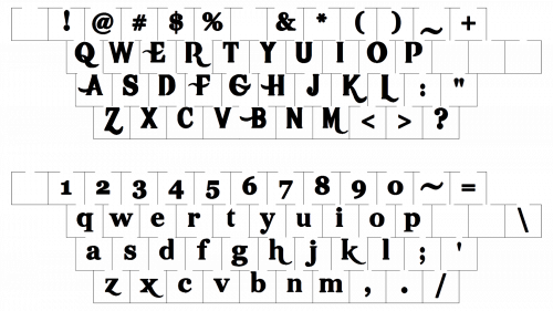
The script wordmark utilizes a unique custom typeface. As the current version of the logo was introduced as a part of the Flavor of Now campaign, we may also discuss the typeface used for the Flavor of Now slogan. It is an industrial-looking font family: simple, sans-serif, all-cap type.
Color

Throughout most of its history, the Pizza Hut logo featured red, black, and yellow. From time to time, green was also included in the restaurant chain’s color palette.
What does thePizza Hut Logo symbolize?
The Pizza Hut logo has been based on an abstract element, resembling a hat, since 1967. The hat symbolizes protection and safety, at the same time, it sounds similar to the second part of the company’s name. The red hat on the Pizza Hut badge stands for the warmth and love the chain tends to give to its customers. Another meaning put into the image of a hat is the original Pizza Hut building, designed by Richard D. Burke, with a roof of the same shape.
Who invented the Pizza Hut logo?
The Pizza Hut logo was designed by the Lippincott design bureau, based on the architectural concept of the Pizza Hut building, created by Richard D. Burke for the first restaurant of the chain. Throughout the years the badge has been redesigned several times, with the most iconic version created by Landor Associates.
Why was the letter “I” green in the Pizza Hut logo?
The versions of the Pizza Hut logo, used by the brand in 1999 and 2010 featured a solid green dot above the letter “I”, which made a strong bright contrast in the badge. It was a detail, brought to the visual identity of the brand by the Landor Associates design bureau, and symbolizes a basil leaf, one of the most common herbs in Italian cuisine.
What is the slogan of Pizza Hut?
The slogan of Pizza Hut is “None outpizzas the hut”. The funny game of words, which is easily memorized and evokes a smile. But the company has always liked to surprise its customers with interesting mottos, hence, throughout the years, Pizza Hit has changed several interesting slogans, such as “Now You’re Eating!”,“Makin’ It Great”, and “Gather Round The Good Stuff”.
Where did the Pizza Hut logo come from?
The Pizza Hut logo was inspired by the hat-like roof of the building, designed by the architect Richard D. Burke at the end of the 1970s for the company’s first restaurant. The famous roof has been the main part of the brand’s badge for decades, only slightly changing its contours.
Who was the designer of the Pizza Hut logo?
The Pizza Hut badge was designed by the renowned American design bureau Lippincott, inspired by the building, created by Richard D. Burke for Pizza Hut. The man behind the logo of the fast food chain is Sam Moyers, the marketing director of Pizza Hut, who curated the creation of the logo from A to Z.
Why did Pizza Hut go back to its old logo?
Pizza Hut decided to come back to its old badge in 2019. It is the emblem, designed in 1974 by the famous Lippincott bureau in collaboration with the Pizza Hut marketing director, Sam Moyers. This badge has a perfect balance of the colors and shapes of all elements is distinctive and strong; representing the company at its best; and evoking a sense of trust and professionalism, at the same time showing the restaurants of the chain as very welcoming ones.


