The Pinterest logo has gone a long way from a script wordmark based on an existing font to a hand-crafted script wordmark and, eventually, a more business-like emblem.
What is the symbol of Pinterest?
The symbol of Pinterest is the letter “P”, stylized like an elegant retro-style pin with smooth curved lines. Executed in white and red, the Pinterest symbol is considered to be one of the most successful visual identity elements of the 21st century. It looks timeless and sophisticated, brilliantly reflecting the name and the purpose of the application, and its creative content.
Meaning and history
The popular online service is specialized in photo and graphics sharing, this is why it was not easy to find a perfect logo for it, as it had to be memorable, strong, yet minimalist, to emphasize on content, not cover. Having it in mind, the service created its first logo in monochrome, but already in a year, an iconic red and white color palette was adopted. Being eye-catching, though pretty simple and strict.
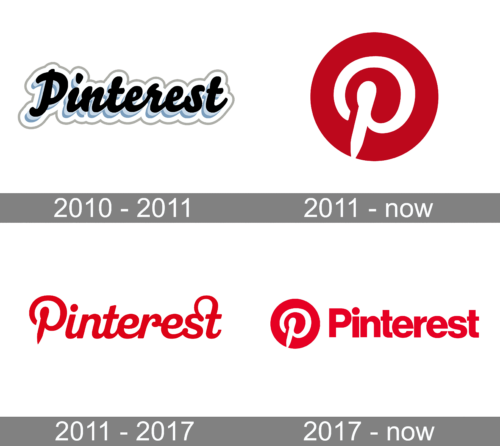
2010 — 2011
The very first logo for Pinterest featured a black cursive lettering with a gradient blue shadow and a wide white and thin gray outline. The inscription looked cool due to its layers, though was too light and “usual”, this is why it only stayed with the service for a few months.
2011 — Today
The iconic Pinterest icon was introduced by the brand in 2011. It is a solid red circle with a smooth white letter “P”, stylized as an elegant pin, with its bottom parts of the vertical bar pointed. In the very beginning, the icon was often used on its own, as well as the logotype, which was created in the same year.
2011 — 2016
The Pinterest logotype, designed in 2011 featured a bold red inscription on a white background. Written in a custom cursive typeface, the wordmark had its first letter repeating the “P” of the emblem. Another unique element of the inscription was in the elongated and arched tail of the “T”, which merged into the “S”. This version of the logotype was used by the service for five years.
2016 — Today
The logo, introduced by Pinterest in 2016, is composed of an iconic emblem and a logotype placed on its right. Both parts of the insignia are executed in the same dark red and white color palette, though feature different styles of lettering. The “P” on the circular emblem remained untouched and fully repeats its version, created in 2011, while the wordmark got a new typeface. Now it is executed in a title case of a bold and traditional sans-serif font with clean lines of the letters, which are placed pretty close to each other.
Emblem controversy
The moment you take a look at the favicon of the mobile app Path you instantly understand why this company isn’t satisfied with the Pinterest emblem. The two icons look too similar and, as a result, may cause consumer confusion. Both feature a white script “P” against the red background. Pinterest has the “P” in a circle, while in case of Path, the letter is placed in a square with rounded corners, which seems to be the only major difference.
Pinterest applied to register their emblem in July 2012 and got the US trademark office’s permission to register it. As a response, Path filed an opposition aiming to forbid Pinterest to trademark the stylized “P.” Anyway, even today, several years after the controversy started, both the companies still have the same “twin” emblems.
Icon
At the first sight, nothing is interesting in the Pinterest Icon — a white cursive letter “P” on a solid red square. But take a closer look, and read the name of the application out loud. “Pin” is what connects all elements of the service’s identity; both visual and conceptual.
Hidden in the logo of the popular Internet service Pinterest, whose users can collect images they like and “pin” them to their online board. The sharpened and elongated tail of the letter “P” on the Pinterest logo is stylized as a needle, which people use to pin images and photos to their boards.
As for the color palette of the icon, it stands for love, passion, and curiosity, the three main qualities of the Pinterest users, creative audience from all over the world.
Font
The letters featured in the 2011 Pinterest logo certainly didn’t belong to any of the existing typefaces. Each of them was drawn specifically for the wordmark. However, the 2017 logo has a completely different approach featuring a “ready-made” font called Neue Haas Grotesk (in its Black weight) with a couple of subtle modifications. The alterations include a round tittle instead of square and a new “s” that was probably modified in order to better fit the “e”.
What is hidden in the Pinterest logo?
The iconic Pinterest logo is considered one of the most successful badges of the 21st century, as it combines brightness, a minimalistic approach, and memorability. The logo is based on a stylized white letter “P”, which is drawn as a pin, explaining the essence of the platform and its purpose. The color palette of the logo represents passion and creativity.
What is the Pinterest logo?
The Pinterest logo is a stylized white letter “P” drawn over a solid red roundel. The capital “P”, written in a thick smooth line, looks like a pin, which nails images to a board, and reflects the specialization of the Pinterest service — graphical content sharing.


