The Phillips 66 Company is a multinational energy company based in Houston, Texas, US. The name of the brand reflects three facts. Firstly, the specific gravity of the gasoline produced by the brand was around 66. Also, the vehicle that tested the fuel drove at the speed of 66 miles per hour. Eventually, the test took place on US Route 66.
What is the symbol of Phillips 66?
The symbol of Phillips 66 is a cool stylized crest with sharp peaks on its top part and smooth arched at the sides. The road sign with the “66” number at the bottom was inspired by one of the first American highways, Route 66, and still keeps its historical heritage nowadays. Today the Phillips 66 symbol looks like a piece of art, executed in a nostalgic vintage style.
Meaning and history

The company has been incredibly loyal to its visual heritage. The Phillips 66 logo has preserved its core, and for a good reason. It gives an insight into the company’s history.
What is Phillips 66
Founded in 1927, Phillips 66 is an American producer of natural gas liquids and petrochemicals. As of 2021, it was ranked number 47 on the Fortune 500 list.
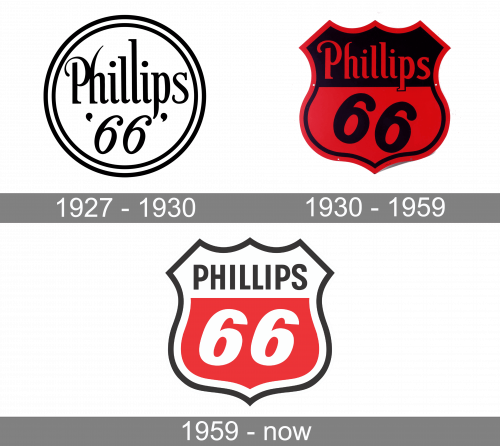
1927 – 1930
The logo was inspired by U.S. Route 66, also known as US 66 or Route 66. One of the earliest highways in the country’s Highway System, it was started in 1926. In 1927, road signs appeared.
1930 – 1959
The moment you take a look at the original road signs on Route 66, the origins of the energy company logo become obvious. The two designs bear an uncanny similarity.
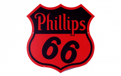
They are both based on a shield shade. Out of all possible versions of this universal frame, the company opted for the one with three points at the top, two points on the sides, and a single point in the middle of the lower part of the border. In both the badges, the shield is broken down into two asymmetrical fields. The lower field is larger and houses the figure “66.” This is where the designers of the logo put a fresh touch. They slightly tilted the characters, which resulted in a more dynamic and eye-catching style.
The top field, which was smaller, housed the lettering “Philips.” In contrast to the road signs, where the name of the state was written in an austere type, the logo featured a decorative script. The top of the initial “P” was formed by a peculiar curved stroke.
The top of the “h” was also unusual because of a subtle curve. The two “l’s” had different heights, which brought about a “dancing” effect. Also, the lower ends of the letters either were slightly curved or bore unexpected asymmetric serifs. The type looked unique and playful, something definitely not present in the iconic road sign.
The palette combined black with a dark and saturated shade of red. There was something decadent and a little bit too dramatic in the palette, especially when it was combined with the ornate script and the refined shield. Due to this, it looked pretty old old-fashioned, especially when used for such a utilitarian purpose.
1959 – present
In 1930, when the original Philips 66 logo was adopted, this decorative style might have been appropriate, but by the 1950s, it was already obvious that the company needed to update its visual brand identity. The designers managed to preserve the iconic structure while also making it by far more modern.
The dramatic style was replaced by a more direct and simple one. The typeface used in the name of the brand was now a minimalist sans. The characters in “66” were made simpler. While the characters still were tilted, they were now aligned horizontally. As a result, the “falling” feel present in the previous version was gone.
Colors and font
While the 1959 logo was inspired by the palette of the previous one, the designers managed to make it less obtrusive and dramatic. They simply reduced the amount of red and black partly replacing them with white. The red was now only used in the lower field housing the figure “66.”
The typography of the Phillips 66 logo introduced in 1959 still looks contemporary due to its minimalism.


