Peugeot is a French brand of car manufacturer, which was established in 1810 by Emile Peugeot. Today it is a part of PSA Peugeot Citroën Group, and is the second largest automaker in Europe (after Volkswagen).
Meaning and history
Peugeot logo dates back to 1847, which makes it the oldest car emblem in the world. The idea of the lion as a brand’s symbol was born in the middle of the 1800s, when the steel business of Peugeot family needed a logo, reflecting the company’s activity and strength. The lion was also a heraldic symbol of the commune the Peugeot family came from.
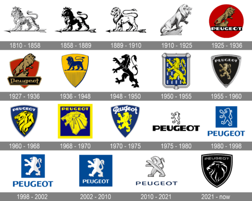
The Peugeot logo had numerous changes during its history. But the lion was always there.
1810 – 1858
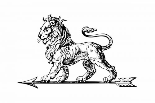
In 1810 Peugeot family decided to use an image of a lion for its company’s logo. The sharp teeth of the lion were representing the strength of the brand’s steel products and the company’s durability.
1858 – 1889
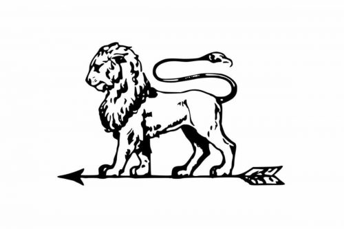
 The lion became darker and brighter, as more black details were used for the drawing. As for the contours and concept, it remained the same, so only the matter of darkness with this redesign. Jo lettering appeared either.
1889 – 1910
Peugeot brothers hired a jeweler to draw the emblem for the company. They chose the lion standing on the arrow among several designs. The logo was registered as the company’s trademark in 1858. It was modernized and placed into a coat of arms shaped frame.
1910 – 1925
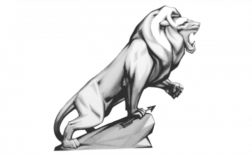
In 1910 the logo was redrawn in a very interesting voluminous way, with the use of light gray gradients, which made the rawring Lion look as if it was alive. The animal was holding a small arrow in its paw, resembling if the very first logo designs of the French automaking legend.
1925 – 1936
The logo was redrawn in black and accompanied by a rectangular black banner in 1925. The banner had a white uppercase wordmark written over it in an extra-bold sans-serif typeface with massive clean-contoured letters, which looked solid and evoked a sense of confidence and professionalism.
1927 – 1936
1936 – 1948

The color palette of Peugeot was changed to dark yellow and blue in 1936. It was a classic crest pointing down with the sides arched from the center. The schematic solid blue lion was standing in profile facing to the left, on a horizontally located arrow, which was turned to the same side. Under the arrow the yellow background had a pattern composed of several thin blue vertical lines, coming out of a blue framing.
1948 – 1950
1950 – 1955
Starting 1948, Peugeot logo is being placed on the car bonnets. And the emblematic lion was redesigned. The new icon was inspired by the Franche-Comté coat of arms. It was placed on a shield with a rounded angled rectangular frame.
1955 – 1960
In 1955 the brand changes its logo form back to the shield-style frame. The lion is standing on his legs and the Peugeot wordmark is now a part of the logo, placed above the lion’s head.
1960 – 1968
The brand changes its logo dramatically in 1960. Now it is a more three-dimensional image of a lion’s head with a thick mane. The wordmark is placed on the top of the head, and the shape of the logo is still resembling coat of arms. The lettering is bolder with strict distinct lines. The color of the logo is closer to copper now.
1968 – 1970
The new logo is a simplified version of the previous one. It is a flat head of a lion, which color scheme varies from gold to chrome. It is minimalist in comparison to the last brand’s logos, but looks modern and strong.
1970 – 1975
1975 – 1980
The birth of the famous “Lion outline” logo. The Lion Rampant is back, but now it looks futuristic. The silver silhouette is placed on a black background. The ridge line adds volume and energy to the logo. In 1976 blue color replaced black and the logo became more vivid and bright.
1980 – 1998
1998 – 2002

The redesign of 1998 drawn the lion in white and light gray and placed it on a solid blue square. Under the square, the uppercase wordmark was written in the same color as the body of the emblem. The lettering was executed in a strong and bold sans-serif typeface with distinct angles and contours.
2002 – 2010
In 1998 the lion became bigger and got paws, which symbolize the power of the company. A white-silver lion was placed on a blue square, which was located above the brand’s nameplate. The lettering of the wordmark was bold with clear straight lines and black shadow.
2010 – 2021
The 3D effect is elevated by the metallic color palette. The lion’s silhouette is confident and stable, while the lettering of the wordmark is executed in fine elegant blue lines.
2021 – Today
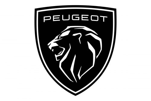
In 2021 the visual identity of the famous French automaker was completely changed 2021. The new logo of Peugeot features a classy black crest with a double white outline and a stylized portrait of the lion, drawn in profile facing left. The wordmark is placed above the head of the brand’s mascot, written in square sans-serif capitals and being slightly arched.
The Emblem
The Lion Rampant of the Peugeot emblem represents power and loyalty. It’s been a very popular heraldic symbol in Scotland and France. Rampant refers to the positioning of the lion — it stands on two hind legs while his forelegs are raised, and faces left. The lion itself is a symbol of courage and majesty.
The Peugeot emblem is a celebration of modern design of classic and timeless icon. It is a confident and bold image, whose metallic color palette adds reliability and trust to the brand.


