Pertamina is a governmental petroleum corporation from Indonesia, which was formed in 1968 through the merger of two companies. Today it is one of the largest producers of oil in its region and is in the top 150 of the Fortune 500 ranking.
Meaning and history
Pertamina, an Indonesian state-owned oil and natural gas corporation, was founded on December 10, 1957. Initially established as Perusahaan Pertambangan Minyak dan Gas Bumi Negara, the company’s inception marked a significant milestone in Indonesia’s journey towards energy self-sufficiency and economic development. The establishment of Pertamina reflected Indonesia’s broader nationalization efforts and aspirations to exert greater control over its natural resources, a sentiment echoed across many newly independent nations during that era.
Throughout its history, Pertamina has achieved several notable milestones. It played a pivotal role in Indonesia’s energy sector, contributing significantly to the national economy. The company expanded its operations beyond oil and natural gas exploration to include refining, petrochemicals, and renewable energy, showcasing its adaptability and commitment to innovation. Pertamina’s strategic international partnerships and exploration successes in various regions further cemented its status as a key player in the global energy market.
Today, Pertamina holds a commanding position in Indonesia’s energy landscape. As of the latest data, it continues to be a major contributor to the country’s economy, providing a substantial portion of the government’s revenue. The company’s current focus includes expanding its renewable energy portfolio and enhancing its sustainability practices. This direction aligns with global environmental goals and Indonesia’s commitment to reducing carbon emissions, thus positioning Pertamina as not just a national asset but a global leader in energy transition efforts.
What is Pertamina?
Pertamina is an Indonesian state-owned enterprise specializing in oil and natural gas. It plays a key role in the nation’s energy sector, contributing significantly to the economy. Pertamina’s diverse operations span exploration, production, refining, and renewable energy.
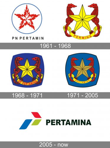
1961 – 1968


The original visual identity for PN Pertamin was introduced in 1961 and featured an elegant badge with a stylized red and white five-pointed star enclosed into a thin blue circular frame. The delicate and strict black lettering I set under the badge and adds a sense of professionalism and confidence to a fine and sophisticated insignia.
As for the Permina logo, it was also built around a five-pointed star, which was drawn in yellow and outlined in red. Two red seahorses were placed in the sides from the stars, and red lettering was placed in a yellow arched ribbon under the badge.
1968 – 1971

After the merger of the two companies, the logo was redesigned. It was decided to adopt the Permina emblem, but set in on a dark blue background. The contours of the elements were refined and the lettering was replaced by the red sand-serif DP Pertamina, also in traditional sans-serif.
1971 – 2005

The contours of the logo were refined and strengthened again in 1971, and the color of the background was switched to a lighter one, which made the square badge of the brand look more reliable and professional.
2005 – Today
Being a state-owned company, Pertamina has a very modern and colorful visual identity.
The Pertamina logo is composed of a wordmark with an emblem on its left. The wordmark features all the capital lettering in a strict neat typeface with straight lines and sharp angles, which looks professional and powerful in black color.
The Pertamina emblem balances the simplicity and strictness of its wordmark. It is composed of a graphical representation of an arrow, which consists of three separate petal-like parts executed in different colors.
The Pertamina emblem is full of hidden meanings, and every detail of it symbolizes one of the company’s core principles. The largest petal of the arrow features a blue color, which is a representation of the brand’s responsibility and reliability. The two equal green and red petals symbolize energy resources and the brand’s tenacity respectively.
The arrow symbol of a perfect reflection of the Pertamina progress and moving forward. The emblem can be also read as the graphical representation of the first letter “P” and the map of the Indonesian islands.
The Pertamina logo is a very strong and symbolic example of the modern brand’s visual identity. It is bright, yet modest, memorable and timeless.


