Peach Aviation Limited was established in 2011 as a joint venture, where All Nippon Airways joined forces with the Hong Kong investment company the First Eastern Investment Group. Today, Peach is among Japan’s most popular low-cost airline companies. It flies to around twenty destinations (as of 2021) and has a fleet of around 35 aircraft.
Meaning and history
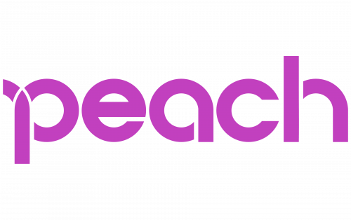
The Peach Aviation logo is jazzy and upbeat. It looks nothing like a typical airline’s logo. The purple color already makes it stand out among the competition, while the visual language only reinforces this effect.
2011 – present
Technically speaking, the logo consists of only of the wordmark. However, it has a pictorial quality to it, which helps to convey meaning beyond the mere letters it uses.
The name of the brand is set in lowercase letters based on the circle shape. The circle is present in almost every glyph, except maybe the “h.” In this logo it apparently represents a traffic circle or roundabout and, as such, symbolizes motion. Speed and motion are tangible here due to the unexpected white gaps in the letters making them look like highways.
If this logo could speak, it would say: “Thousands of roads are awaiting you,” thus appealing to the urge to travel and change places inherent to many human beings.
In spite of the symbolic touch and the fact that the shapes are slightly unusual, the wordmark remains highly legible. It is an issue of paramount importance for an airline company as customers should be able to read the logo even at a great distance.
What is Peach Aviation
Peach is a budget airline based in Tajiri, Osaka Prefecture, Japan. The majority of the destinations are in Japan, but the airline also flies to Shanghai, China, Hong Kong, South Korea, Taiwan, and Thailand.
When the wordmark is presented on the aircraft, it is given in two versions. The front part of the aircraft is white, so the logo is purple here. The rear part is purple with the white logo seen on the tail of the plane.
We should say that the purple half of the aircraft is conspicuous enough in itself, so it’s easy to recognize. And yet, the highly legible wordmark is also valuable for customers to avoid possible confusion.
Icon
The website icon looks somewhat unexpected, to say the least of it. It’s just a purple circle – nothing else. Due to the addition of gradient, there is some depth, so the circle in fact looks more like a button. In a way, this shape may be interpreted as a call to action. While the purple color dominating the primary Peach logo already looks vivid enough, the icon is even more eye-catching. Also, we should keep in mind that purple is the color of dreams and fantasies.
Taking all this into consideration, we can assume that the message of this icon is “Fulfill your dreams.” The dreams here are connected with travel, whether it is the urge to visit a specific place or see someone special living far away – anything that you might have been putting off for ages.
This message is sent in quite an aggressive way. Due to its bright surface, such an icon does stand out on the list of visited websites or on the list of favicons. Looks like the designers wanted people to have a real bee in their bonnet about flying Peach Aviation.
Colors and font
The use of purple color makes the Peach Aviation logo conspicuous among the logotypes of its competitors. Purple is a very unusual color for an airline. This was probably one of the reasons why the designers who worked on this visual brand identity opted for it. Also, they probably took into consideration the subliminal message purple sends, being the color of dreams.
The wordmark is a custom artwork, not a ready-made typeface.


