Patreon is a San Francisco-based membership platform that offers content creators tools to run a subscription service. Having launched a campaign, artists then receive monthly donations from their fans, who, in their turn, get various benefits from the artists.
Meaning and history
The meaning behind the Patreon logo isn’t immediately obvious, yet it works on the subliminal level conveying the image of a safe and reliable company.
What is Patreon
Patreon is a membership platform helping creators and artists earn by providing rewards and perks to their subscribers. It can be described as something between a crowdfunding site and a subscription service.
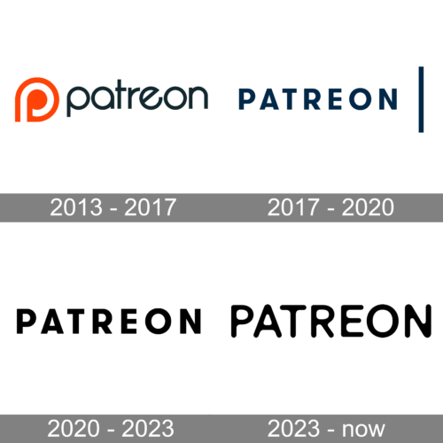
2013 – 2017
The bright spot of the earliest Patreon logo was the “P” icon. It looked slightly similar to a roundabout, except that the circle was open. We can assume that, symbolically, this meant the start of the entrepreneur’s journey: you set off at the very beginning of the curve, then go round the head of the “P” and get some investment while you do (with the help of Patreon, of course). Eventually, you go ahead along the straight line – right to the fantastic future. So, generally, this simple icon could be interpreted as a symbolic representation of what happens to projects on the Patreon platform.
The typeface used for the wordmark is in line with the icon (it might have been modeled on it). The only notable difference in the shape of the “P” in the wordmark is that there is no gap. The circle base of the “a,” “e,” and “o” make these glyphs similar to the “p,” thus resulting in a homogeneous typeface. The other letters don’t break the pattern, although they are narrower.
2017 – 2020
In June 2017, an appreciably different logo was introduced. It became cleaner and more serious. Apparently the company wanted to emphasize its maturity and the fact that it moved to the following stage of its development, from “play” to “business.”
The two pillars of the visual brand identity were the wordmark and the “p” icon.
The wordmark was set in a totally generic sans serif typeface. All the letters were capitalized. The proportions were traditional, based on the square, except for the circular “o.” The stroke thickness was the same in all the glyphs.
Something that confused many users was the vertical line to the right of the wordmark. The meaning and function of this element wasn’t obvious, so for quite a few people it looked like visual clutter.
The “roundabout” “P” was replaced by a simpler design. There were just two geometrical shapes: a rectangle standing on its narrow side and a coral circle to the right. Together, they were supposed to represent a stylized “P” (something not very straightforward). You can’t say that the meaning behind the icon (apart from the fact that it’s a “P”) is clear to anyone without any explanations.
After the new Patreon logo was released, there were quite a few discontented users. The main issue was that the old logo had some visual equity, while the new design was unrecognizable. This created a problem for those who, for instance, had the Patreon watermarks on their websites.
2020 – 2023
The company has made yet another move towards a cleaner design. The ambiguous vertical line next to the wordmark disappeared. Both the elements of the icon are colored in the same way – the designers replaced the papaya color with a more vivid hue.
2023 – Today
The Patreon logo, rendered in a clear and straightforward font, encapsulates the philosophy of the platform: simplicity, transparency, and community. The typography, exclusively in uppercase, uses bold, black characters that possess subtle roundings at the edges, providing a gentle softness that contrasts with the otherwise dominant boldness. This balance between robustness and softness alludes to the platform’s dual purpose: empowering creators while nurturing a community of supporters.
At first glance, the logo seems unembellished, but therein lies its strength. The use of a stark, monochromatic palette suggests transparency and straightforwardness, echoing Patreon’s direct approach to connecting creators to their patrons without unnecessary frills or intermediaries. Each letter stands tall, side by side, in a unified manner, symbolizing the collective support that patrons offer to creators, enabling them to pursue their passions.
The decision to use a minimalist design speaks volumes. In a world saturated with ornate and intricate designs, the Patreon logo stands out by simply not trying to stand out.
Icon
The Patreon Icon is a brilliant example of a contemporary minimalist and artistic approach to visual identity design. The two deep red symbols on a white background look powerful and stylish, representing the brand in its best.
The Patreon icon is composed of a straight vertically placed solid rectangle and a solid circle, set on the upper right part of the image. The two elements are placed at a decent distance from each other, though still can be read as the stylized letter “P”, the first letter of the brand’s name.
Colors
While there have been some minor shifts in the palette, the overall color scheme has remained pretty much the same: orange plus a dark color (almost black). The version introduced in 2020 features the brightest shade of orange so far, which can be described as fiery coral. The charcoal color from the original Patreon logo was replaced by dark navy in 2017, which, in its turn, was replaced by black.


