

![]() Stormers Logo PNG
Stormers Logo PNG
The team started playing in 1997 under the name of the Western Stormers. Since then, they have had two major logo updates.
Meaning and history
![]()
The Stormers, a renowned rugby union team, were founded in 1995, emerging from the Western Province team that played in the Super 10 competition. This foundation marked a new era in professional rugby, aligning with the sport’s global shift towards professionalism. Based in Cape Town, South Africa, the Stormers have been a notable force in rugby, particularly in the Super Rugby competition.
Central to the Stormers’ achievements is their consistent performance in the Super Rugby tournament. They have been finalists multiple times, showcasing a blend of tactical prowess and athletic excellence. Their playing style, characterized by a strong defense and dynamic attack, has earned them a significant fan base and respect within the rugby community. Beyond the field, the Stormers have been influential in promoting rugby in South Africa, contributing to the sport’s growth and development.
Currently, the Stormers continue to compete at a high level in Super Rugby, maintaining their status as one of the premier teams in the league. They are known for nurturing talent and have produced several players who have gone on to achieve international success. The club’s current position reflects a blend of historical legacy and a forward-looking approach to the game, balancing tradition with the evolving dynamics of professional rugby.
What is Stormers?
The Stormers are a professional rugby union team based in Cape Town, South Africa. They compete in the Super Rugby competition, known for their strong defense and dynamic attacking style.
1997 — 1999
![]()
While most of the players came from the Western Province Currie Cup side, the club also drew players from the Boland Cavaliers and SWD Eagles (until 2005). This fact was reflected in the original Stormers logo as it consisted of the colors of all the three Unions.
The logo was based on a large red triangle with a square angle positioned on the top. Inside, there was a smaller triangle in dark blue. Inside the dark blue triangle, there were strokes and waves in white, yellow, and green.
The part of the red triangle that wasn’t occupied by the smaller shape housed the name of the team. The word “Stormers” was given in larger glyphs in a font imitating handwriting. The letters of the word “Western” were smaller, italicized block capitals.
As you can see, the design was pretty cluttered, which attracted much criticism. A journalist called the original logo “scrambled eggs with a box of Smarties thrown in.”
1999 — 2007
![]()
Taking into consideration the criticism, it was only natural that the brand identity went through a complete overhaul as soon as in 1999. The uniform now consisted of a minimalistic black jumper and shorts with black and white socks. And of course, it featured the iconic lightning bolt logo on the breast.
2007 — Today
![]()
Black lost its status of the team’s official color in 2007. This was reflected both in the logo design and the jerseys. The reason for replacing the black with navy blue was that the Stormers and WP brands converged.
We should also add that in 2013, the navy blue of the jerseys was replaced by royal blue. It was chosen as the original color of Western Province Rugby.
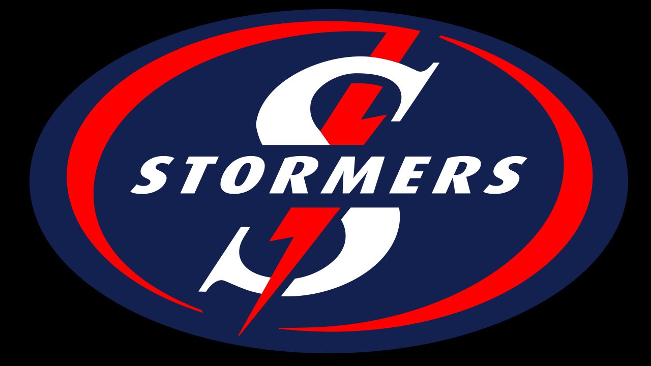
When the Stormers unveiled their updated jerseys on December 8, 2017, you could clearly see that the lightning bolt logo appeared on the royal blue background, which made royal blue part of the emblem. On the away jerseys, the background was charcoal.
Font
The team’s name on the Stormers logo features an italicized sans serif type. The large “S,” though, is utterly different. It’s more elegant, with delicate serifs.
Colors
![]()
Back in 1999, when the Stormers first played in their black uniforms, this color got the status of one of the brand’s core attributes. In 2007, it was replaced by navy blue, which, in its turn, was later replaced by royal blue to create a firm link with the WP brand.


