Parle is the name of an Indian company, which was established in 1929, and specialized in the production of food products, especially biscuits and confectionery. The company was founded by the Chauhan family, which still fully owns the brand today.
Meaning and history
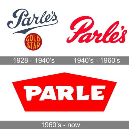
Parle is one of the most internationally recognized Indian food producers, which was founded at the end of the 1920s, and in the early years of its history specialized in the production of cookies. Although by today the assortment of goods, offered by the brand, has significantly grown, its most popular product is still biscuits, which are sold under the Parle-G label.
In terms of visual identity, Parle Products is as conservative, as with its products assortment. The company has always been specializing in cookies and biscuits, and never tried to change it, only to slightly expand. The same is with the Parle logo. The bright geometric badge has remained almost untouched since its introduction at the beginning of the company’s history, only got its contours and lines cleaned and refined.
What is Parle?
Parle Products, or simply Parle, is the name of a food producer from India, which was established at the end of the 1920s by the Chauhan Family, and is mostly known for its biscuits and confectionery products. The most famous product of the company is Parle-G, which was reported as one of the top-selling biscuit labels in the world.
1928 – 1940’s
At the beginning of the Parle’s history, they used the company name printed in a very elegant and stylish way. The inscription featured a cursive font and was placed on a slight diagonal with the last letter curving and underlining the whole word. The name was accompanied by a dark red badge that said “Gold Star” in yellow. Although it seemed to be slightly out of place, the badge looked like a stamp that proved the amazing taste and quality of the goods sold under the brand.
1940’s – 1960’s
The updated log still featured the brand name printed using a cursive style of writing with all the letters being interconnected and italicized. The lettering, though, was different than in the previous logo. There was no more underling of the word or even its diagonal placement. The “Gold Star” badge was also gone. These changes did not make the logo look any less attractive as it now featured a bright red color. It instantly caught the attention and created an image of a strong and serious company.
The 1960s – Today
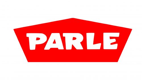
The Parle logo, which by today has grown into a symbol of tasty and high-quality biscuits, is executed in a bright and powerful red-and-white color palette, which makes the badge visible and confident on any background, whether it’s a product package or an advertising material.
The Parle badge is composed of a horizontally stretched pentagon, pointing up. The figure looks like an arrowhead, adding a sense of movement and progress to the visual identity of the Indian brand.
The bold white lettering in the custom typeface is set in the uppercase over the red pentagon. The massive letters have unique and elegant contours, which add friendliness and a welcoming feeling to the badge, even despite the heavy shapes and flatness of the elements.
The Parle logo looks warm and nice, yet also shows the brand as a powerful and professional one. The geometric shapes and intense color palette evoke a sense of development and progress, while the interesting contours of the letters add creativity.


