One of the most influential animation studios in the US, Paramount Animation was established in the summer of 2011. It is the animation division of Paramount Pictures.
Meaning and history

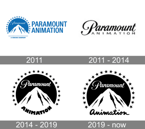
The first four features released by the studio did not have a separate logo but used the one of Paramount Pictures.
2011

The initial logo uses the same emblem as the mother company – a bright blue circle with the white mountain on it, crowned by 22 stars. On its immediate right, they put the studio’s name wordmark written in tall capital letters of the same blue shade.
2011 – 2014
The Paramount Animation logo, designed in 2011, was very delicate and distinctive, with just two lines of lettering, set in plain black lines against a white background. The upper part of the badge boasted the sleek cursive “Paramount”, written in the corporate typeface, while the bottom, “Animation”, wordmark used an extended geometric sans-serif font for its uppercase characters. It was a very stable timeless badge, which could still be used by the company and look fresh and actual.
2014 – 2019
The original Paramount Animation logo looks pretty much like that of its parent company. There is a mountain peak with the word “Paramount” above. The “handwritten” name was inspired by the original Paramount wordmark from more than a hundred years ago (it was introduced in 1912). The structure (mountain plus the wordmark plus the stars) is almost as old – it was first used in 1914.
What makes the design different from the visual brand identity of the parent company is the word “Animation,” which appears below the mountain. We should say it looks pretty heavy due to the very bold sans serif type. The word is arched and, together with the stars, forms a circle.
2019 – now
A new animated logo was unveiled. Its most characteristic feature is the character named Star Skipper. Little is known about the girl, except that she can be seen in the Paramount Animation logo, skipping a stone across a lake, which turns into a star.
Another important update is the new type used for the word “Animation.” Similar to that used in the name of the parent company, it was also inspired by handwriting. Yet, it has a by far more modern, playful style.
The Star Skipper has an interesting history. When film producer Mireille Soria was hired as the division’s president, she was set the goal to make a new logo. The design team decided to choose a female character as the majority of the team were women. According to Soria, it “captures the magic” of their brand.
The Star Skipper was designed by Christopher Zibach and animated by ATK PLN and Reel FX Creative Studios. It made its debut at the beginning of the new episode of the SpongeBob Movie released in 2020.


