Panda Express is a fast-food chain specializing in American Chinese cuisine. Founded by Andrew and Peggy Cherng, it originated in Glendale, California. Created to offer quick, flavorful, and affordable Chinese dishes, it blends traditional Chinese flavors with a modern, fast-casual dining experience. Known for dishes like Orange Chicken, it has become a popular choice in the U.S. and internationally, signifying the fusion of Chinese culinary traditions with American tastes and convenience.
Meaning and history
Panda Express, a culinary emblem of American-Chinese gastronomy, began its journey in 1983. It’s the brainchild of Andrew and Peggy Cherng, a visionary couple who sought to merge the essence of Chinese flavors with the pace of American life. The Cherngs, hailing from the restaurant world, crafted a fast-casual format that revolutionized Chinese dining in the U.S. Their signature dish, Orange Chicken, created in 1987 by Chef Andy Kao, became a nationwide sensation, symbolizing the brand’s innovative approach to traditional recipes.
As it expanded, Panda Express maintained a family-owned ethos, emphasizing quality and community. By the 21st century, it had blossomed into a global franchise, with locations spanning several countries, continually adapting and introducing new dishes. Its success lies not just in its cuisine but also in its cultural bridge-building, making Chinese culinary traditions accessible and relatable across borders.
What is Panda Express?
Panda Express stands as a trailblazer in the realm of fast-casual dining, offering an American twist on traditional Chinese cuisine. Founded by Andrew and Peggy Cherng in 1983 in California, it has carved a niche with its fusion flavors, epitomized by its iconic Orange Chicken, and has grown into a beloved international chain. This eatery blends the rich heritage of Chinese cooking with the convenience and accessibility of American fast food, creating a unique culinary experience.
1973 – Today
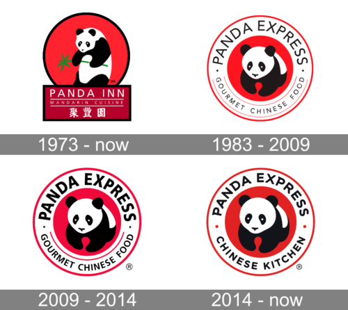
The logo features a stylized panda bear cradled within a bold red circle, clutching a green bamboo shoot, symbolizing freshness. Beneath the panda, the words “PANDA INN” in capitalized white letters rest on a deep maroon banner, with “MANDARIN CUISINE” and Chinese characters providing an international flair. This emblem elegantly marries the charm of the panda with the culinary promise of authentic Mandarin dishes.
1983 – 2009
This logo evolution introduces “PANDA EXPRESS” encircling a more minimalist panda, seated centrally against a stark white backdrop, inside a vibrant red ring. “GOURMET CHINESE FOOD” frames the bottom curve, emphasizing the brand’s upscale fast-food ethos. The panda’s playful features capture the friendly appeal of the chain, while the encircling text conveys a classic seal of quality, indicative of the brand’s promise to deliver gourmet experiences in a quick-service format. The design’s simplicity and bold color contrast ensure instant recognition and memorability.
2009 – 2014
In this iteration, the logo retains its circular red border but adds the registered trademark symbol, reflecting the brand’s established status. The text “PANDA EXPRESS” boldly encompasses the top half, with “GOURMET CHINESE FOOD” lining the bottom, both in a confident, sans-serif typeface. The panda, endearing with its round eyes and soft lines, remains the focal point, symbolizing the chain’s commitment to Chinese culinary culture. This design tweaks the color balance, enhancing contrast and brand recognition.
2014 – Today
The logo now reads “PANDA EXPRESS CHINESE KITCHEN,” signaling a refreshed brand focus on culinary authenticity. The typeface is slightly altered, and “CHINESE KITCHEN” replaces “GOURMET CHINESE FOOD,” suggesting a homely, authentic cooking space. The circular red emblem remains a striking background, with the panda’s playful visage continuing as the heart of the design. This subtle shift reinforces the brand’s commitment to genuine Chinese kitchen artistry, wrapped in a familiar, approachable visual identity.


