Falabella is a multinational chain of department stores headquartered in Santiago, Chile. It belongs to S.A.C.I. Falabella.
Meaning and history

The history of the company began in 1889. It was established by Salvatore Falabella, an Italian Chilean immigrant, as a tailor’s shop.
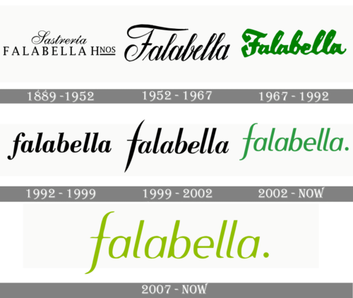
During all of its long history, the Falabella logo has always preserved a refined and elegant calligraphic touch. Although it was more prominent in the older versions, even the current one has it.
1889 – 1952
In the original logo, the word “Falabella” featured a clean yet elegant sans. The word “Sasteria” was an example of the calligraphic refinement. The decorative cursive handwriting made it look as if it had been written by a master of calligraphy.
1952 – 1967
Only the word “Falabella” was left now. This time, though, it featured cursive handwriting (different from the one from the previous wordmark). The designer added tiny decorative elements in the middle of the letters.
1967 – 1992
The glyphs adopted a highly decorative historic touch. It was especially obvious in the case of the “F,” which looked as if it had been copied from a medieval document. The wordmark was now colored in a rather rare shade of green.
1992 – 1999
This was when the glyphs lost the links connecting them with one another. Ever since, each letter has stood apart from its neighbors. Yet, they did not lose their stylish variations in the width of the strokes, rounded shape, and curls characteristic of the cursive handwriting (the italicized version of the Bodoni Bold typeface).
Also, this was the first version where the initial was lowercase.
1999 – 2002
The generic “f” was replaced by an unusual one, which immediately made the logo stand out. The glyphs lost their serifs and some of their weight.
2002 – 2007
The wordmark returned to the green color, although the tint grew lighter. The updated font appears to have been inspired by the Gandhi Sans font in italics. A period appeared.
2007 – now
The Falabella logo was colored a rare grassy green.
Font
The current style of letters for the Falabella brand was adopted in 2002, although the roots of this appearance from even the earliest drafts of their emblems. The characters are now thin, tilted and moderately elegant. The font used here is a delicate italic style with bars that stick out somewhat. They use smooth, curvy lines that thin near the tips. Before, they were even more sophisticated, as well as cursive. The letters don’t meet now. They are also absolutely lowercase.
Color
Since 2007, they used a yellowish green shade for their logo. Before, they favored a brighter, more saturated green shade. Before even then, most logo variants only had black letters. The green is now used for many elements in their branding, and the coloring can actually change to other green shades. Also, it’s often accompanied by black, especially for borders.


