The logo of the financial brokerage group OVD is clean and dynamic. In comparison with the older version, it is a little more minimalist.
Meaning and history
OVB Holding AG is a financial sales company, established in Germany in 1970, and today operating with subsidiaries in 15 European countries. With more than 4 million customers, OVB claims to be one of the largest financial brokerage groups in Europe.
The object of the company is the management of companies operating in particular in the business fields of advisory and brokerage services for financial and similar services, advisory and brokerage services for capital investments, building society savings contracts, insurance contracts, and in the field of advisory and brokerage services for real estate investments of all kinds.
What is OVB?
OVB is the name of a European financial holding, which was established in Germany in 1970. Today the company has branches in 15 European countries, serving more than 4 million clients. The main focus of OVB is business advisory and brokerage services.
1970 – 2018
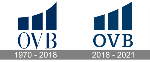
While the previous emblem had the same structure, there were quite a few minor differences. The most obvious one was the type. With its combination of thin and thick strokes, it looked elegant in a traditional way, which also made it look somewhat dated. The thin serifs only reinforced the impression.
Also, the tops of the three columns had a slightly different shape. It was especially apparent in the case of the third column with its sharp angle.
2018 – 2021
The current OVB logo features an abstract emblem, which can be interpreted as a graphic representation of positive dynamics. It consists of three shapes. Each of the shapes is higher than the one standing before it. At the same time, the tops of the shapes form a single curve, which shows that all the three are parts of a single whole.
Below, the letters “OVB” can be seen. The fact that the number of shapes is the same as the number of letters creates a visual rhyme and establishes a link between the two parts of the design.
Font and Color
The simple and stable uppercase lettering from the primary badge of OVB is set in a distinctive serif font with straight contours and cuts of the capital letters. The closest fonts to the one, used in this insignia, are, probably, Antonia Text Medium or Lagu Serif Semi Bold.
As for the color palette of the OVB visual identity, it is based on a deep and calm shade of blue, which looks very serious and reliable, evoking a sense of confidence and professionalism and showing the company as an expert in its field of activity.
The type in the current OVB Group logo is bolder and evener, although you can still notice the strokes have different thicknesses. The serifs are still there but they have grown heavier.
Company overview
The OVB Group was established in 1970. Today, it is known among the largest financial brokerage groups in the EU. It is a holding company with its headquarters in Cologne, Germany.
According to the brand’s official website, they work with more than 100 providers to serve their clients’ needs providing consulting services based on their individual financial situation.


