

![]() EBRD Logo PNG
EBRD Logo PNG
The logo of the European Bank for Reconstruction and Development has gone through a single subtle modification over its 30-year history. The update made it look more modern.
Meaning and history
![]()
EBRD, or European Bank for Reconstruction and Development,is an international financial institution with 61 founding members, the European Union, and the European Bank. The EBRD was established in 1992 to facilitate the transition to a market economy in Eastern Europe. Since its inception, the bank has expanded its geographic coverage: Today the EBRD operates in 29 countries, from central Europe to central Asia.
The EBRD specializes in project finance, particularly for banks, enterprises, and companies, investing in both greenfield and brownfield operations.
As an international institution, the EBRD makes extensive use of its established relations with the governments of the region to create favorable conditions for entrepreneurial activity, privatization, and the creation of a full-fledged market economy.
What is EBRD?
EBRD is an abbreviation standing for the European Bank for Reconstruction and Development, a financial institution, established in the United Kingdom in 1991. Today the organization operates in more than 30 countries in Europe and Asia, helping build economies.
1991
![]()
The design looked pretty much the same except for the typography. The font in the previous EBRD logo was a serif one, which made it seem slightly dated in comparison with the current version.
Also, on the primary logo, the name of the bank used to be positioned below the emblem, not to the right.
now
![]()
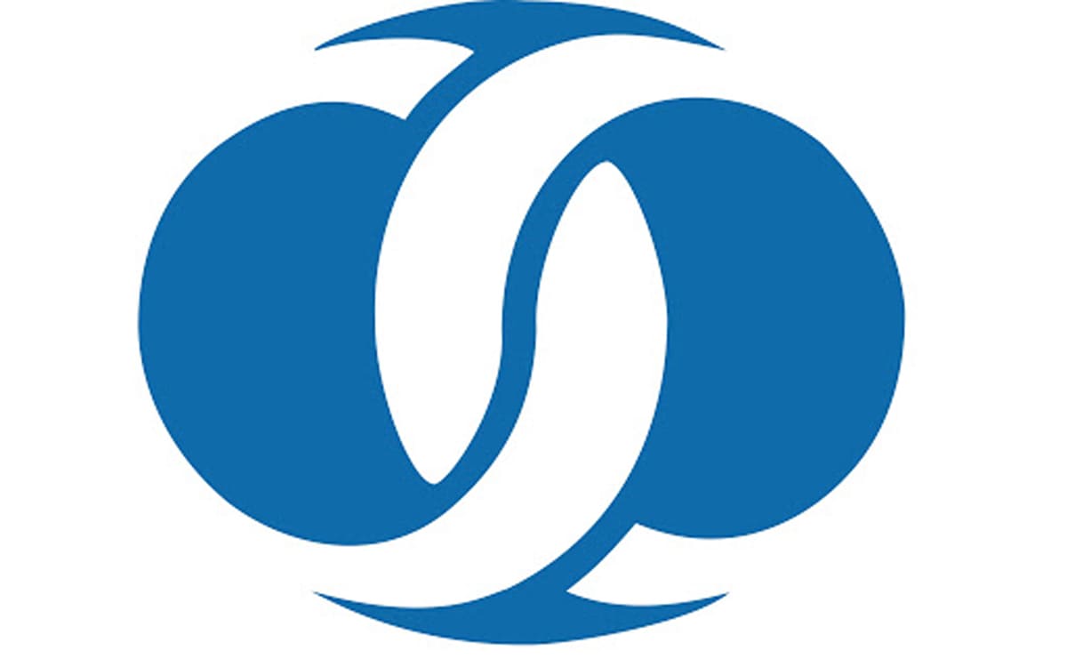
In addition to the full name of the bank, the EBRD logo features an emblem in blue and white. While the emblem is pretty abstract and does not represent a specific object, it conveys its message using the language of symbols.
For instance, the two white rings are joined like links in a chain, which go well with EBRD’s mission as a developmental investment bank. This symbol represents joined forces, collaboration, repair of an essential link that gives a chance for further development.
While the shape of the logo is not exactly a circle but rather an ellipse, it still reminds the globe. This is one of the ways to suggest a global reach. Originally, EBRD worked with the countries of the former Eastern Bloc, today it has spread its reach to over thirty countries.
To the left of the emblem, there is the full name of the company. The words “European Bank” form the first line. The glyphs are larger than those used for the second line, due to which they are better legible.
Font and Color
The classy and sophisticated lettering from the primary badge of the European Bank for Reconstruction and Development is set in the title case of a confident serif typeface with sleek contours of the characters. The closest fonts to the one, used in this insignia, are, probably, Times New Roman PS Std Bold, or Hezareh Bold with thick lines of the letters and thin sharp serifs on their ends.
As for the color palette of the European Bank for Reconstruction and Development, it is based on a smooth yet intense shade of purple, which is a symbol of wisdom and royalty. The color looks very chic and expensive and evokes a sense of quality, professionalism, and excellence.
Despite its generic style, the font in the current European Bank for Reconstruction and Development logo perfectly does its job. It is legible even at smaller sizes and creates a serious business mood.
Company overview
The European Bank for Reconstruction and Development was established in 1991 with the mission of building market economies. As a tool for this purpose, it uses the investment. The company is headquartered in London.
Members of the EBRD are from different corners of the globe, from North America to Africa and Australia. While the bank belongs to around 70 countries, the major shareholder is the US. The bank only lends to its countries of operations.


