

![]() Oris Logo PNG
Oris Logo PNG
The Swiss watch manufacturer Oris has been pretty consistent in its visual brand identity for about seven decades, at least.
Meaning and history
![]()
The first Oris factory, which was run by less than 25 workers, started working in 1906. However, the company itself was established by Paul Cattin and Georges Christian two years earlier.
While the Oris logo hasn’t remained the same since then, it has stayed remarkably consistent in its key part, the word “Oris” itself, throughout many decades. For instance, if you examine the face of alarm clocks from the 1940s, you’ll see the same perfectly legible, clear block capitals as on the Chronoris chronograph (1970) or the Diver Sixty-Five unveiled in 2015. However, the company also has an additional logo featuring a small shield shape.
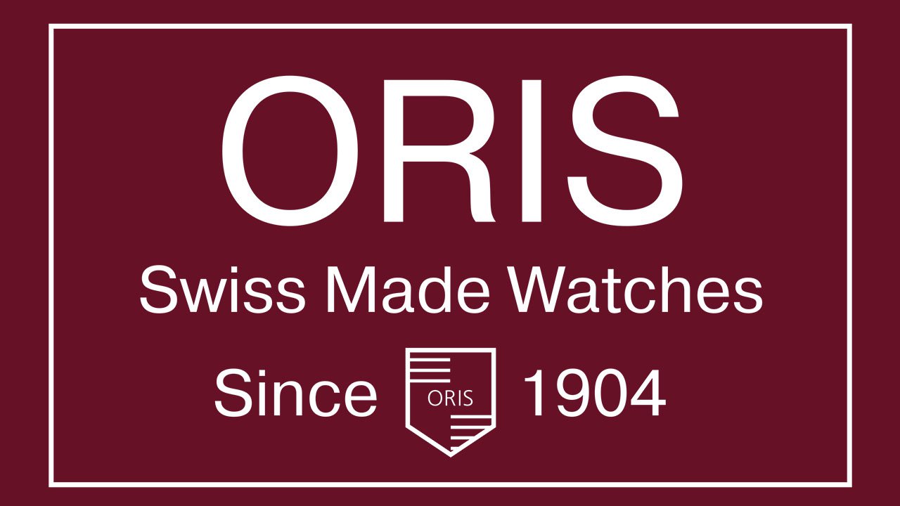
Font
![]()
If you take a closer look, you’ll certainly notice that the Oris logo combines more than one type. The smaller lettering “Swiss Made Watches Since 1904” appears to be set in Franklin Gothic (or at least a type looking very much like it). As for the word “ORIS,” it is apparently a customized font. Such types as ITC Newtext and ITC Quorum are of a similar style.
Colors
While the emblem is a monochromatic one, it uses light grey (in some versions) in addition to the basic harmony of black and white. In other versions, however, the shield is given not in grey but in black.


