OpenSea is an American NFT platform, launched in 2017. On it, users get to mint their own non-fungible tokens, sell and buy them for crypto. It was one of the big names in the NFT trade the first few years of its existence. However, because NFTs weren’t as popular then, the marketplace only became famous in 2021, when such tokens suddenly grew in demand.
Meaning and History

OpenSea was created in 2017 by a number of American crypto businessmen. They were among the first NFT marketplaces. Users could mint their tokens for free and soon without permission from the platform. They could then sell them or buy someone else’s work. By 2022, the company became a multibillion business. The name alludes to the free, unrestricted nature of blockchain.
2017 – 2018

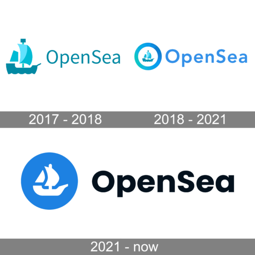
The platform name made it easy to come up with a visual representation. Besides, the “OpenSea” inscription, which was done in turquoise using a simple sans-serif font, the emblem had a simple ship icon done in three different shades: teal, turquoise, and sky blue. The addition of a white waterline added dynamics and reflected that the company never stands still and continuously works on improvements. This emblem can be easily associated with the name and a cohesive color palette strengthens this association.
2018 – 2021

The original emblem depicted a ship, placed inside a round figure. The area around it was white. Further around it, they placed a thick colored ring. Both the ship and the ring had gradient color schemes that went from green to blue. It’s visible, however, that it wasn’t a continuous gradient, but a pattern, divided into polygons. The ship itself was an artistic silhouette with simple forms. Its bottom line had a wavy look to make it seem like the vessel actually sails through the waves.
2021 – today

It was severely simplified in 2021. Namely, the ship was now white and placed inside a single blue circle. The blue had a continuous, single shade. The ship was also changed in design somewhat. Its shape became smoother and rounder, in addition to several smaller modifications. The wavy line in the bottom became a solid straight one. There was also the name wordmark, written to the right of this emblem (just as in the previous design). Here, the letters became visibly bolder, but little else changed.
Font

The font used in the wordmark is a typical sans-serif with protruding bars, much like Arial. It was much thinner in the 2017 design. Since 2022, they added more boldness to it and made these characters slightly shorter. They normally used black for these letters, but in the original design they could also be blue (or use other colors of the same spectrum).
Color

For much of their branding, the contemporary coloring is just blue. In particular, it’s a bright, moderately light shade. They, however, use other variations of blue for different purposes that don’t involve the emblem itself. The other favorite colors are white and black (especially for the wordmark).


