

![]() The Highlanders Logo PNG
The Highlanders Logo PNG
The Highlanders have been pretty consistent in their brand identity, including the logo, which remained almost intact for over 20 years.
Meaning and history
![]()
The club started its history as a New Zealand rugby union team in 1996.
1996 — 2000
![]()
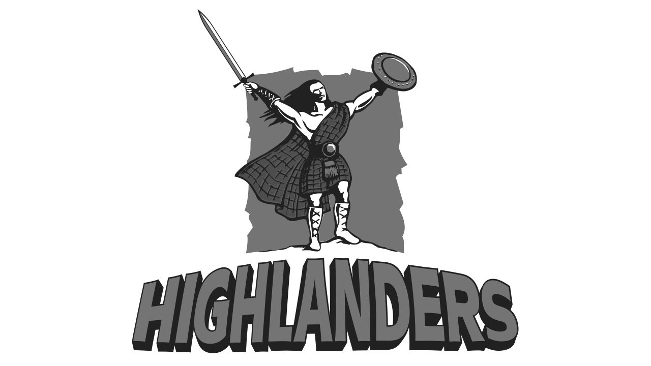
The earliest Highlanders logo featured an ancient warrior with his arms spread wide holding a sword and a shield. The warrior’s clothes were dark blue with a yellow belt. The lettering below read: “The Otago Highlanders,” which was the team’s original name.
![]()
2000 — Today
![]()
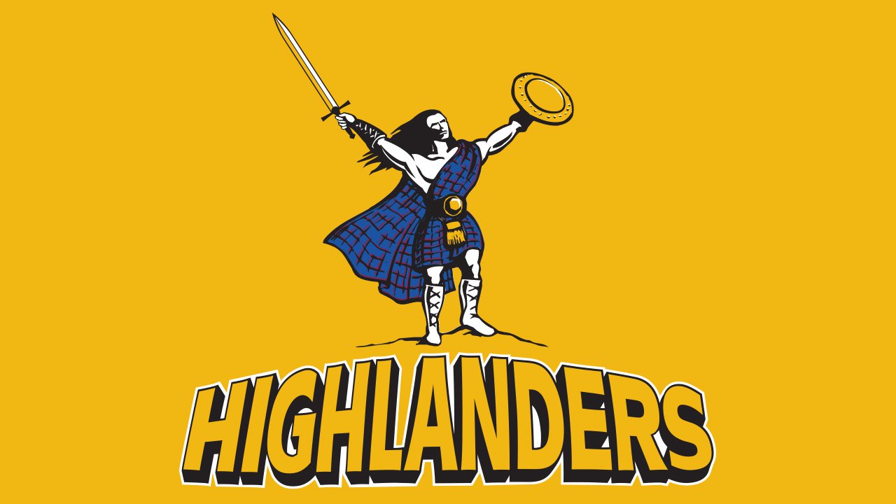
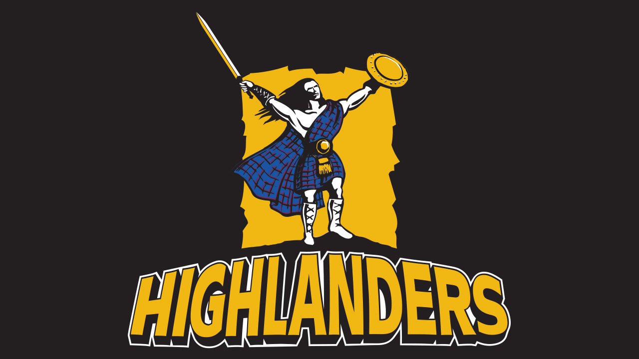
The current logo looks pretty much like the original one. The club got rid of the word “Otago” and the blue background.
Colors
The original palette was comprised of yellow, blue, and maroon. They were chosen as a way to emphasize the link with the area the Highlanders represent (yellow, blue, and maroon are the colors of Otago, North Otago, and Southland). Also, blue was chosen as the main color of the Flag of Scotland.
In 2011, though, the club unveiled a home uniform dominated by lime green. As the kit received negative feedback, the Highlanders decided to leave it for away matches during the 2012 Super Rugby season.
As for the Highlanders logo, it has been traditionally dominated by yellow and blue with white and black accents.


