The chain of luxury department stores Nordstrom has gone through at least three distinctive logotypes since 1901 when it was founded.
Meaning and history
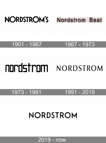
In 1930, when Nordstrom was a Seattle-only shoe store, it had a playful logo based on the Futura type. The Futura family was developed by Paul Renner in 1927 and was inspired by Bauhaus typefaces. While the original Nordstrom logo may look somewhat dated now, in the 1930s it was a state-of-the-art design.
The most eye-catching glyphs were the “O’s” – they were higher than the standard height of capital letters. Also, the “O’s” were circles and looked very wide in comparison with other letters, which seemed to have been squeezed between the “O’s.” The “N” and “M” were also slightly higher than the normal cap height, due to which they looked more prominent than all the other glyphs.
Also, the 1930 logo featured an apostrophe and “S,” which were removed only around 1955.
What is Nordstrom?
Nordstrom is the name of an American department store chain, which was established at the very beginning of the 20th century. Today the chain has almost 500 locations across the United States and Canada, offering luxury goods for the whole family.
1901 – 1967
The very first Nordstrom logo was created in 1901, and stayed with the department store for more than 60 years, being a great representation of the confidence, progressiveness, and professionalism of the company. It was a bold and softened sans-serif logotype in the uppercase with the letters slightly varying in size, which made the whole wordmark look more playful and dynamic.
1967 – 1973
The redesign of 1967 has introduced a more traditional and elegant version of the Nordstrom badge, with the “Nordstrom Best” inscription set in the title case of a classy sans-serif typeface with old-school shapes of the characters, and perfectly balanced lines and spaces. This badge stayed with the chain for almost six years.
1973 – 1991

In 1975, a completely different wordmark was introduced. There were only lowercase letters. Their shape was also unusual, but all the letters seemed to fit each other in terms of the proportions and style. The logo was given either in black and white or in brown and white.
1991 – 2019

The rectangle-based type of the previous Nordstrom logo was replaced by a font with glyphs of a more traditional shape. Here, the “O’s” are ovals, the “S” is formed by curves rather than rounded angles, etc.
Beyond any doubt, this version emphasizes elegance and refinement. And it’s not an old-fashioned elegance but a modern one – note, for instance, those softly widening and narrowing lines.
2019 – Today
The current logo is simple and timeless. Its unique style is the result of the style of the type by which it had been inspired.
Font
The logo appears to have been designed using one of the fonts from the Optima family. Most likely, it’s a customized version of Optima Pro Medium.
While the glyphs on the Nordstrom logo have pretty much the same recognizable shape as the letters from this font, they have slightly different proportions. Due to the somewhat elongated shape, the wordmark appears slimmer than if it hadn’t been customized. One of the possible reasons is that the modifications have made the logo less wide, which could be good for a signboard, for instance. Another possible reason is that the elongated letters better fit the modern understanding of beauty with its slimmer and higher shapes
The Optima family, which includes 24 fonts, was developed by Hermann Zapf and published by Linotype. The unique style of Optima results from the fact that this is, in fact, a serif type from which the serifs have been removed. In other words, it’s a combination of a serif and sans serif font.
Colors
The classic combination of black and white contributes to the timeless elegance of this logo.


