Noah is the new name of the rock band from Indonesia, which was known as Peterpan since 2000. The new name came to the band after a two-year break in their career, which was taken for a reason — the frontman of the band got arrested.
Meaning and history
This alternative rock band was born in Indonesia in 2000 and was incredibly popular with young people in their country. The first name of the band, which today is known as Noah, was Peterpan. It was how Peterpan, a group of six young people, conquered the music charts of the country until 2010 when the lead singer Ariel was arrested for a sex scandal.
The band practically broke up and did not perform until Ariel was released from prison in 2012. With his return, the band was renamed, but lost half of its members. Today Noah is still on the ride and releases new singles, which are warmly met by the fans of the band.
What is Noah?
Noah is the name of an Indonesian rock band, which was established in 2000 under the name Peterpan. Initially, the band consisted of six members, but with the start of a new chapter in its history, and with the new name, the group got cut to three.
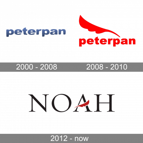
In terms of visual identity, the first two versions of the band’s logo were based on their original name, Peterpan, and looked pretty simple yet confident and stable due to the bold lines of the characters. As for the new era, the Noah one, its badge reflects the roots of the band, applying the graphical element from the first chapter of its history.
2000 – 2008
The very first Peterpan logo was designed in 2000 and stayed unchanged for eight years. It was a heavy lowercase logotype in a modern sans-serif font with the characters executed in gradient blue, coming from medium blue to black from top to bottom. The logotype was the only element of the badge.
2008 – 2010
The redesign of 2008 changed the color palette of the Peterpan logo to bright red, refined and cleaned the contours of the lowercase characters, and added a graphical emblem to the composition. The emblem of the band was an elegant red feather with rounded details and elongated lines, set above the inscription.
2012 – Today
After the rebranding of the band, a new logo was created for it in 2012. The Noah badge is elegant uppercase lettering in a serif font with black characters accompanied by a small red feather, which replaced the horizontal bar of the letter “A”. This feather fully repeats the one from the last Peterpan badge, but is set in a darker shade of red, and turned to the right now.
Font and color
The sophisticated yet stable uppercase logotype from the primary badge of the Noah rock band is set in an elegant serif font, which is very similar to such types as Trajan Bold, Gouda Trajan Pro Bold, or Gouda Titling Semi Bold.
As for the color palette of the Noah visual identity, it is based on a strong and powerful combination of black and dark red. These colors evoke a sense of passion, mystery and confidence, and perfectly suit to the music genre the band performs in.


