Over the first two years of its existence, Nickelodeon was actually called Pinwheel, so the company’s original wordmark reflects this fact. It was only in 1977 that the channel was relaunched under its current name and the history of the Nickelodeon logo actually started. Let’s look how the company’s branding got to where it is today.
Meaning and history
The history of the famous channel’s visual identity started with the foundation of the Pinwheel company in 1977. It was the original name of the channel. The very first logo was simple while wordmark placed on a purple background. The letters were smooth and playful and the color palette evokes a sense of creativity and imagination, but the Pinwheel era lasted for only two years. The Nickelodeon was born in 1979.
What is Nickelodeon?
Nickelodeon is a cable channel for kids, which was established in the United States in 1979. It was the first cable channel, that specialized exclusively in content for kids, and today Nickelodeon has grown into a huge corporation, which operates worldwide, and has its programs and cartoons available in English and Spanish languages.
1977 – 1979
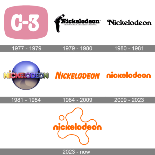
The very first logo, used by the channel for almost two years at the end of the 1970s, featured a smooth light-pink horizontally oriented banner with the sides arched from the center, making up a shape, resembling a television. In the center of the logo, the bold white “C-3” in a heavy rounded serif font was set. No other elements were present in this original version.
1979 – 1980
The first logo for the new company was designed in the same year and only stayed until 1989. It was an interesting and intriguing logo, where the man in a hat was looking inside the first letter of the nameplate, stylized as a nickelodeon machine, which was a projector.
The wordmark was written in black and executed in a strong geometric serif font with bold letters and distinct solid serifs. There was “The Young People’s Satellite Network” tagline in all capitals, placed under the wordmark and making the whole logo complete.
1980 – 1981
The logo was redesigned in 1989 and the strong and confident wordmark was replaced by a more elegant and imaginative one. The curved tail of the letter “N” made the whole inscription look playful and welcoming, adding a sense of lightness and happiness to the sophisticated inscription with smooth lines. This logo also only lasted for one year, but was pretty well balanced and executed.
1981 – 1984
The logo, introduced in 1981 lasted a little longer — for three years. It was a colorful and memorable version, designed by Lou Dorfsman. The visual identity featured a three-dimensional globe in gradient gray and purple shades with a multicolor wordmark, horizontally placed over it. Each of the rounded sans-serif letters featured its own color — from yellow to purple and green.
Rainbow color palette and the pinball emblem made a perfect pair in representing the new generation of the children’s television.
1984 – 2009
The new era of the Nickelodeon visual identity started in 1984. The company has finally chosen its signature color palette — orange and white, a combination which symbolizes happiness and evokes smiles. The main logo was composed of an orange wordmark placed on a white background, but there were many different versions created between 1984 and 2009 — white lettering on an orange blot, orange inscription with a thin white outline, and even a shortened, “Nick” version.
As for the typeface of the nameplate, it is a modern sans-serif with playful stencils on both letters “O”, Balloon font. It does look stylish and memorable, representing the best of the channel and making it stand out from the list of its competitors.
2009 – 2023
In 2009 the cartoon channel redesigns its logo again. The color palette remained untouched, but the style of the lettering was changed dramatically. Now the inscription is executed in the lower case letters, which looks even friendlier and more welcoming than it used to be.
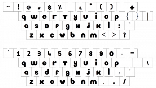
The bold modern sans-serif font is customized but based on Harry Squeezed Obese font. The most interesting element of the inscription is the letter “I”, which looks like a keyhole, which promises to show you amazing worlds and adventures once you start watching the channel’s programs.
2023 – Today
The redesign of 2023 has introduced quite an interesting version of the Nickelodeon visual identity. The color palette hasn’t been changed, and the badge is still executed in orange, with the background mainly set in plain white. As for the composition, it kept the lowercase logotype from the previous version but added light graphics to it. Now the inscription in a bold sans-serif typeface is decorated by a thin line, making up an abstract shape with a contoured circle above the letter “I”.
Font
The rounded sans-serif type used in the Nickelodeon logo looks very close to Bauhaus 93.
Color
The corporate wordmark has been featuring the orange-and-white color scheme since 1984.
Why did Nickelodeon change its logo?
Nickelodeon had to come up with a new identity after the brand created several
Branches and sub-brands, had to be United under one common umbrella badge, hence the stable minimalistic wordmark was introduced by the company in 2009.
What was the original Nickelodeon logo?
The original Nickelodeon badge, introduced in 1977, was composed of a solid pink element in a shape of a tv screen, with an enlarged white “C-3” written on it in a heavy rounded serif font. This badge stayed with the channel for a couple of years, and in 1979, it was replaced by a black-and-white badge with the man in a hat and a black “Nickelodeon” inscription.
When did Nick change its logo?
The Nickelodeon badge has had several redesigns throughout the years, although, the last version of the logo was created in 2009, and the refinement of 2021 has made it blue. As for the very first redesign of the Nickelodeon badge, it was held in 1979, and then — in 1980.
Why is the Nick logo blue today?
The logo of Nickelodeon was redrawn in blue and orange n 2021 to celebrate the launch of the Paramount Plus streaming service. The refinement of the logo follows marketing targets, but also in blue the badge of the tv channel started looking fresher and stronger.


