NHK is the largest broadcast corporation in Japan, which was established in 1925. Owned by the government, NHK broadcasts the most trusted and popular programs on national television through two of its channels — General and Educational.
Meaning and history
The most influential and reputable tv-corporation in Asia, NHK started its path in 1925 as a radio channel, which was named JOAK for the first year. The tv era for the company began in the 1940s, and this is when the visual identity became really important. The company has had not too many redesigns throughout its history, but a couple of its logos became truly iconic and are still remembered by millions of people.
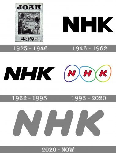
1925 – 1946
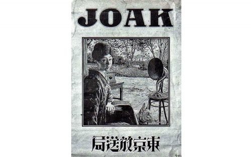
The very first logo was designed for JOAK in 1925. It was not even a logo, but more of a poster, with a lady sitting near the speaker, a wordmark in English above it, and in Japanese — under it.
One year later, after the company was renamed, a new badge was introduced. It was a geometric sans-serif “NHK” inscription in black outline, placed over a bold circular frame with two spikes coming out of it from the top right and bottom left parts, creating a diagonal growth feeling.
1946 – 1962
In 1946 the logo was redesigned in order to fit the needs of the new television. It was a very simple yet powerful wordmark in black, executed in a bold sans-serif typeface, and very well balanced.
1962 – 1995
Two logo versions were used by the corporation starting from the beginning of the 1960s. It was an italicized sans-serif inscription, where letters were placed whether close or far from each other. From first sight, it was nothing special, but the logo evoked a sense of dynamics and energy.
1995 – 2020
In 1995 the most iconic logo for NHK was designed. Three bold red letters in a rounded sans-serif and with a thin black outline were placed each in its own egg. Three eggs were glued to each other and had two possible color palettes — rainbow and gray. The logo got nicknamed “The NHK Eggs” and became a truly legendary emblem in the history of television.
2020 – Today
The company decided to simplify its logo in 2020, so the eggs framing was gone and only the lettering remained on it. Executed in the same bold and rounded sans-serif, it is italicized and smooth, reflecting confidence and progress. The main color of the visual identity is now light gray, but you can also see monochrome versions, depending on the background and needs.


