

Located not far from Lucerne in central Switzerland, Titlis is one of the highest peaks in the Swiss Alps, reaching an altitude of over 3,000m above sea level. It is a highly popular tourist destination in the country. The mountain is home to a ski resort and features a glacier with several accessible ice caves throughout the year. Managing the economic activities in the Titlis area, including transportation, hotels, restaurants, and food venues, is Titlis Bergbanen.
![]()
The company has set a strategic goal to establish itself as one of the top Alpine destinations, providing guests with an unforgettable experience at the summit. To achieve this, they have recently embarked on a reconstruction project for the mountain station and a rebranding initiative, which has been entrusted to the design studio Markenfels.
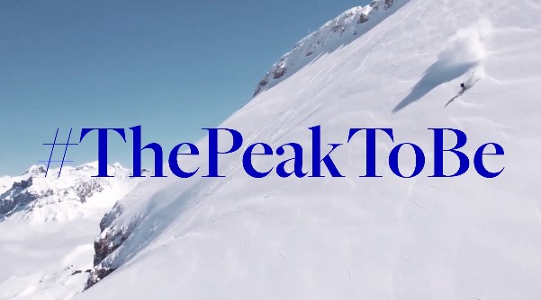
The renovation of the station and the observation tower (originally built as a telecommunication tower by Swiss Post in the 1980s) marks the beginning of a new era for Titlis Bergbanen. It introduces innovative architecture aimed at attracting an international audience with a strong focus on technology, as stated in the brand’s press release. In other words, the goal is to cater to new customer segments with higher expectations. With the rebranding, the company now positions itself as simply Titlis, an ultramodern brand striving for greater popularity under the slogan “The Peak To Be.”
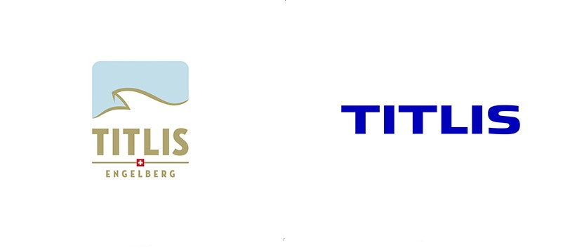
When it comes to visual language, Titlis is shedding its old, slightly outdated identity that seemed more suited for a Swiss chocolate brand than a mountain resort. The logo has been simplified to a bold sans-serif wordmark. Additionally, the new branding incorporates a T symbol, consisting of eleven vertical lines, representing Titlis as an iconic mountain and also referencing the structure of the observation tower.
The color palette prominently features a bright shade of blue as the main color, contrasting with clean white and accentuated by an intense hue of red. However, this somewhat cool color scheme not only reflects the mountain atmosphere of Titlis but also alludes to a high-tech universe that will contribute to the brand’s premium image.

Overall, the graphic system developed with a “Digital First” approach is primarily optimized for digital usage. The use of the hashtag symbol (#) aligns with this theme, originating from the social media culture that emerged over a decade ago. Furthermore, Titlis’ new corporate typeface, Freight Big from the Freight Collection, adds an editorial aspect that contrasts with the rest of the visual identity.
Titlis will undoubtedly benefit from its new look, which clearly reflects its ambitions and contributes to a comprehensive overhaul of the brand’s experience. However, it could also consider incorporating a more humanistic image that focuses on the emotional aspects of the summit, making the brand even more appealing.


