The State of Ohio has updated its tourism brand, bringing back a slogan that was used back in the 1980s-1990s. The announcement took place this Wednesday when the state was celebrating Tourism Day. The new visual identity is hoped to attract new visitors and businesses.

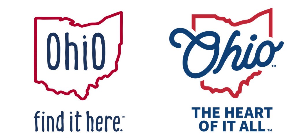
Located in the US Midwest, Ohio is the seventh-most populous state, with a population of 11.8. In the state’s new brand identity, the new old tagline “Ohio, The Heart of It All” is as important as the logo which conveys a retro-feeling of the 1950s through the typography. It replaces the slogan “Find it here” At the same time, the identity is intended to send a message about the future and prosperity.
According to Ohio’s Governor Mike DeWine, the state is quite prosperous now, and should be positioned as “the heart of opportunity, the heart of technology, the heart of adventure, and the heart of family”. As officials said at the presentation of the refreshed brand, the brand’s activities for tourism and economic development should be considered as a whole. The new marketing strategy of the state will be coordinated integrally.

Apart from various tourism events, directions, and visitor sites, the goal is to focus more on job opportunities, family relationships in communities, and improving quality of life in general. As Lt. Governor Jon Husted explains, tourism is very important for Ohio, however, it’s only a part of the puzzle. Moving forward, the authorities of the state are going attract not only visitors but also people who want to live and work here.
As for the Ohio brand’s logo, the base structure has little changed. The lettering “Ohio” is still colored in blue, embedded into a red outline of the state. However, it is bigger and designed in a handwritten manner. This style with thicker lines makes the logo more vivid, adding some confidence and positivity.

Regardless of the simplicity of such solutions, there is a view that a design featuring geographic outlines is insufficient for a national brand. In other words, the drawn borders put limits on the brand’s concept. Even for a purely touristic brand, this visual concept is not free from controversy.
If the Ohio brand should generate a really integral and forward-looking identity, it will need further comprehensive actions from responsible officials. And this has to lead to one more rebranding.


