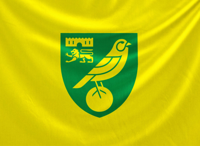
Established in 1902, the Norwich City F.C., playing in the Premier League, has updated its visual identity for the first time in 50 years. According to the club’s commercial director Sam Jeffrey, it marks a great moment in Norwich City’s history as the team has got a new emblem which is adapted to the digital technology and, most importantly, comprehensible for everyone.

For the rebranding, Norwich City was collaborating with a designing team, fan groups, and stakeholders for two years. As the club recently announced on its website, the official presentation of the new logo is planned for next July.
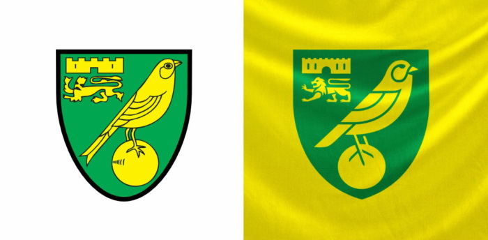
The changes in the logo, according to the club’s officials, were made thoroughly, keeping in mind the traditions of the Norwich City symbolism. The emblem retains the basic structure and elements of the previous insignia. However, the design was simplified, being adapted for an optimal presentation and a modern look on all types of media. Thus, the castle and the lion, which represent the coat of arms of Norwich, the canary, symbolizing the team’s nickname Canaries, and the football the bird rests on, were executed in a specific manner.

Ditching the black bordering, the logo is painted only in green and yellow (Norwich City’s official colors), while the football is now placed exactly in the center of the lower part of the shield. Also, the lion has received clearer and more elevated traits, compared to that ugly and comic figure in the previous emblem.
The design was created by the London-based design agency SomeOne that already cooperated with other football clubs like Manchester City, Aston Villa Tottenham Hotspur, and Wolverhampton Wanderers.


