Nokia, known as a global mobile phone brand, has unveiled its new logo. As the Finnish telecommunications company recently announced at the Mobile World Congress 2023, the brand has reached important milestones over the past two years. The refreshed visual identity aims to make the changes now.

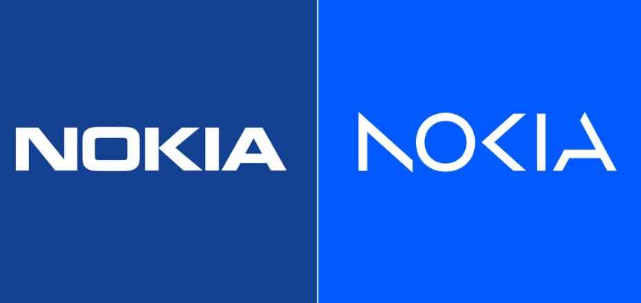
The announced redesign is the most dramatic renovation in Nokia’s history. The brand’s logo representing an all-caps wordmark has been used unchanged since 1978. As the MWC 2023, held in Barcelona, is the first event’s edition after the coronavirus break, the company has chosen it to present its new face. Backed by the new corporate strategy, the brand identity has to reflect what the Nokia brand is now – “a B2B technology leader pioneering the future where networks meet cloud”.

Expressing the present day’s image of Nokia, as the company’s press release says, the visual identity also conveys the renewed energy of the brand as well as its commitment to digital transformation. Based on the iconicity of the previous insignia, the new logo feels more modern and digital, mirroring the current identity of the company. The design is also said to be inspired by the manufacturer’s strength in network technology, innovation, and collaborative partnership.

Although the Nokia wordmark is still all-caps, makes a completely different impression. Three of the five letters dropped some strokes: the right vertical stroke in the “N”, the left bar in the “K”, and part of the left stroke in the “A”. We saw a similar solution in other technology brands, like Samsung, Asus, and Kia. Changing the font style, the letterforms are narrower, while the whole wordmark looks not so heavy and less static.
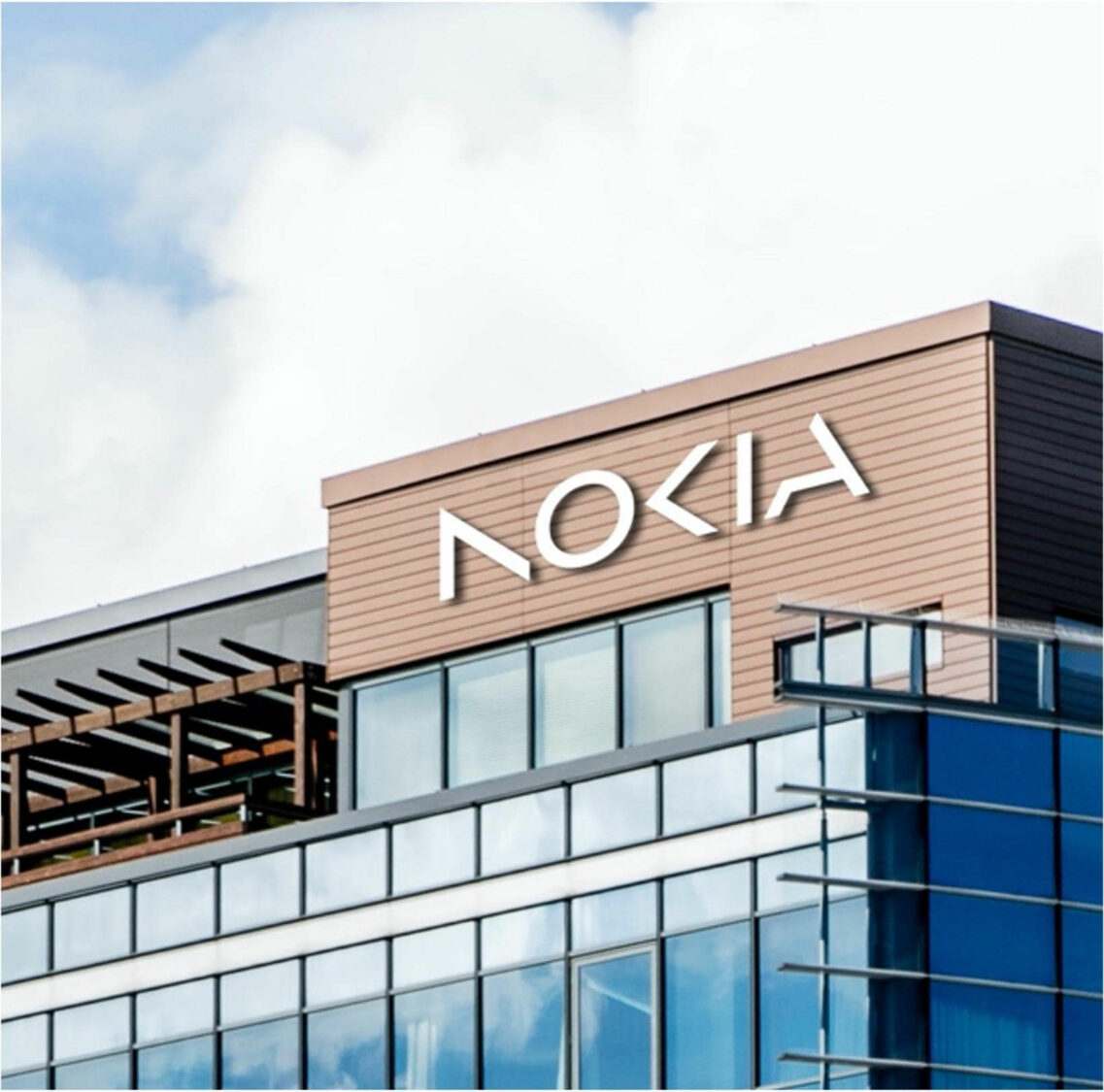
The logo will gradually appear on Nokia products and carriers. The company’s official website has already been updated with the new design.


