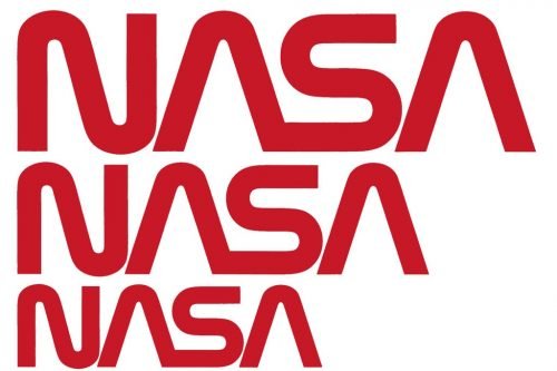
After 28 years, NASA brings back its worm logo that was used from 1975 to 1992. This iconic emblem will be drawn on the side of the SpaceX Falcon 9 rocket that planned to be launched to the ISS in May.

The revival of the worm emblem is connected with the fact that the Falcon 9 is the first manned space mission to launch from the Cape Canaveral since 2011. While American astronauts have been sent to the International Space Station by the Russian Soyuz rockets from the Baikonur space port for nine years, the new old NASA logo is a good symbol of resuming space transportation from American soil.
The NASA administrator Jim Birdenstine, who grew up in the 1980s when the worm was used, said that this symbol is not forgotten, being a reminder of the US glorious space achievements such as Apollo program.

It is interesting to note that Birdenstine tweeted the news about the return of the vintage NASA logo on April 2, the birthday of Richard Danne who was one of the designers of the worm. Danne and Bruce Blackburn created the emblem in 1975 in the framework of a special governmental program. The logotype got the nickname “the worm” because of the curved lines with the same width as well as the ”A”’s without bars. In addition, the ”NASA” wordmark has a specific color that became known as the NASA Red that is also associated with worms.
According to Birdenstine, while NASA’s current meatball icon will stay a primary emblem, the worm may receive a wider use at the agency. Supposedly, it will also mark the Starliner rocket that is scheduled to be launched to the ISS in December.


