

After Joe Biden was sworn in as the 46th President of the United States, his administration has unveiled a new logo of the White House. While changing the presidential residence’s emblem under each new President has become traditional, the new iteration’s design represents something opposite to that of Donald Trump’s presidency.
The work on the new White House logo began more than a month ago. For this, Joe Biden’s administration hired Wide Eye, a Washington-based design agency, that already cooperated with the Democrats, developing the visual identities for Camala Harris’ vice-presidential campaign and the Democratic National Convention. According to the team, they offered 30 drafts of the emblem before the final version was approved.
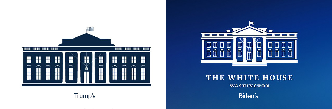
Overhauling the logotype, Wide Eye paid more attention to the architectural details, redrawing the White House with more clearly defined windows, columns, roof as well as the portico which was reshaped with a protruding edge, and that is intended to symbolize the openness of the presidential administration, according to Rob Flaherty, a WH director of digital strategy. In addition, the logo’s main color scheme was inverted, compared to the previous version – the building in white, corresponding to its name, is depicted against a blue background now.
The logo revamping comes together with the updating of the White House website which has received a fresh design with new features offering, among other things, color and font changing.


