

The Australian brand Black Star Pastry is a good example of how a local pastry becomes a worldwide food icon. Amid a craze for its cakes, which New York Times called “the world’s most instagramable”, the company felt the need to adjust its strategy to its rapid growth.
![]()
Such swift changes are not uncommon in today’s social media era, but a business has to build its brand strategy thoroughly in order not to be trapped by immediate success. So, approaching the issue seriously, the Australian bakery applied to the Melbourne-based Ongarato Studio and Japanese illustrator Noritake to create a “graphic universe” that would represent the brand’s culinary chef-oeuvres.
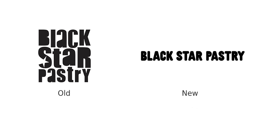
The new logo of Black Star Pastry shows off a less dense structure, compared to the previous design, being a pure wordmark in a round and rather bold font. The old emblem’s stylized closely packed letterforms have been replaced with an open and more readable visual identity, more suitable for a modern urban pastry brand.
Besides, an alternate logo was created to be applied on smaller surfaces and packages, featuring only consonants “BLK STR” which typographically copies the main logo’s font, but with a more clearly fluffy design. With rounder forms, this version resounds more with the brand’s exquisite cakes.
The branding concept focuses on minimalistic black-and-white images designed by Noritake who is known for his monochrome drawings used in publishing and fashion design. His creativity has always revolved around universal visual elements including references to pop culture (David Bowie and a black star) and cute mascots.

In the modern and essentially digital world, the dog, the hedgehog, and the little boy, created for the brand, become multicultural ambassadors that develop the theme of friendship and interaction. This design solution is based on “kawaii mascots” which has some appeal to Western consumers. In general, the idea is to imagine Black Star Pastry in a place between innocence and elegance, according to the company. Although a monochrome design for a food brand may seem odd, it shows its full meaning, when applied to packaging, as it contrastingly emphasizes the colors of the brand’s pastry.

Indeed, Black Star Pastry challenges clichés, departing from bright and visually “delicious” trends in branding. Instead of provoking salivation and inviting you to eat, the pastry brand offers you to enjoy its baking experience that will leave unique memories.


