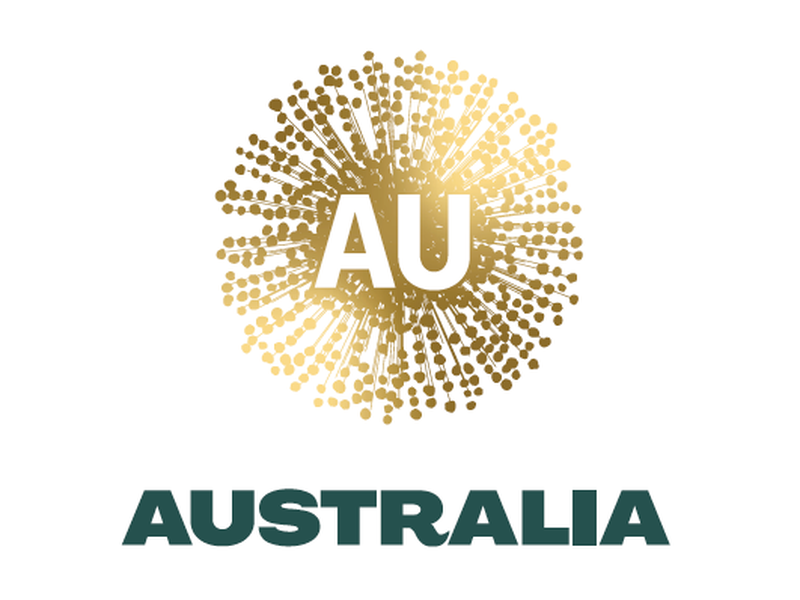
The National Brand Advisory Council of Australia, a body that is committed to develop a national brand for the country, has presented a new logo which will be symbolizing Australia and help national institutions and businesses promote the Australian culture and products.

Although Australia is strongly associated with the kangaroo and this marsupial is the unquestionable symbol of the country, NBAC decided not to follow simple clichés and chose golden wattle as a central image for Australia’s brand. Within the country, wattle is considered a national symbol, just like the kangaroo or emu.
In the new logo, the flower is represented as an abstract burst of gold dots and lines that, according to a NBAC press-release, is “an organic burst of positivity” while symbolizing “the enduring spirit of the Australian people”. This pattern was influenced by the Aboriginal art that uses lines and circles. The emblem also includes the letters “AU” which are Australia’s ISO code, and are also the code for gold in the periodic table of elements.
The symbolic wattle is accompanied by the sans-serif all-caps lettering “Australia” that, all the same, contains an allusion to the kangaroo – in the “R” with its extended end looking like a roo tail.

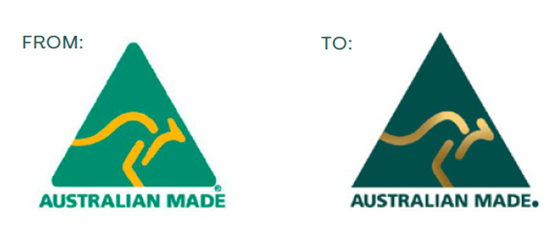
There were some gossips that the new emblem would replace the Australian Made logo. However, as the trade minster Simon Birminham said, the beloved kangaroo isn’t going anywhere. At the same time, the popular trade mark has been refreshed to be more consistent with the new national brand. The triangle has received sharp angles (they were rounded in the previous version) and darker green color, and the kangaroo has switched from yellow to gradient gold.


