

![]() New York Life Logo PNG
New York Life Logo PNG
New York Life is an American insurance firm, which was established in 1845. Being one of the three leading companies of the segment in the USA, the NYLIC is also among 70 largest corporations by the revenue, according to Fortune500.
Meaning and history
![]()
New York Life Insurance Company, a hallmark in the American insurance industry, was founded in 1845 by a group of prominent New Yorkers. It stands as one of the oldest and most respected life insurance companies in the United States, with a rich heritage that traces back to the mid-19th century. From its inception, New York Life was at the forefront of many innovations in the insurance industry. It was one of the first to issue policies to women and to those traveling to and from the California Gold Rush, reflecting a pioneering spirit in its approach to insurance.
Throughout its history, New York Life has marked several milestones that shaped its journey. In the early 20th century, it was among the first to introduce the “non-forfeiture” option, allowing policyholders to receive benefits from their policies even if they were unable to continue paying premiums. The company also played a crucial role during significant historical events; for example, it paid out claims promptly to the families of victims of the Titanic tragedy in 1912. Fast forward to the 21st century, New York Life continued to expand its portfolio, incorporating assets under management and other financial services, thereby strengthening its market position.
Today, New York Life stands as a global leader in the life insurance sector, known for its financial strength, stability, and commitment to its policyholders. It consistently ranks among the top life insurance companies in the United States, both in terms of assets and policyholder surplus. With its headquarters in New York City, the company continues to uphold its founding principles, prioritizing the financial security and well-being of its clients, a testament to its enduring legacy and ongoing relevance in the ever-evolving world of insurance.
What is New York Life?
New York Life is a premier life insurance company, renowned for its robust financial services and commitment to client security. Spanning over a century, it stands as a pillar of trust and stability in the insurance world.
1845 – 1954

The very first New York Life badge featured a one-line logotype in black uppercase letters, executed in a very elegant yet bold serif typeface with thick lines and massive serifs on their ends. The lettering was perfectly balanced in space and size, which made the logo look timeless and professional. This badge stayed with the company for a little less than a century, which is more than impressive.
1954 – 1964
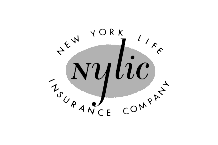
The redesign of 1954created the most ornate New York Life logo of all, used by the company throughout the years. It was a solid light-gray horizontally-stretched oval with the italicized black “Nylic” inscription in a mixed case and an uppercase sans-serif “New York Life Insurance Company” lettering written in black around the medallion. The badge was used by the company for ten years.
1964 – 1975
![]()
The first redesign of the New York Life logo was held only in 1964 and this is when the monochrome palette was switched to electric blue and white. The new concept boasted a solid blue square with rounded angles and stylized white lettering in the uppercase placed over the square in three lines, with all the letters connected.
1975 – 1999
![]()
In 1975 the company comes back to its original monochrome color palette, making the square white and the inscription — black. The badge became strong and geometric due to the use of a strict square black frame, which balanced the black inscription and added a sense of complete design to the image.
1999 – Today
![]()
The New York Life visual identity is simple yet elegant and positive. It is text-based and its typeface and color scheme are the main design element of the logo.
The current New York Life logo was designed in 2007 by Raphael Boguslav, and was only slightly refined by now.
The three levels of the wordmark, enclosed in a solid blue square, feature custom sans-serif typeface with all capital lettering in white. The ends of the letter-lines are slightly curved, which makes the nameplate look sleek and elegant.
![]()
All three layers of the texts are spaced very close to each other, evoking a sense of flow and smooth movement.
The blue and white color combination reflects the brand’s responsibility and stability, it shows the company as reliable yet with a young spirit. The blue is a symbol of freedom and purity, it adds air to the image and meaning to the brand.


