NBCUniversal Media is a conglomerate working primarily in the media and entertainment industry. It belongs to Comcast. The company got its name after its two most important parts, the National Broadcasting Company (NBC) and the film studio Universal Pictures.
Meaning and history
The conglomerate’s origins can be traced back to 1950 when NBC and Universal Television in collaboration produced a number of shows for NBC.
Yet, it was only in the spring of 2004 that NBCUniversal was created when Universal Studios’ parent company, Vivendi Universal Entertainment, sold an eighty-percent stake to General Electric, which was the parent company of NBC.
What is NBC Universal?
NBC Universal is the name of a media conglomerate, which was established in the United States in 2004. NBCUniversal got its name after NBC, the National Broadcasting Company, and Universal Films, both are subdivisions of the conglomerate. Since 2011 the company is owned by Comcast.
2004 – 2011
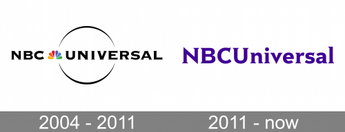
The original NBCUniversal logo combined the visual brand identities of the two companies that formed it, the National Broadcasting Company and Universal Pictures.
The centerpiece of the logo was the so-called peacock. It was the most famous logo of NBC over its long history that started in 1926.
The colored “feathers” appeared on NBC’s emblem for the first time in 1956. They were used to emphasize NBC’s color programming. Since then, the company has used this emblem over all its history except only four years.
And yet, it was only in 1979 that the peacock emblem became the network’s primary logo. In 1986, it reached the status of NBC’s sole emblem. The peacock was created in-house.
In the NBCUniversal logo, the peacock was placed between the two parts of the company’s name separating them from each other. The lettering featured a bold type with very thin and elegant serifs.
Interestingly, it was the only colorful element in the logo – all the rest was black and white. The circle with an elegant thin border (the so-called spinning planet) was “borrowed” from the logo of Universal Pictures.
2011 – now
In late 2009, it was officially announced that Comcast would buy a stake in NBC Universal from General Electric. U.S. regulators approved the deal in early 2011.
On January 27, 2011, NBCUniversal introduced a new visual brand identity. It looked by far simpler than its predecessor. Steve Burke, NBC Universal Chief Executive, explained that the old one “seemed kind of busy.”
Both the pictorial elements, the peacock and the spinning planet, disappeared. This move seemed natural. Now, there was no more need to show visual links to the NBC and Universal Pictures, while for the previous logo, showing these links was essential.
Yet, the designers preserved some of the brand’s visual heritage. They used a similar type that also featured elegant thin serifs. The resemblance was superficial: the moment you compared the two wordmarks side by side, you would notice, for instance, that the top left end on the “N” was sharp in the new logo and flat in the previous version, that the glyphs grew higher, that the majority of the letters grew lowercase, etc.
The logo was designed by Wolff Olins.
Colors
The wordmark is purple on the white background. The purple was inspired by one of the colors from the original peacock emblem.
Font
The NBCUniversal logo released in 2011 features the Rock Serif type, which was created specifically for NBCUniversal.


