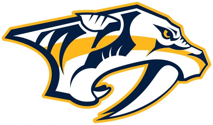
The Nashville Predators logo features a side view of the saber-toothed tiger in blue and gold against the white background.
Meaning and history
In 1995, rumors spread among sports fans in Nashville that the New Jersey Devils would move there, to the Nashville Arena, which was being constructed at the time. However, the attempt to bring the Devils to Nashville failed, while the arena opened the following years.
Shortly after, the city made one more attempt, this time they tried to get the NBA’s Sacramento Kings. When it turned out that the club wouldn’t move, either, Nashville went after a hockey team.
In the summer of 1997, the National Hockey League granted a conditional franchise to Nashville, following the request from a group headed by businessman Craig Leipold.
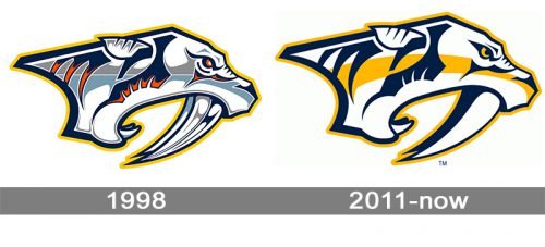
1998 — 2011
The most interesting thing in the Nashville Predators logo history is probably that the logo actually appeared before the team.
Shortly after the city got an expansion franchise in 1997, the owners unveiled an emblem, which looked rather unusual for a hockey logo. It was a six-color emblem depicting an animal with sharp teeth, which turned out to be a saber-toothed tiger. The name for the club was to be chosen by fans themselves. The club owners received around 75 names and chose three of them: Ice Tigers, Fury, and Attack.
However, none of the names seemed to satisfy the majority of the fans, as well as the team owners. Eventually, Craig Leipold suggested his own version, “Predators.” This very version won during the final vote.
2011 — Today

In 2012, the Preds logo was revisited. The modification may be not that obvious from the first glance, yet if you take a closer look, you may notice that the color scheme has become simpler (three colors instead of six). There have also been a couple of minor alterations in the shape of the elements. For instance, the pupil in the creature’s eye has become more distinct. This emblem is featured on the Nashville Predators uniforms.
Secondary emblem
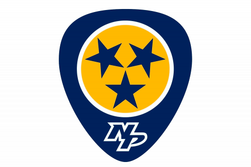
There are at least two additional logotypes. One of them features a navy blue badge with three blue stars in a yellow circle and the letters “N” and “P” below. The blue stars apparently come from the flag of the team’s home state, Tennessee.
The other alternate logo represents two 3D letters, “N” and “P,” in white with blue and yellow frames. The team also used the skull of the saber-toothed tiger as its secondary logo.
Why is a saber-toothed tiger the symbol?
The answer is rooted in the history of Nashville. Back in 1971, construction works started on UBS Tower, one of the city’s most impressive buildings. While working, crews discovered a skeleton of the species of saber-toothed tiger that is known under the name of Smilodon Floridius. The species inhabited the continent until the Early Anthropocene Epoch (around 11,500 years ago).
When the Predators were looking for a mascot, they opted for the tiger as it was connected with the local history and looked aggressive and memorable enough.
Font
While the earlier versions of the wordmark featured the Interdiction font created by Daniel Zadorozny, in 2011, the team adopted a different wordmark, where the letters seemed a bit more legible. The combination of sharp decorative elements and curves creates a harmony with the bold shape of the main logo.
Colors
The current Nashville Predators logo comprises three colors: blue (#011840), white (#ffffff), and yellow (#ffb915).The original emblem consisted of six colors, including red and two shades of grey.
GOLD
PANTONE: PMS 1235 C
HEX COLOR: #FFB81C;
RGB: (255,184,28)
CMYK: (0,31,98,0)
NAVY BLUE
PANTONE: 282
HEX COLOR: #041E42;
RGB: (4,30,66)
CMYK: (100,90,13,68)
WHITE
HEX COLOR: #FFFFFF;
RGB: (255,255,255)
HSB: (42,0,100)
CMYK: (0,0,0,0)


