Simple as it seems, the N64 logo holds a hidden mathematical connection to the brand’s name and the type of processing unit is uses.
Meaning and history
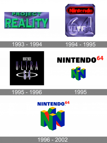
The visual identity history of Nintendo 64, or N64, was pretty short, as well as the life of the products itself, which only lasted from 1995 to 2002. The only two versions, created for the brand throughout the years, featured completely different styles and moods.
1993 – 1994
The new product was introduced by Nintendo in 1993, under the name Project Reality. Its logo was composed of a gradient purple horizontal rectangle withbold green lettering in a modern sans-serif font, written across it in two levels. It was a very bright and memorable badge, which only stayed in use by the company for a few months.
1994 – 1995
In 1994 the brand was renamed Nintendo Ultra 64, with the logo changed accordingly. The logo featured a shape of an SD card and was set in gradient purple, with the red and black Nintendo insignia placed on its top part, and the bold “64”, overlapped by the uppercase “Ultra”, embossed on the central part of the badge. This version didn’t stay long with the company either.
1995 – 1996
The original version of the N64 logo, which was used during the ore launch of the product, featured a solid black square with the narrowed white “Nintendo” in Sans-serif on top, an enlarged gradient purple “Ultra” in the middle, and the outlines “64”, surrounded by a white orbit, placed under the “Ultra” wordmark. It was a simple composition, which looked creative and artsy due to its color palette.
1995
The redesign of 1995introduced a predecessor of the current Nintendo N64 logo. It was a geometric three-dimensional element, formed by several capital “N”s, connected to each other. The emblem was set in green, blue, and yellow, and accompanied by the heavy sans-serif “Nintendo” inscription in black, placed above the graphical element and followed by a bright red “64”.
1996 – 2002
The redesign of 1996 completely changed the N64 visual identity, making it composed of two parts — a bold blue lettering and a stylish multicolor emblem, placed under it. The “Nintendo” inscription in all capitals was written in a square Sans-serif typeface and had a red “64” placed on its right, and executed in thinner lines.
The emblem of the brand featured a three-dimensional figure, formed by four merged letters “N”, making up a cube. The color palette of the image boasted a bright and strong combination of green, red, yellow, and blue, each color for one of the cube’s sides.
Symbol
The N64 logo consists of the wordmark and an emblem featuring a 3D model of four letters “N” joined together. The figure “64” that is a part of the wordmark reminds of the fact that the console got its name after its 64-bit central processing unit.
Emblem
The most interesting fact concerning the Nintendo 64 logo is that it has 64 faces and 64 vertices if rendered as a 3D model. If you try counting on your own, you may come to the conclusion that the numbers of the faces and vertices are different. That is because the Nintendo designers counted not only the blocks that are visible, but also the hidden ones.
Font
As far as the Nintendo 64 logo is built around a single letter, we should point out its typographic qualities. The capital “N” belongs to a clear sans-serif typeface looking somewhat stocky and solid.
Color
The basic logo comprises four colors: red, green, blue, and yellow. In each case, designers opted for a bright, eye-catching shade. As the result of this, the N64 logo leaves a vivid visual impression. Interestingly enough, these colors coincide with the colors of the buttons on the Nintendo 64 console (four yellow buttons, one red, one green, and one blue).


