Motrin is a brand of anti-inflammatory pain relief drugs, containing ibuprofen and produced by Johnson&Johnson. The medicine of the label also fight migraines, fever, and rheumatoid arthritis.
Meaning and history
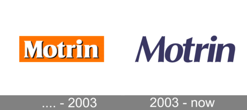
Before 2003
2003 – Today
Motrin’s visual identity is simple yet bright and evoking a happy feeling. The text-based logo is drawn in orange and white, which symbolizes energy, joy, and friendship.
The bright color palette of the Motrin logo makes the brand visible and recognizable. When placed on the packaging, the Motrin insignia features a bright blue color for the lettering, and as the white or silver tagline, depending on the type of medicine.
The Motrin wordmark is executed in an italicized sans-serif typeface with clean and neat lines. The letters feature traditional shapes and are perfectly balanced, having enough space between each other, but looking compact and solid.
Some of the products boast colorful packaging, with a part of the background framed and colored in dark blue or pink. The Motrin visual identity is minimalist and simple, yet it represents the brand, that values its clients’ health and happiness most of all.


