

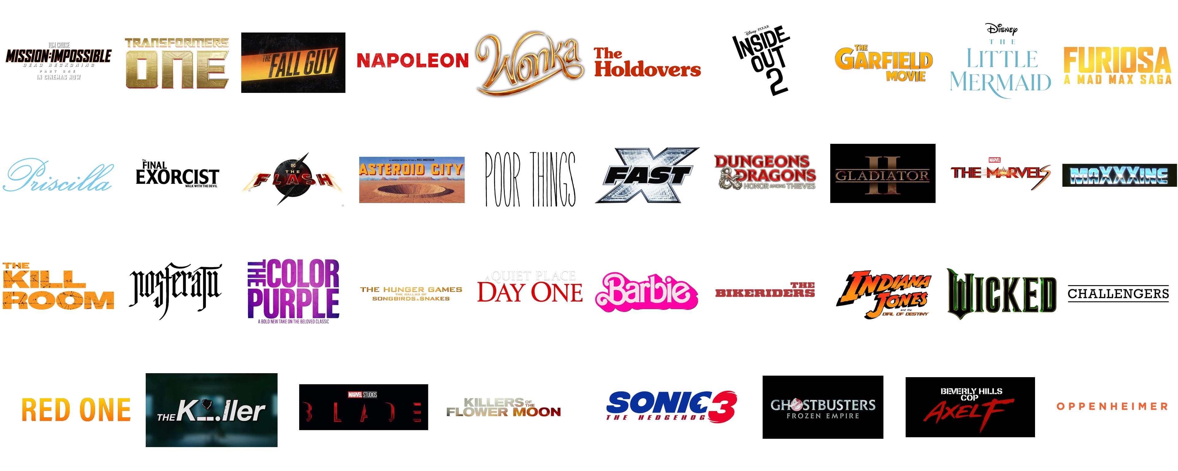
American film covers often show impressive logotypes, nameplates, and other things to define their visual appeal and identity. More than just icons, they encapsulate the core narrative of a film, capturing potential audiences’ interest. The design reflects elements such as genre, theme, and mood, setting expectations and creating a lasting initial impression as part of the film’s promotional efforts.
Film studios place considerable importance on crafting these visual symbols. An effective logotype enhances a film’s appeal, helping it to stand out among numerous competitors. Designers incorporate specific elements that echo the film’s theme, like color schemes, typography, and relevant imagery, aiming to connect with the audience. This approach fosters a sense of anticipation and excitement for upcoming releases.
Analyzing various logotypes can indicate the evolving trends and shifts in design preferences over time. Every period in the film industry introduces distinct styles that reflect current artistic and cultural trends. These logotypes do more than just promote films; they act as records of evolving design preferences and innovations in the entertainment industry, illustrating the changes in how films reach audiences and engage them.
Dungeons & Dragons: Honor Among Thieves
![]()
The logo for ‘Dungeons & Dragons: Honor Among Thieves’ features bold, ornate lettering in a striking red hue with metallic trim, which captures the adventurous spirit of the game. Accompanied by a silver dragon emblem that intertwines with the text, the design conveys the mystical and medieval elements central to the Dungeons & Dragons universe.
Below the main title, the phrase ‘Honor Among Thieves’ is presented in a smaller yet similarly styled font, emphasizing themes of camaraderie and rivalry within the narrative. This logo effectively blends fantasy with the allure of epic storytelling, appealing to both longtime fans and newcomers to the franchise.
Oppenheimer
![]()
The Oppenheimer logo is rendered in a simple yet bold orange font against a black background, emphasizing clarity and impact. Each letter is capitalized, which adds to the assertiveness of the design. The choice of a bright, attention-grabbing orange suggests innovation and energy, characteristics pertinent to the film’s dynamic and dramatic themes.
Its minimalist design allows for versatile use across various media platforms, ensuring it is easily recognizable. Overall, the logo’s clean lines and striking color choice make it memorable while effectively conveying the essence of its cinematic content.
Priscilla
![]()
The logo for Priscilla features an elegant, flowing script in a light blue hue that suggests sophistication and grace. With its smooth curves and fine lines, the typography evokes a sense of artistic flair and individuality. Each letter is interconnected, reinforcing a theme of continuity and connection which may resonate with the brand’s values or target audience.
The color choice is soothing and gives the logo an approachable yet refined appearance. Its minimalist design emphasizes readability and versatility, making it suitable for diverse applications while maintaining its distinctive character.
Wonka
![]()
The Wonka logo is characterized by its lavish and whimsical script, rendered in a radiant gold tone that captures the brand’s magical and indulgent essence. Its ornate lettering with exaggerated swirls and elegant curves conveys a sense of fantasy and excitement, aligning with the imaginative nature of Willy Wonka’s chocolate factory.
The shiny metallic finish adds a luxurious feel, suggesting the premium quality and unique experience. Its visual style attracts attention and enhances the mystical and joyful world associated with Wonka products, making them memorable and distinctive in the marketplace.
The Flash
![]()
The Flash logo is dynamic and visually striking, reflecting the superhero’s incredible speed and energy. It features bold, angular lettering with a metallic finish enhancing its sleek and modern appearance. Prominently, the design incorporates the iconic lightning bolt, symbolizing the character’s superhuman speed, which slices through the logo with a vivid contrast.
The color scheme predominantly showcases deep red and gold tones, emphasizing urgency and vibrancy. Additionally, subtle details, such as a circular element that resembles a vinyl record, add depth and texture to the logo. Overall, it successfully captures the essence of The Flash, appealing to fans of the character and the broader DC universe.
The Marvels
![]()
The Marvels logo combines dramatic visual elements to convey excitement and action, integral to the Marvel Studios brand. Bold, three-dimensional lettering in gold and red gradients captures attention, with an added flair in the form of dynamic streaks that suggest motion and energy.
Central to the design is a starburst, symbolizing impact and power, enhancing the logo’s connection to superhero themes. Red and blue hues dominate the palette, reflecting the traditional colors associated with Marvel’s iconic characters. Overall, the design embodies a modern aesthetic that promises high stakes and heroic adventures in the upcoming film.
Sonic The Hedgehog 3
![]()
Sonic The Hedgehog 3 has a bold, oversized lettering that captures the energetic essence of the franchise. Primary colors dominate, with ‘SONIC’ in vibrant blue-capped letters, contrasting sharply against a pure black background, enhancing visibility and impact.
A red numeral ‘3’ follows the title, partially overlapping and integrated into the design to signify the sequel’s place in the series. Below, ‘THE HEDGEHOG’ is written in smaller letters, maintaining a balance and ensuring the focus remains on the titular character’s name. This design features the film’s fast-paced nature and appeals to a youthful, action-loving audience.
The Garfield Movie
![]()
The logo for The Garfield Movie features bold, chunky lettering that conveys a sense of playful mischief, characteristic of the title character. Rendered in a vibrant orange hue that mirrors Garfield’s iconic fur color, the text is outlined with a thin black border to enhance readability against varied backgrounds.
‘GARFIELD’ is displayed in larger font, with other words flanking the main title in smaller, yet equally bold, capitals. This design choice draws attention to the name and subtly emphasizes the film’s focus on this beloved feline. The use of a classic and straightforward font reflects the film’s appeal to children and nostalgic adults, promising entertainment and humor.
Blade
![]()
This logo features stark, modern typography that captures the essence of the film’s edgy narrative. Letters are rendered in a glowing red outline, creating a sharp contrast against the dark background, subtly hinting at the movie’s action and horror themes. Each character in ‘BLADE’ is spaced generously, allowing the eerie red light to resonate more profoundly, suggesting themes of danger and vigilance.
Marvel Studios’ logo in white is positioned above the main title, smaller yet prominent, signifying its production authority. The minimalistic style of the logo, devoid of additional graphic elements, focuses entirely on the text, reinforcing the movie’s direct and intense tone.
Napoleon
![]()
The Napoleon film cover shows a nameplate with oversized letters painted in a vibrant red, each letter slightly distressed, suggesting wear and historical depth. Its broad strokes and solid fill evoke strength and command, fitting for a name synonymous with leadership and battle. Such a design choice aligns well with themes of historical significance and enduring legacy, making the logo striking and symbolic. It’s a straightforward yet effective design that captures attention with its size and color contrast against a simple background.
Mission: Impossible – Dead Reckoning Part One
![]()
The logo for “Mission: Impossible – Dead Reckoning Part One” is a striking visual that captures the essence of high stakes and adrenaline-fueled action typical of the franchise. The letters are sharply styled in an intense orange gradient that transitions into black, resembling a burning ember fading into darkness. This color scheme conjures images of danger, urgency, and the thrill of the chase.
Each character in the title is designed to stand out boldly, ensuring that even from a distance, the name is recognizable and imposing. The text “DEAD RECKONING” is prominently displayed under “MISSION: IMPOSSIBLE”, separated by a colon that adds a dramatic pause, emphasizing the sequel’s critical plot point. The mention of “PART ONE” in a smaller but assertive font teases the continuation of this thrilling narrative, inviting fans to anticipate more intrigue and suspense in a future installment.
Transformers One
![]()
The “Transformers One” logo encapsulates the iconic and mechanical aesthetics associated with the blockbuster series. Crafted in a metallic gold with red accents, the text mimics the transformative and intricate designs of the Autobots and Decepticons. This stylized font reflects the advanced, alien technology that the films’ robotic characters embody, with sharp angles and interlocking segments that suggest movement and conversion.
The use of gold symbolizes value, power, and an epic scale, appropriate for the grandiose battles and stories depicted in the Transformers universe. The bold, embossed appearance of the letters gives the logo a robust and durable feel, much like the Transformers themselves. This design ensures that the logo stands out in promotional materials and merchandise, immediately connecting audiences with the high-energy and transformative action of the film.
The Fall Guy
![]()
The logo for “The Fall Guy” employs a rugged, stencil-style font that conveys action and grit, which is ideal for a film likely packed with stunts and physical challenges. The use of a stark black background with the text in a bright yellow gradient grabs attention and creates a strong visual contrast, emphasizing the film’s likely high-energy and adventurous spirit.
The font’s weathered look and the uneven yellow tones suggest a story of resilience and endurance, possibly hinting at the protagonist’s journey through challenging or ‘explosive’ scenarios. The choice of such a bold color palette and impactful typography design makes it clear that “The Fall Guy” promises to deliver an exciting, edge-of-your-seat cinematic experience.
The Holdovers
![]()
The Holdovers logo employs a striking use of red serif typography that is both bold and somewhat nostalgic, reflecting a classic, perhaps timeless, appeal. The capital letters are sturdy and evenly spaced, with a slight curvature on the edges that adds a touch of elegance to the overall design. The red color chosen is vibrant and commanding, ensuring that the title stands out against any background.
This logo’s design suggests a theme that could relate to holding onto traditional values or elements from the past, resonating with audiences looking for a blend of modern storytelling with a classical touch. The substantial letterforms convey a sense of importance and gravitas, appropriate for a film that might explore deep, reflective themes or historic narratives.
Inside Out 2
![]()
Inside Out 2’s logo maintains the minimalist and modern style of its predecessor, utilizing stark, bold sans-serif lettering in black against a plain background. The simplicity of the design focuses attention on the title itself, reflecting the film’s emphasis on internal emotions and psychological exploration. The ‘2’ is subtly styled, integrated seamlessly to the right of ‘Out,’ signifying its continuity as a sequel.
The use of black and white colors in the logo underscores the clear, straightforward approach the film takes to complex themes, such as mental health and emotional growth. This design will likely appeal to both original fans of “Inside Out” and new viewers interested in insightful, animated psychological dramas.
Gladiator II
![]()
The logo for Gladiator II instantly evokes the grandeur and historical drama of ancient Rome, featuring robust serif typography with golden and crimson accents that mimic the appearance of aged and luxurious artifacts. The ‘II’ is prominently displayed in Roman numeral format between the larger letters of ‘GLADIATOR,’ which reinforces the film’s epic historical context.
With its rich textures and shadow effects, the logo suggests a continuation of the intense, dramatic storytelling that marked the original film. The design aims to attract audiences who appreciate visually impactful and emotionally powerful cinema, with a clear nod to its heroic and historic undertones.
The Little Mermaid
![]()
The Little Mermaid logo is elegantly crafted with soft, flowing serifs that mirror the aquatic and graceful themes of the story. The choice of a light blue color palette evokes the sea and sky, lending a dreamy, whimsical quality that complements the fairy tale nature of the film. Each letter is designed to flow into the next, mimicking the fluid movement of water.
This logo design targets a demographic looking for enchantment and fantasy, promising a magical visual and narrative experience. The gentle curves and airy spacing of the letters convey a sense of openness and freedom, themes central to the storyline of Ariel’s adventure above and below the ocean waves.
Furiosa: A Mad Max Saga
![]()
Furiosa: A Mad Max Saga uses bold, angular lettering in a striking yellow gradient that screams action and intensity. The letters are stylized with sharp cuts and industrial aesthetics, reflecting the dystopian and rugged environment of the Mad Max universe. The ‘A Mad Max Saga’ is positioned beneath ‘FURIOSA’ in a smaller, more straightforward font, indicating the film’s focus on the character Furiosa within the larger franchise.
The use of bright yellow against a simple background ensures high visibility and impact, suitable for a film that promises high-octane action and strong thematic elements of survival and rebellion. This logo is designed to attract fans of the series and new viewers alike, with its direct and powerful visual appeal.
The Final Exorcist: Walk with the Devil
![]()
The Final Exorcist: Walk with the Devil features a logo that uses stark, contrasting black-and-white typography to evoke a sense of ominous intrigue. The font is modern, with sharp edges and a slightly disjointed arrangement that suggests chaos and disruption, fitting for a horror film. ‘Walk with the Devil’ is subtitled in a smaller, lighter font, adding a chilling hint about the film’s narrative focus.
This logo design effectively captures the eerie and suspenseful atmosphere of the film, targeting horror enthusiasts and fans of supernatural thrillers. The straightforward color scheme and edgy font mirror the expected intensity and darkness of the movie, setting the stage for a gripping and frightful experience.
Asteroid City
![]()
The “Asteroid City” logo is presented in large, bold, uppercase letters that evoke a sense of classic 1950s Americana, which aligns with the cinematic style typically associated with director Wes Anderson. The font is retro-futuristic, combining elements of vintage American signage with a modern twist that suggests a quirky narrative. Set against a desert landscape backdrop with a massive crater, the logo encapsulates the central motif of the film—a city impacted by or built around an asteroid.
The bright orange and yellow colors of the logo contrast vividly against the muted tones of the desert scene, drawing the viewer’s eye directly to the film’s title. This design choice not only highlights the title but also enhances the thematic elements of exploration and adventure in an unusual, possibly otherworldly setting. The overall aesthetic of the logo perfectly complements the expected storytelling style of Wes Anderson, known for his visually unique and detailed cinematic worlds.
Poor Things
![]()
“Poor Things” features a logo with hand-drawn, uneven, black lettering, which creates a personal and intimate feel, suggesting a whimsical yet poignant narrative. The irregularity of the strokes and the varying thickness of the letters convey a sense of movement and spontaneity, indicative of a story that may explore complex, unstructured themes or characters that break the mold.
The simplicity of the black and white color scheme emphasizes the raw, unpolished nature of the story, likely reflecting a narrative that is both unique and emotionally resonant. The handcrafted style of the logo suggests that the film could focus on human experiences and imperfections, appealing to an audience that values depth and authenticity in storytelling.
Fast X
![]()
“Fast X” uses sleek, metallic lettering styled to resemble the brushed aluminum often found in high-performance vehicles, aligning with the fast-paced, thrilling nature of the franchise. The logo incorporates an X that intersects and slices through the text, enhancing the visual impact and emphasizing the film’s theme of high-speed action and cutting-edge adventure. The polished chrome finish and sharp angles reflect a modern, high-tech world, consistent with the advanced automotive technologies featured in the movie.
This logo design targets fans of the action genre, offering a visually compelling and dynamic representation of speed and power. The stark, bold contrast against a darker background ensures that the title stands out, mirroring the high-stakes drama and intensity typical of the franchise’s previous installations.
MaXXXine
![]()
The “MaXXXine” logo features futuristic, neon-blue lettering with a glowing effect that suggests a science fiction or high-tech thriller genre. The use of three Xs in the title is stylistically bold and may hint at extreme situations or themes explored within the film. The light emanating from the letters gives a sense of vibrancy and motion, evoking the dynamic and possibly perilous adventures of the titular character, MaXXXine.
This logo is visually striking, designed to attract a young, energy-driven audience interested in stories of adventure and resilience in a futuristic or alternative reality setting. The cool blue tones and the glow effect suggest a film that is both visually engaging and emotionally charged.
The Kill Room
![]()
The “The Kill Room” logo utilizes stark, blocky lettering in a distressed orange hue, suggesting decay or destruction that aligns with a gritty, intense thriller or horror genre. The text appears as if it has been scratched or eroded, which could symbolize the themes of violence or turmoil central to the film’s plot. The choice of a bold, impactful font and the textured effect of the letters create a sense of urgency and danger.
This design effectively communicates the film’s likely focus on suspense and high-stakes conflict, aiming to attract viewers who are fans of thrillers and psychological dramas. The use of a bright, attention-grabbing color ensures that the logo stands out, mirroring the likely tension and excitement of the film’s narrative.
Nosferatu
![]()
The “Nosferatu” logo adopts a gothic, archaic font that immediately evokes the horror genre, particularly the eerie and supernatural. The elongated, sharp serifs and the jagged edges of the letters suggest a connection to the historical and mythical themes associated with the vampire lore central to Nosferatu. The black and white color scheme enhances the logo’s classic horror feel, resonating with the chilling and dark atmosphere of the film.
This logo design is deliberately reminiscent of early 20th-century horror films, appealing to both aficionados of classic horror and new audiences interested in the revival of iconic horror figures. The traditional gothic lettering sets the tone for a film that promises to deliver suspense, fear, and a deep dive into the macabre.
The Hunger Games: The Ballad of Songbirds & Snakes
![]()
The logo for “The Hunger Games: The Ballad of Songbirds & Snakes” is crafted with sharp, angular lettering in a gradient of gold, reflecting the opulence and high stakes of the Capitol within the dystopian world of Panem. The typography evokes a feeling of conflict and tension, with the pointed serifs suggesting the dangerous and competitive nature of the Games. The inclusion of ‘The Ballad of Songbirds & Snakes’ in a smaller, yet equally impactful font beneath the main title adds a lyrical element to the logo, hinting at the deeper narrative explored in this prequel.
The use of gold not only alludes to the wealth and power central to the story’s setting but also contrasts with the darker themes of manipulation and survival that are pivotal to the plot. This design appeals to fans of the series by maintaining the visual continuity of the franchise while introducing new elements that hint at the novel’s exploration of the origins of the Games and its early protagonists.
A Quiet Place: Day One
![]()
“A Quiet Place: Day One” features a logo with stark, bold lettering in a distressed red and white design that conveys urgency and danger. The splattered and smeared appearance of the red paint over the pristine white text visually represents the sudden and violent nature of the events that the title suggests, aligning with the horror and suspense of the film. The choice of red is evocative, symbolizing both blood and the heightened emotions of fear and alertness that are central to the movie’s premise.
This logo effectively communicates the film’s theme of survival in silence against a backdrop of lurking threats, appealing to audiences who seek intense, suspenseful experiences. The text’s fragmented and disrupted look further emphasizes the chaos and disruption that the characters face from day one of the alien invasion, setting the tone for a prequel filled with tension and terror.
Barbie
![]()
The “Barbie” logo is presented in a bright, vibrant pink with playful, cursive lettering that embodies the iconic doll’s fun and feminine attributes. The glossy finish and the bubbly style of the text reflect the light-hearted and whimsical spirit of the Barbie brand. This logo taps into the nostalgia associated with the toy while also appealing to a new generation with its modern, polished look.
Designed to stand out with its bold color and unique font, the logo promises a delightful and enchanting cinematic experience, likely filled with adventure, fashion, and empowerment themes, much like the character’s history. The use of pink not only captures the essence of Barbie’s character but also speaks to the film’s target audience, looking for an engaging, feel-good movie.
The Bikeriders
![]()
“The Bikeriders” logo uses simple, bold sans-serif typography in a solid red color, suggesting a straightforward and raw cinematic experience. The text is compact and intense, which reflects the gritty, rebellious nature of biker culture that the film is likely to explore. The simplicity of the design, devoid of any embellishments, focuses entirely on the essence of the biker community—freedom, brotherhood, and non-conformity.
This logo design appeals directly to those intrigued by stories of subcultures and the spirit of adventure and rebellion. The choice of red emphasizes passion and danger, common themes in narratives about bikers, while the stark, bold font reinforces the tough, resilient attitude characteristic of the film’s subjects.
Indiana Jones and the Dial of Destiny
![]()
The logo for “Indiana Jones and the Dial of Destiny” captures the adventurous spirit of the franchise with its rugged, orange gradient lettering styled to appear as if it’s been etched or carved, reminiscent of ancient artifacts. The dynamic, slanted typography conveys movement and excitement, fitting for the legendary archaeologist’s thrilling escapades. The incorporation of ‘the Dial of Destiny’ in a smaller, more straightforward font beneath ‘Indiana Jones’ highlights the mysterious artifact around which the plot presumably revolves.
This design is perfectly suited to the cinematic style of Indiana Jones, combining elements of history, mystery, and adventure. The orange color evokes the dusty, earthy environments typically explored in the films, while the stylized font keeps with the series’ theme of timeless quests and epic discoveries, appealing to both longtime fans and new viewers.
The Color Purple
![]()
The logo for “The Color Purple” uses vibrant, bold lettering in shades of purple to echo the themes and tone of the story. The color purple, historically associated with royalty and spirituality, holds significant meaning within the narrative, symbolizing pain, suffering, and ultimately, survival and triumph. The typography is modern and robust, suggesting a fresh perspective on the beloved classic. The phrase “A bold new take on the beloved classic” underlines the intention to both honor and reimagine the original story.
This logo targets an audience familiar with the classic story but also appeals to a new generation, promising them a contemporary version that maintains the emotional depth and cultural significance of the original. The use of purple not only ties directly back to the title but also conveys a sense of depth and richness appropriate for the complex emotional landscape of the film.
Wicked
![]()
The “Wicked” logo features sleek, gothic-style lettering with sharp edges and a striking green hue, embodying the magical and somewhat dark elements of the story. The color green is closely associated with the central character, Elphaba, who is known for her emerald skin, and symbolizes the themes of envy, alienation, and otherness present in the narrative. The metallic sheen of the letters adds a modern and sophisticated touch, hinting at the magical aspects of the story set in the land of Oz.
This design effectively attracts fans of the musical and new viewers alike by evoking a sense of mystery and fantasy. The elegant yet edgy font reflects the complex narrative of misunderstood characters and a reimagined villain, promising a visually enchanting and emotionally gripping experience.
Challengers
![]()
The “Challengers” logo is minimalist and contemporary, using clean, straight lines in a classic serif font that suggests seriousness and elegance. The simplicity of the black text on a white background emphasizes clarity and directness, likely mirroring the film’s narrative focus on competition or personal and professional challenges. This understated design speaks to a sophisticated audience looking for a compelling drama or a character-driven story that delves into themes of ambition, conflict, and resolution.
The straightforward design of this logo aligns with films that aim to present their themes without embellishment, focusing on strong storytelling and character development to draw in viewers who appreciate nuanced and thoughtful cinema.
Killers of the Flower Moon
![]()
“Killers of the Flower Moon” features a logo with lettering that transitions from a sandy beige to a deep, burnt orange, reflecting the historical and somber themes of the film. The gradient effect suggests a narrative that moves from light to dark, symbolizing the progression of the story from innocence to violence and betrayal. The rustic, almost eroded appearance of the text could represent the decay of justice and morality, central to the plot of the film based on true events involving murders in the Osage Nation.
This logo is designed to attract an audience interested in historical dramas, with a visual style that cues the film’s exploration of dark, complex themes surrounding exploitation and murder. The earthy tones and textured lettering evoke the 1920s setting and the gritty reality of the historical events depicted.
Beverly Hills Cop: Axel F
![]()
The logo for “Beverly Hills Cop: Axel F” utilizes dynamic, slanted lettering in bold red, set against a stark black background to create a strong visual impact that reflects the film’s action-packed and energetic nature. The red color signifies danger, passion, and excitement, fitting for a fast-paced action comedy. The use of Axel Foley’s initials in the title pays homage to the iconic character while introducing a fresh chapter in the franchise.
This design is particularly effective in reigniting interest among fans of the original movies and attracting newcomers with its promise of thrilling chases and comedic adventures. The sharp, angular typeface and striking color contrast encapsulate the film’s blend of humor and high-stakes police action.
Red One
![]()
The “Red One” logo features vibrant, gradient lettering that shifts from a fiery orange to a deep red, embodying energy, intensity, and passion. The bold, sans-serif typography conveys a sense of modernity and urgency, suggesting a film that’s fast-paced and action-packed. The transition in color could also imply a narrative shift or a progression towards something critical or climactic within the story.
This logo is designed to catch the eye and attract audiences looking for thrilling entertainment. The use of red not only ties into the title but also traditionally symbolizes danger, making it perfect for a movie that promises high stakes and adrenaline-fueled excitement.
The Killer
![]()
“The Killer” logo uses stark, contrasting colors with the title in white against a dark, blurred background, creating an aura of mystery and suspense. The font is modern and fragmented, with some letters incompletely formed and a bullet hole substituting part of the letter ‘K’, enhancing the thriller or crime genre feel of the film. This imagery hints at violence and chaos, key elements in the narrative.
The logo effectively communicates the essence of a gripping, dark thriller, appealing to an audience that relishes intense, edge-of-the-seat narratives. The bullet hole and blood splatter not only intensify the visual impact but also immediately inform viewers of the film’s violent and suspenseful content.
Ghostbusters: Frozen Empire
![]()
The “Ghostbusters: Frozen Empire” logo retains the iconic Ghostbusters font and symbol, enveloped in a frosty, icy texture that suggests a cold or wintry theme for the new installment. The classic logo is updated with a “Frozen Empire” subtitle, indicating a new twist or a chilling challenge for the ghostbusting team. The use of silvery, icy effects on the text complements the idea of a supernatural encounter in a frigid or desolate setting.
This design cleverly combines the familiar with the novel, sparking interest among fans of the original movies and attracting those intrigued by the blend of supernatural elements with a potentially stark, icy environment. The cool tones and frosted text visually communicate the film’s setting and atmosphere, promising a unique and exciting addition to the Ghostbusters saga.


