

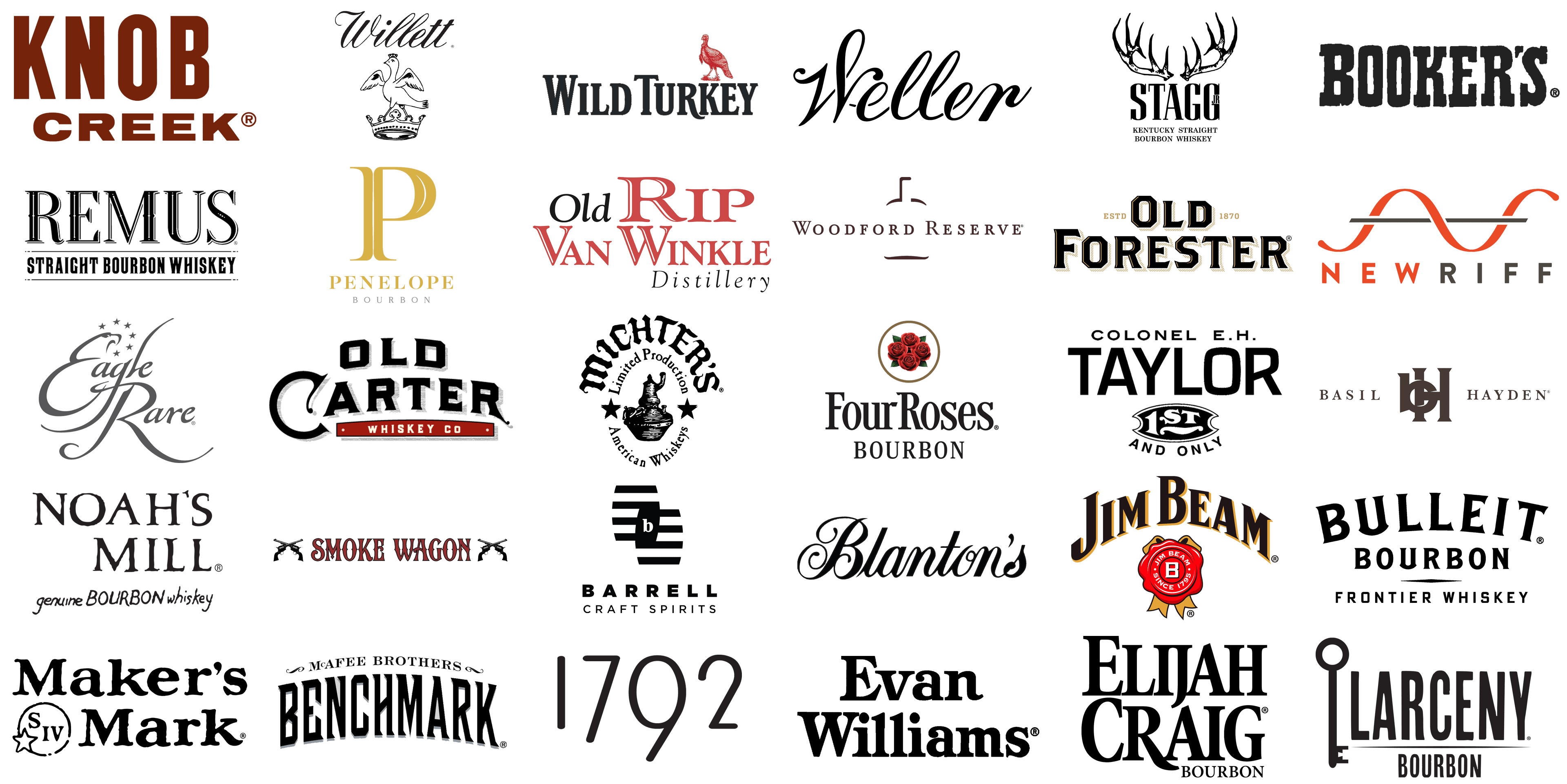
Bourbon, embodying the American spirit, boasts a rich blend of history and craftsmanship. Corn, a key ingredient, and the meticulous process of making small-batch bourbon, bond together to create a distinct product. Bourbon logos do more than just symbolize brands; they narrate stories, preserve heritage, and signify the quality of whiskies. This article delves into the fascinating world of bourbon logos, examining how these symbols encapsulate each brand’s essence, from the spicy notes of rye whiskey to the smooth undertones of Tennessee whiskey.
Creating a bourbon logo is an intricate art. It harmoniously balances aesthetics with tradition and modernity, much like the careful blending of barley, spice, and caramel in the best bourbons. These logos incorporate elements that mirror the brand’s history, like the warmth of vanilla or the richness of chocolate in their unique recipes. Every hue, font, and image in these logos is meticulously selected to narrate the brand’s story. Each logo, whether it exudes a bold, rustic charm or a sleek, contemporary vibe, uncovers the essence of its bourbon, from barrel proof selections to the envy-inducing smoothness of premium varieties.
In today’s era where branding is pivotal, bourbon logos hold a crucial role. They’re not merely identity markers but also vital marketing and positioning tools. A well-designed logo symbolizes prestige, quality, and authenticity, essential in a market that treasures heritage and craftsmanship.
This exploration through bourbon brands reveals that logos are more than mere symbols of a drink; they embody a culture. They reflect the voices of master distillers from Heaven Hill, the warmth of southern hospitality, and the spirit of American innovation. The aim of this article is to provide an in-depth understanding of the roles and significance of bourbon logos in the industry, focusing on their design, evolution, and their impact on brand perception and consumer choices.
1792
![]()
Embodied by its foundational year, when Kentucky became part of the United States, 1792 Bourbon stands out for its deep, velvety flavors, enhanced by a prominent high rye composition. Its emblem features an elegant, yet assertive numeric style, mirroring the brand’s direct and robust character. These numerals are crafted in a contemporary, slightly slanted manner, symbolizing dynamism and advancement, aligning with the brand’s innovative spirit rooted in historical significance. The emblem’s understated design emphasizes a focus on substance over style, paralleling the bourbon’s robust and unadorned nature.
Barrell
![]()
Renowned as an independent selector of distinct, full-strength American whiskey batches, Barrell Craft Spirits is celebrated for its artisanal selections. The Barrell Craft Spirits insignia is a testament to contemporary minimalism, with a layered arrangement reminiscent of bourbon barrel staves. The logo’s striking, monochrome palette showcases a ‘b’ subtly integrated within, representing the intricate flavor stratification in their spirits. Its clever use of negative space to craft the letter ‘b’ intimates a complexity akin to the multifaceted flavors of their bourbon.
Basil Hayden
![]()
Part of the Jim Beam small batch collection, Basil Hayden’s Bourbon distinguishes itself with a spicy yet smooth profile, courtesy of its high rye content. Its logo elegantly merges heritage and simplicity. The ‘BH’ monogram intertwines, evoking a family crest, hinting at the brand’s rich legacy and hands-on bourbon crafting. The use of a serif font for “BASIL HAYDEN” adds a touch of timelessness, while the earth-toned palette conveys warmth and accessibility.
Benchmark
![]()
A subsidiary of Buffalo Trace, Benchmark Bourbon is renowned for its approachable, budget-friendly selection, embodying classic Kentucky straight bourbon traits. Its logo combines sharp, angled typography with the softer script of “McAfee Brothers”, striking a balance between boldness and elegance. This design reflects a brand that merges assertive flavors with a respectful nod to its historic lineage.
Blanton’s
![]()
Blanton’s, acclaimed as the pioneer of single barrel bourbon from Buffalo Trace Distillery, is revered for its rich flavor and heritage. The Blanton’s logo is characterized by an exquisite, script-like elegance, with the “B” and “s” rendered in a more ornate style than the other letters. This sophisticated script reflects a brand that embodies refinement and premium quality, hinting at a rich history and an aura of exclusivity.
Booker’s
![]()
Booker’s Bourbon, another jewel in the Jim Beam small batch collection, is uncut and unfiltered, known for its robust and intense flavor profile, directly reflecting the founder Booker Noe’s personal taste. Logo adopts a starkly contrasting style, with heavy, chunky lettering that appears almost stamped or stenciled. The rugged, bold font reflects a brand with a robust, unapologetic presence, evoking images of traditional craftsmanship and a bourbon that makes a strong statement.
Bulleit
![]()
Renowned for its high rye content and bold flavor, Bulleit Bourbon distinguishes itself with a design reminiscent of the American frontier. The Bulleit Bourbon logo employs a striking, western-style font, reflecting the brand’s rugged, frontier spirit. The name ‘Bulleit’ is presented in prominent, sturdy letters, with ‘Bourbon’ and ‘Frontier Whiskey’ positioned subtly below. A horizontal line divides the text, evoking the image of a horizon, further accentuating the frontier motif.
Colonel E.H. Taylor, Jr.
![]()
Colonel E.H. Taylor, Jr. Bourbon, a gem from Buffalo Trace Distillery, honors its namesake’s impact on bourbon production standards. The logo prominently features ‘TAYLOR’ in bold capitals, symbolizing a legacy of strength and history. “COLONEL E.H.” appears in a smaller font above, balancing the surname’s dominance, while a seal-like emblem below reading “1ST AND ONLY” hints at the brand’s unique and pioneering status in the bourbon world.
Eagle Rare
![]()
Under the Buffalo Trace Distillery umbrella, Eagle Rare is lauded for its intricate flavors and extended aging process. Its logo showcases a graceful, flowing script, indicative of sophistication and elegance. The illustrative eagle above the text embodies the brand’s commitment to exceptional quality and rarity, while the stars subtly reference the bourbon’s American roots.
Elijah Craig
![]()
Elijah Craig, known for pioneering charred oak barrel aging, is synonymous with rich history and complex flavors. The Elijah Craig logo, with its bold lettering, exudes a sense of progress and modernity. The contrasting font weights between ‘Elijah’ and ‘Craig’ may reflect the dynamic taste profile and the bourbon’s significant role in the industry’s history.
Evan Williams
![]()
Evan Williams, renowned as one of the best-selling Kentucky Straight Bourbon Whiskeys, is acclaimed for its smoothness, affordability, and the pioneering legacy of its namesake. Its logo showcases a robust, serif font, exuding a sense of strength and dependability, resonating with its status as a leading global bourbon brand. The font’s substantial presence parallels the whiskey’s full-bodied nature, symbolizing reliability and quality.
Four Roses
![]()
Distinguished by its unique use of five yeast strains and two mashbills, Four Roses Bourbon presents a complex flavor spectrum, earning admiration among aficionados. The logo radiates a softer, more romantic vibe, with a rose bouquet encased in an oval frame, lending an air of elegance and finesse. This suggests a bourbon that’s both delicate and delightful. The “Four Roses Bourbon” typography is classic yet understated, allowing the floral imagery to dominate and convey its refined character.
Jim Beam
![]()
As a top-selling global bourbon brand with a heritage stretching back to 1795, Jim Beam is celebrated for its consistent taste and accessibility. Its logo combines a serif font with a distinctive wax seal emblem featuring the initial ‘B’, merging tradition with a strong brand identity. The seal, spotlighting the brand’s inception date, underscores its deep-rooted history, while the gold and red hues hint at a premium quality experience.
Knob Creek
![]()
Knob Creek, a member of the Jim Beam small batch collection, stands out for its robust, full-bodied profile. Expert craftsmen achieve this through extended aging and a higher proof, embodying traditional bourbon craftsmanship. The brand’s straightforward, bold typeface marks the Knob Creek logo, embodying the brand’s straightforward approach to bourbon production. Its simple, solid font mirrors the rich and potent flavor profile that Knob Creek is famous for.
Larceny
![]()
Celebrating the heritage of John E. Fitzgerald and the Old Fitzgerald brand, Larceny Bourbon, noted for its smoothness thanks to wheat as a secondary grain, offers a unique twist on tradition. Its logo employs a contemporary, sans-serif font, portraying a modern and approachable spirit. The antique key element in the design alludes to unlocking distinctive flavors or ‘stealing’ a moment of enjoyment, aligning with the brand’s narrative and name.
Maker’s Mark
![]()
Renowned for its distinctive hand-dipped red wax seal and unique choice of red winter wheat over rye, Maker’s Mark offers a smooth, accessible flavor. Its logo features a unique hand-drawn font, embodying the personal craftsmanship inherent in their bourbon. The emblem, “S IV” within a circle, accompanied by a star, symbolizes the Samuels family’s longstanding whiskey-making tradition, now in its fourth generation. This design accentuates the brand’s dedication to heritage and quality, with the iconic red wax seal echoed in the star and circular motif around “S IV”.
Michter’s
![]()
Tracing its roots to America’s first whiskey company, Michter’s is celebrated for its richly flavored, limited-production premium bourbons, reflecting a small-batch distillation legacy. The Michter’s logo incorporates a classic font set within an arch, reminiscent of a barrel’s top, highlighting the brand’s commitment to limited production and artisanal quality. The central depiction of a pot still reinforces this theme, while surrounding stars possibly represent the excellence and American roots of their whiskey.
New Riff
![]()
Established in 2014 in Kentucky, New Riff Distilling has rapidly gained recognition for its adherence to traditional bourbon-making techniques and its high-quality, non-chill filtered spirits. The New Riff logo is characterized by its minimalist and contemporary design, featuring an orange sine wave that symbolizes a new interpretation or ‘riff’ on conventional bourbon production. The logo’s clean, simple lines suggest a modern brand dedicated to innovation and a refreshing approach to bourbon tradition.
Noah’s Mill
![]()
Known for its rich, full-bodied flavor derived from small-batch production and aging to peak maturity, Noah’s Mill stands out in the premium bourbon sector. Its logo utilizes a rustic, slightly whimsical font, with “genuine Bourbon whiskey” in a more subdued typography. This design communicates a sense of authenticity and tradition, alluding to a handcrafted approach in bourbon distillation.
Old Carter
![]()
Founded by Mark and Sherri Carter, Old Carter Whiskey Co. is renowned for its handcrafted, small-batch spirits, each release showcasing a unique flavor profile reflective of the Carters’ personal involvement. Their logo merges a vintage serif font with a classic color palette, invoking a sense of longstanding tradition. The underline and red banner bearing ‘WHISKEY CO’ add to its traditional American whiskey label appearance, resonating with bourbon’s rich history and heritage.
Old Forester
![]()
As America’s first bottled bourbon, continuously sold by the same company since 1870, Old Forester has earned acclaim for its rich history and consistently high-quality bourbon. The logo features bold, block letters with a shadow effect, exuding a sense of strength and longevity in the bourbon market. The “ESTD 1870” element highlights its remarkable heritage as one of the oldest continuously operating bourbon brands, symbolizing a legacy built over centuries.
Old Rip Van Winkle
![]()
Famed for its highly coveted and limited production bourbons, Old Rip Van Winkle Distillery is a byword for exceptional quality and exclusivity in the bourbon arena. Its logo showcases a serif font with a vintage feel, reflecting the enduring tradition of bourbon crafting. The lettering’s varied size and color add dynamism, while the name itself, reminiscent of the legendary Rip Van Winkle, suggests a narrative steeped in tradition.
Penelope
![]()
Introduced in 2018 with a unique four-grain blend, Penelope Bourbon has quickly found favor among bourbon enthusiasts for its smooth, nuanced flavor profile. Its logo features a refined serif font, dominated by an elegant ‘P’, hinting at a classic, sophisticated taste. The logo’s simplicity and gold accents lend it a contemporary yet opulent look, embodying a brand that merges tradition with modern, stylish sensibilities.
Remus
![]()
MGP Indiana produces Remus Bourbon, named after the notorious Prohibition-era figure George Remus. This bourbon is famous for its rich, high-rye content and bold flavor, capturing the essence of classic American bourbon. The Remus logo, distinguished and graceful with a serif font, harks back to the 1920s and resonates with the era of George Remus. Its understated, classic design mirrors a bourbon that takes pride in its historical roots and exceptional quality.
Smoke Wagon
![]()
Originating from Nevada H&C Distilling Co., Smoke Wagon Bourbon is lauded for its small-batch production and distinctively smooth, complex taste. The logo, featuring crossed revolvers surrounding the “Smoke Wagon” text, is a nod to the Wild West. Its western-style font and imagery conjure images of the rugged, adventurous American frontier, suggesting a bourbon that is bold and full of character.
Stagg
![]()
Stagg Bourbon, and particularly its George T Stagg variant, is celebrated for being an uncut, unfiltered bourbon of high proof and deep, intense flavors, forming a part of the esteemed Buffalo Trace Antique Collection. The Stagg Jr. logo is defined by a striking pair of antlers, symbolizing both strength and grandeur. The contrast of stark black and white, along with the use of a serif font for “STAGG JR”, creates an imposing presence, reflective of the bourbon’s powerful and richly flavored character.
Weller
![]()
W.L. Weller, renowned for its innovative use of wheat instead of rye in its mash bill, results in a bourbon with a smoother, softer profile. This approach also links it to the much-sought-after Pappy Van Winkle bourbons. The Weller logo, with its fluid, cursive font, emanates elegance and smoothness, mirroring the gentle character of its wheated bourbon. Its minimalist design represents a confident simplicity and a commitment to excellence.
Wild Turkey
![]()
With roots stretching back to the mid-19th century, Wild Turkey Bourbon is distinguished by its bold, high rye content recipes and the legendary expertise of Master Distiller Jimmy Russell. The Wild Turkey logo features a detailed depiction of the eponymous bird, reflecting the natural, untamed essence of their bourbon. The strong, traditional serif typeface complements the classic American imagery, embodying the brand’s storied heritage.
Willett
![]()
Operated by the Willett family, the Willett Distillery is noted for its distinct, small-batch boutique bourbons, often single-barrel, that have developed a dedicated following due to their unique flavors and rarity. The brand’s name, rendered in flowing script, adds a touch of personal, artisanal flair, consistent with the boutique character of their distillery.
Woodford Reserve
![]()
As the inaugural Kentucky distillery to implement pot stills and triple distillation, Woodford Reserve is synonymous with a bourbon rich in taste and tradition, marrying age-old methods with contemporary craftsmanship. The logo centers around a prominent copper pot still, an emblematic figure of classic bourbon distillation. The use of a serif font for “Woodford Reserve” conveys sophistication and a deep-rooted heritage, underscoring the brand’s commitment to quality and its historical significance.


