

A butterfly is an amazing creature, with the green inhaling colored in the most unbelievable shades and patterns. The first things a butterfly is associated with are femininity and beauty, this is why most brands, using its depiction for the logos, are connected to women, fashion, or cosmetics. But if we dig a little deeper, we find out other meanings for this elegant insect from the Lepidoptera families, such as rebirth and resurrection.
But unfortunately, this second side of the butterfly symbolism almost always stays hidden, and most logos with this insect belong to companies, connected to the beauty and fashion industry.
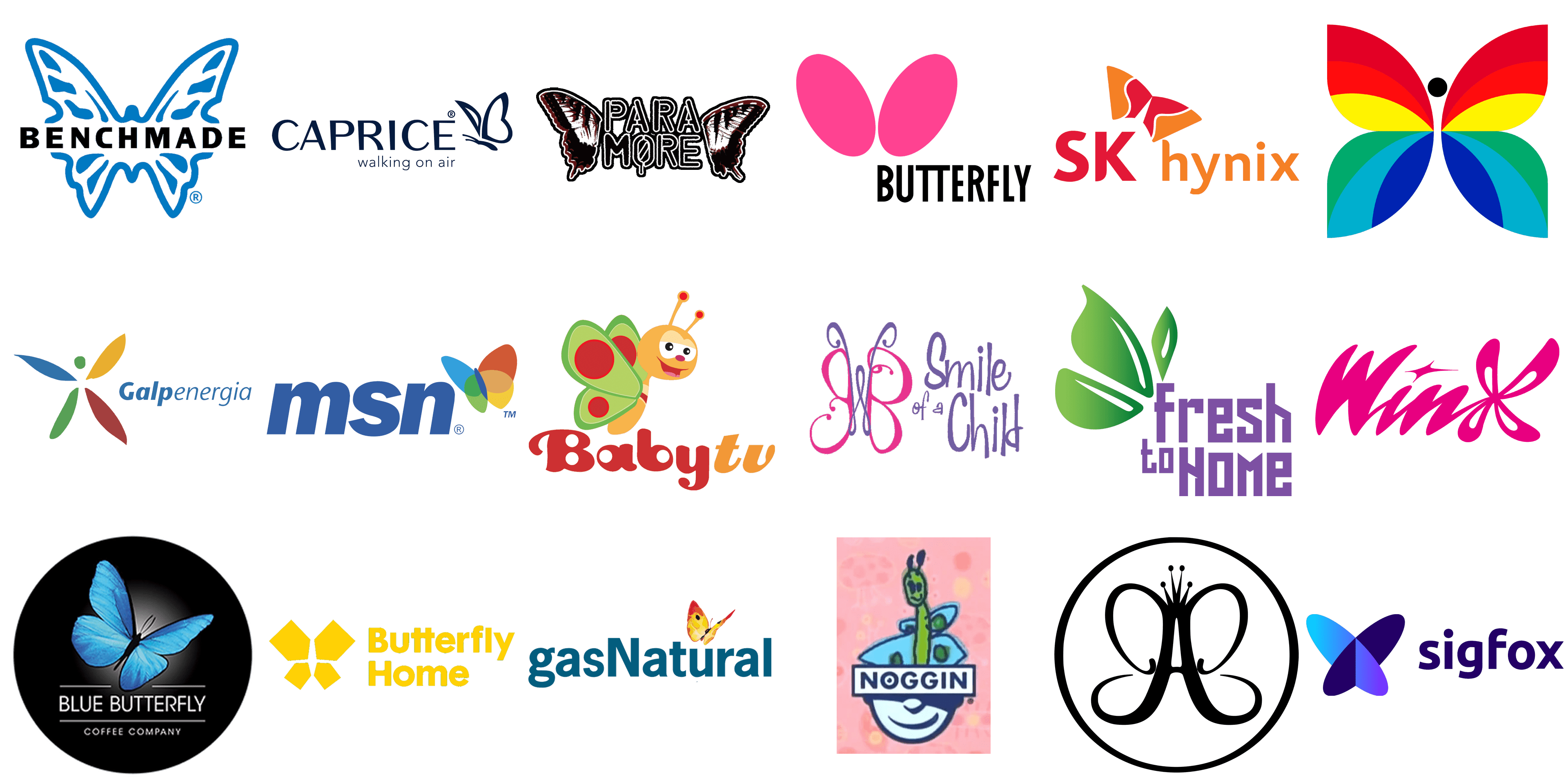
In our today’s list, we have gathered the most famous labels, which use an image of a butterfly for their logos. Let’s have a closer look and see the variety of shapes and colors the designers choose for the depiction of this beautiful creature. All brands in the list are set in alphabetical order.
Anastasia Beverly Hills
![]()
Anastasia Beverly Hills is an American cosmetics brand, which is all about beauty and elegance. The visual identity of the company is based on the stylized letter “A”, which has the lines of its bars elongated and curved, making up a contour of a butterfly. The symbol is decorated by an elegant crown with four sharp arched peaks and is enclosed into a black circular frame. The black and white color palette of the Anastasia Beverly Hills logo can be switched to gold and white when placed on the packaging of the brand’s products.
Baby TV
![]()
The butterfly from the badge of Baby TV is completely different. The tv channel with content for the little ones uses a bright and funny caricature of an insect, executed in green, orange, and red color palette. The smiling butterfly is depicted in profile, flying to the right and smiling. The red circles on its green wings are supported by the bold red “Baby” in the logotype, while the orange body and head of the creature are balanced by the bold orange italicized “Tv” written in the lowercase on the right from the “Baby”. The badge looks very friendly and perfectly represents the essence of the tv channel.
Benchmade
![]()
Benchmade is a brand of knives. And it is pretty unexpected to see the elegant ornate butterfly as the main element of the logo of a company with such specialization. The butterfly here is drawn in smooth blue lines and figures and makes up a background for a clean and bold “Benchmade” lettering in solid black uppercase characters, executed in a straight modern sans-serif typeface. These two elements create a very interesting and unusual composition of tenderness and brutality.
Blue Butterfly
![]()
Blue Butterfly is the name of an American manufacturer of coffee blends, which has a butterfly not only as a part of its name but also as the main element of its visual identity. The logo of the company comprises a bright image of a flying butterfly, executed in bright blue gradients, with thin black lines. The wings of the insect are drawn very realistically and detailed, and this elevated the badge to the next level. The butterfly can be placed whether in a solid black circle, or on a plain white background, and accompanied by a two-leveled inscription in a clean medium-weight sans-serif typeface. The upper line of the lettering is enclosed between two thin horizontal lines, while the bottom line, set in small capitals, is placed straight on a solid background with no additions.
Butterfly Home
![]()
Butterfly Home is another company, which has chosen a butterfly as its symbol. The visual identity of this brand is executed in a yellow color palette with no color accents. The minimalistic approach is also used in the graphical emblem of the brand, with the butterfly drawn in a stylized geometric manner, being formed by four fragments in a shape of a pentagonal house. The two upper houses feature a larger size than the two at the bottom of the composition. The interesting emblem is accompanied by a two-leveled logotype in the title case of a bold modern sans-serif typeface, with clean simple contours.
Butterfly
![]()
Butterfly is the name of a company, engaged in the production of equipment for table tennis. And the bold stylized emblem from the primary logo of the brand resembles two ping-pong rackets, drawn without handles. The solid fuchsia butterfly here is formed from two diagonally-oriented ovals, which are almost touching each other’s contours at the bottom, and flare to the sides at the top part. The emblem is placed above a narrowed uppercase lettering in black, executed in a modern and sharp sans-serif typeface. The smooth lines of the minimalistic emblem balance the straight contours of the lettering and make up a perfect bright image.
Caprice
![]()
Caprice is a German brand of comfortable footwear, which has a butterfly on its logo as a symbol of lightness. The insect here is drawn in smooth black lines and placed on the right from the uppercase sans-serif logotype, set in a modern font with full-shape letters, clean contours, and straight cuts. The softness and elegance of the butterfly make the whole badge look more tender and elegant, while the stability of the inscription evokes a sense of expertise and professionalism. The logo looks pretty simple, yet it is perfectly balanced and suits the needs of the company.
CBC
![]()
CBC, or Canadian Broadcasting Corporation, has been using a stylized colorful butterfly as the only element of its visual identity since the 1960s. The butterfly was drawn in simple clean contours, with each of the wings having a pattern of three smooth stripes. The two upper wings were colored in yellow and two shades of red, while the wings at the bottom of the butterfly were set in green, navy, and sky-blue. The wings were set against a white background, with a slight space between them, and the body of the butterfly missing. However, there was a head — a solid black dot placed between two red stripes of the upper wings.
Freshtohome
![]()
Freshtohome is an Indian company, which offers delivery of fresh and healthy foods at your door. And this caress of the company about its clients’ comfort and well-being is depicted in a smooth green butterfly, whose wings are stylized as the leaves, which support the “Fresh” part of the brand’s name. The butterfly in smooth green gradient is placed on the left from the two-leveled inscription in geometric purple serif characters, softening them and creating elegant color contrast. The three leafy wings of an insect come out from the lowercase letter “F”, building a connection between the graphical and text parts of the badge.
Galp
![]()
Galp is a Portuguese energy corporation, which also used a butterfly symbol in its visual identity for a short period of time. The historical logo of the company was composed of a graphical part, followed by a blue logotype in cursive, with the “Galp” part set in extra-bold lines, and the “Energia” written in thin ones. The graphical emblem of Galp depicted a butterfly, formed by four thin elongated wings in blue, yellow, green, and red, with the solid green circle replacing the head of the insect. The colors in the Galp badge were darkened and muted, which made the logo look more serious and confident.
Gas Natural
![]()
Gas Natural is one more energy corporation on our today’s list, but this one operates in the United States. The logo of the company was composed of bold blue lettering in the lowercase, with just one “N” capitalized. The inscription, written in a heavy sans-serif typeface with traditional shapes of the letters, looked very stable and serious, so the bright yellow and red butterfly, drawn above the letter “U” was adding some lightness and motion to the massive strict badge. The color palette of the butterfly depicted energy and power, perfectly representing the area of the company’s activities.
SK Hynix
![]()
SK Hynix is the name of a Korean corporation, which is engaged in the production of memory chips. The company uses a bright orange and red color palette for its modern and clean visual identity, based on solid heavy shapes. The lettering is written in two different styles — with the bold uppercase “SK” in a fancy sans-serif font, set in red, and followed by an orange lowercase “Hynix”. The inscription is accompanied by a stylized image of a butterfly, placed above the capital “K”. The butterfly is formed from two equal elements, which are vertically divided into red and orange parts by a thin wavy white line.
MSN
![]()
MSN is a Microsoft web portal, which started as an online messenger, and today combines various services for mobile devices, which use the Windows OS. Since the early years of the platform, it has been using a butterfly image for its logo. The first versions were set in bright color palettes, with the wings of the creature set in blue, red, yellow, and green, while the latest redesign has redrawn the MSN badge in monochrome, setting the wings of the butterfly in solid black and placing it against a white background.
Nick Jr.
![]()
Nick Jr. is a famous tv channel with content for kids of different ages, which has a very caste visual identity, consisting of several badges, drawn in one style. All of the logos of the channel feature two silhouettes of two animals — an adult and a kid, set in orange (for a bigger image) and blue (for a kid), with white lettering over both figures. There is also a version of the logo with butterflies, used by Nick Jr. the left one is drawn in orange and features a pattern with some dark circles on its wings, while the blue baby butterfly has its wings decorated by thin dark lines.
Noggin
![]()
Noggin is an entertainment brand, created for kids by Nickelodeon and Sesame Workshop. The content of the brand is available to watch via a cable tv-channel or a mobile app. The visual identity of Noggin is based on one essential element, which can be accompanied by various symbols, depending on the needs of the channel. This element is the bottom half of the human’s face, with the horizontal rectangle on top. The bold uppercase logotype is written inside the rectangular frame. As for the upper part of the face, it can be replaced with various images, and a butterfly is one of the options. A hand-drawn creature is set in a green and blue color palette and looks very naive and unusual.
Paramore
![]()
Paramore is an American rock band, which also has a butterfly image in its visual identity. Although here it’s not the creature itself, its two wings, drawn in black, white, and red, and placed on the sides of the two-leveled inscription in black stencil capitals. The wings on this logo look a bit depressing and dramatic, due to their color palette, with red strokes looking like blood. The whole badge looks very interesting and unique, making the band stand out in the list of its competitors, and perfectly illustrating the style of music it performs.
Sigfox
![]()
Sigfox is a French network operator, which was established in 2010, and by today has already grown into a confident and reliable company. The visual identity of Sigfox looks progressive and sleek, reflecting the mood of the company and its willingness to develop and grow. The logo is composed of flat lettering placed on the right of the three-dimensional emblem. Both elements are set in a blue color palette, but the emblem uses bright gradients, and the logotype is set in dark blue. The Sigfox emblem is a stylized butterfly, composed of two crossed flat ovals, placed on the ribs under a slight angle.
Smile TV
![]()
Smile TV is an American tv-channel, focused on religious Christian content. The logo of the channel has always been tender and light, reflecting love and caress. One of the versions of the Smile TV badge featured an elegant pink and purple image of a butterfly, drawn in thin ornate lines against a white background and followed by handwritten purple lettering with smooth contours and a lot of air in and between the characters. The logo looked pretty simple, but very kind and welcoming, brilliantly reflecting the purpose of the channel and its religious “inclination”.
Winx
![]()
Winx is the name of famous animated series for girls, which tells a story of a group of fairies. The visual identity of the franchise is very title and bright, with the bold fuchsia logotype written in a smooth custom cursive, and the letter “X” replaced by a stylized butterfly. The enlarged element has its wings drawn in loops of equal sizes, but slightly different shapes. Set against a white background in its primary version, the logo can also be seen on a gradient purple banner, and in this case, all the elements gain a white outline for better visibility.


