Galp is a natural gas corporation, established at the end of the 19th century in Portugal, but was incorporated under its name only in 1999. Galp consists of over 100 different brands connected with petroleum and its distribution.
Meaning and history
Galp has a very rich history, which heads back to 1846 when the gas lamp was first introduced in Lisbon. The brand has a remarkable and memorable visual identity, which reflects its heritage and at the same time — its movement forward.
1978 – 1999

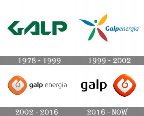
The logo, designed or Galp in 1978 featured stylized lettering executed in a custom sans/serif typeface with its uppercase letters having their contours. Open and tails cut diagonally, making sharp triangles, which reflected progressiveness, power, and innovative approach of the company.
1999 – 2002

In 1999 the logo was completely redesigned and now the inscription in a title case italicized font was drawn in blue and set on the right from the delicate and elegant emblem, which depicted a stylized butterfly with its wings thin and colored blue, green, yellow, and red. It was a light and tender logo, which only stayed with the company for three years.
2002 – 2016

The redesign of 2002 introduced the prototype of the Galp logo we all can see today. The lowercase logotype in black modern sans-serif typeface was set in the right from the stylish geometric emblem. The gradient orange rhombus with a glossy texture had a stylized light gray letter “G” placed on it. The emblem became iconic and instantly recognizable in no time.
2016 – Today
The Galp logo is composed of a wordmark and the brand’s emblem, located on its right. The iconic emblem was first designed in 1978 and features a red square with the graphical representation of the letter “G”.
During the years, the emblem was modified and refined, and today it is a rhombus with rounded angles with a more modern and stylish form of the “G”. The color scheme left almost untouched, but the red became lighter, closer to orange, which adds a sense of energy and dynamics to the logo.
The Galp wordmark in all the lowercase lettering is executed in a bold typeface with rounded lines. It looks sleek and confident, showing the company as a professional one, with its values of quality and progress.
The Galp logo is a perfect reflection of authority and expertise alongside the latest researches and future-centrism.


