Moskvitch was a Soviet and later Russian automaker founded in 1930. Originally state-owned, the company became privatized in the 1990s. It was best known for producing small, budget-friendly cars, primarily for the domestic market. Moskvitch operated mainly in Russia and had a significant presence in Eastern Europe. Production ceased in 2002, and the brand officially became defunct in 2006. In 2022, the company resumed production.
Meaning and history
Founded in 1930, Moskvitch was a prominent Soviet automotive manufacturer that later transitioned into a Russian company. It was initially established under state ownership but became a privatized entity in the post-Soviet era. Renowned for its small, affordable vehicles, Moskvitch carved a niche for itself primarily in the domestic market but also exported cars to various countries, particularly in Eastern Europe. One of the company’s most iconic models was the Moskvitch 412, which gained popularity for its reliability and affordability. By the late 1990s, however, the company started facing financial difficulties and production challenges. Ultimately, production came to a halt in 2002, and the brand was officially dissolved in 2006, marking the end of an era in Russian automotive history. In 2022, the company resumed production.
What is Moskvitch?
Moskvitch was a Soviet and Russian automotive manufacturer founded in 1930. It specialized in producing small, affordable cars mainly targeted at the domestic market. The company ceased production in 2002 and was officially dissolved in 2006. In 2022, the company resumed production.
1930 – 1945
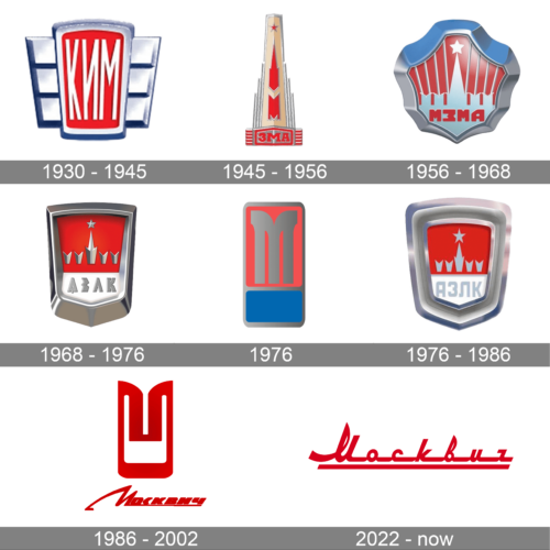
The automaking company, known today as Moskvitch, was established under the name KIM, hence the original logo of the brand was based on this lettering. It was quite an elegant badge, composed of a trapezoidal crest with two short geometric wings on the sides. The silver lettering on a solid red background was framed into a thick silver outline, looking balanced and bright.
1945 – 1956
The redesign of 1945 has created a more complicated logo for the brand and reflected its new name, ZMA. It was a vertically-stretched badge with the red Kremlin tower drawn on it. The bottom part of the composition was decorated by a horizontally-striped banner with the name of the company written over the crest.
1956 – 1968
In 1956 the Kremlin tower was redrawn in silver metallic on a red background of a modernized crest. Now it was more massive, and gained a thick silver frame, with curves, which created an interesting contour for the logo. The name of the brand was written in bold red capitals over the wall, from which the tower with a star on top was coming out.
1968 – 1976
A more modern and geometric version of the badge was designed at the end of the 1960s. The tower with the star was still there, as well as the solid red background, but the lines and shapes were refined and made straighter and more distinctive. As for the name of the brand, it was now set in bold silver capitals against a white fragment at the bottom of the crest.
1976 (unused)
For just a few months in 1976, the automaker has been using quite a minimalistic crest as its main emblem. It was a vertically-oriented rectangle in matte red and blue, outlines in silver, with the stylized enlarged letter “M” written on the top, red part of the crest. It was a very intense and elegant badge.
1976 – 1986
The refined badge from 1968 came back to Moskvitch’s visual identity in 1976 but with some modifications. The frame became thicker and gained more gloss, the shape was slightly changed too. As for the main part of the crest, it kept the composition but gained flat silver elements and the lettering became more readable.
1986 – 2002
The redesign of 1986 introduced the first badge with the “Moskvitch” lettering on it. It was a stylized red inscription set under a graphical emblem with the letter “M” inscribed into a vertically-oriented rectangular element. The whole logo was set in an intense and deep shade of red and looked very progressive and stylish.
2022 – now
After the rebirth of the legendary automaking brand in the 2020s, a new logo was created. It has some resemblance with the previous version, but this time it is just the wordmark, with no graphical elements. The color is still red, but the style of the inscription has changed, gaining more rounded contours of the title case characters.


