Morgan Motor Company is the name of an automaking brand from Great Britain, which was established in 1910 and acquired by Investindustrial Group in 2019. The company is known for their professional and accurate approach and releases about 1 thousand of cars, which are assembled by hand, per year.
Meaning and history
Morgan Motor Company is a family business, engaged in the production of small batches of comfortable sports cars, opened by Englishman Henry Morgan in 1909. Morgan started by opening his park of buses but switched to three-wheeled vehicle manufacturing soon enough. Cars in three-wheel configuration for a long time were the trademark of the brand and were in production until 1936.
Morgan Motor Company is a major British brand that has managed to maintain its independence. Today it is the only private auto company in the country. Morgan produces no more than a thousand cars a year. Each car of the brand is assembled by hand, using expensive materials such as ash, oak, aspen, maple, high-strength steel, and aircraft aluminum. The interior trim uses expensive Windsor cowhide leather and satin-finished aluminum, with precious wood and gold inserts on the car at the customer’s request.
What is Morgan Motor Company?
Morgan Motor Company is a British manufacturer of sports cars, which was established at the beginning of the 20th century, and acquired by the Italian Investindustrial Group in 2019. MMC is a luxury brand, which only produces a limited amount of vehicles per year.
1909 – 1980
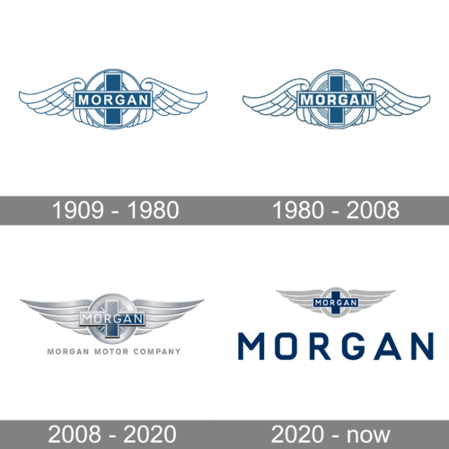
The Morgan Motor Company badge from 1909 stayed unchanged for almost a century and looked almost the same as the contemporary one. It was just lighter and more tender, executed in thin blue contours, with the iconic wings in smooth rounded elements. As for the lettering, on the co treaty, it was bolder and more masculine than today, and this added a special balance to the whole concept of the badge.
1980 – 2008
In 1990 the Morgan Motor Company badge was slightly refined. The contours of the wings were emboldened, but not much, and the central ring, made of several lines was redrawn. But the main change was made to the lettering. The uppercase “Morgan” wordmark was rewritten in a bolder and more geometric sans-serif typeface with a strong and classy mood.
2008 – 2020
The Morgan Motor Company’s visual identity is designed according to all the canons of luxury, elegance, and style. Its badge in silver, blue and white palette, perfectly represents the high-end design and quality of the British marque, showing it as a professional and exclusive.
The MMC logo is composed of a sophisticated emblem, which is sometimes accompanied by a simple yet modern wordmark, placed under it. The lettering is executed in blue or gray, depending on the background and placement. As for the typeface, the brand uses a traditional geometric sans-serif for all capital letters of the nameplate.
The minimalism and clearness of the inscription perfectly balance an ornate luxury emblem, which boasts a three-dimensional circular medallion with two wide stylized wings. The “Morgan” lettering is placed on a blue cross, which is located in the center of the circle.
There is also a smaller blue and white circle inside the silver one, which adds more style, making the logo complicated and interesting.
As for the color palette, the combination of white, silver, and blue represents the brand and reliable and loyal, accenting on the quality of its cars and the fundamental approach of the brand.
2020 – now
A new version of the Morgan Motor brand was introduced in 2020. The emblem was redrawn in flat shades with gray slightly darkened up. As for the main change, it was made to the wordmark. The full name of the company was replaced by a short “Morgan” written in the uppercase of a stylish geometric sans-serif font, in a solid and dark shade of blue.
Font and Color
The clean and stable uppercase lettering from the Morgan Motor Company logo, written under the emblem in plain black lines, is set in a modern sans-serif typeface, which looks pretty similar to Engravers Gothic, with its distinctive contours and clean medium-weight lines.
As for the color palette of the Morgan Motor Company’s visual identity, it looks fresh and airy, with gradient shades of blue and white, accompanied by matte silver wings and delicate details, adding a luxurious touch and elegance to the overall composition.


