Moodle is an online-system, created time to help kids and teachers in the online education process, and providing various tools for schools, colleges, and universities. The system was introduced in 2002 by Martin Dougiamas.
Meaning and history
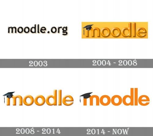
The Moodle logo is very recognizable across the globe as it has been around since 2004, and today we all see it’s cleaned and modified version with no big changes. Its stability and confidence say a lot about the system itself, making it look professional and strong.
2003
The original Moodle logo, introduced in 2003, was more a trial version and only stayed with the platform for one year. It consisted of a three-dimensional “moo-dle.com” inscription in the lowercase of a simple yet bold rounded sans-serif typeface, in gradient black, with a delicate and light shadow.
2004 – 2008
The first serious redesign of 2004 brought the prototype if the current Moodle logo, placing an orange three-dimensional emblem in the lowercase into an intense yellow rectangle and placing a black graduate hat on the letter “M”, which gave an idea of what the product was about and made it look playful and fun at the same time.
2008 – 2014
In 2008 the three-dimensional orange inscription with the hat war placed on a white background and had its lines thickened. The letters became more solid and confident, but the overall style and mood of the logo have not changed at all, keeping the uniqueness and recognizability.
2014 – Today
The redesign of 2014 made the Moodle logo flat and strict, by drawing its sans-serif letters with no gradient shades, and making the lines and edges straight and clean. The color of the lettering became a bit darker and more intense, white the tassel on the graduation hat became orange (on the previous versions it was in black).
Moodle often plays with its logo, replacing the graduation hat with the ones in different styles. This is how you can see the Santa red and white cap before Christmas, for example.
Font and color
The Moodle logotype in the lowercase is executed in a clean and simple sans-serif with thick lines and solid shapes of the letters. The typeface is pretty close to such fonts as Futura Pro and Zelda Demi Bold, the classics among all sans-serifs.
The orange and black color palette of the Moodle visual identity is all about energy, dynamics, and movement. The progressive character and the purpose of the online service are brilliantly reflected in this color combination, where black gives serious-ness and orange shows that learning can be fun.


