Monster is a renowned global employment website founded and operated by Monster Worldwide, Inc., with the mission to connect job seekers with potential employers. The company operates primarily in the digital space, providing services through its extensive online platform. Monster’s reach is vast, operating in multiple countries across the globe, helping millions of individuals and organizations streamline the job search and recruitment process.
Meaning and history
Monster was founded as “The Monster Board” in 1994 by Jeff Taylor, a visionary entrepreneur who wanted to change how people sought jobs and recruited talent. The company rapidly evolved, merging with Online Career Center, one of the earliest examples of a digital job search platform. This merger marked Monster’s earnest entry into the online job portal market, setting a precedent for many digital advancements to come.
Over the years, Monster has achieved several notable milestones. It was among the first to leverage the power of the internet for streamlined job listings and applications, dramatically altering the traditional job search process. By the early 2000s, Monster had become a global leader in online recruitment, with operations spanning several continents. The company introduced innovative technologies and services, such as resume databases, career advice content, and sophisticated job-matching tools, which further solidified its market position.
Today, Monster continues to be a dominant force in the employment industry. It has adapted to modern challenges and technological advancements by integrating AI and machine learning to enhance job-matching accuracy and improve user experience. The company’s current position reflects its sustained commitment to innovation and its ability to stay relevant in a rapidly evolving employment landscape.
What is Monster?
It is a global online employment solution for people seeking jobs and the employers who need great people. It’s been pivotal in transforming the way companies recruit and people find work. Utilizing an extensive database, Monster allows users to explore and apply to numerous job opportunities across various industries worldwide.
1994 – 1997
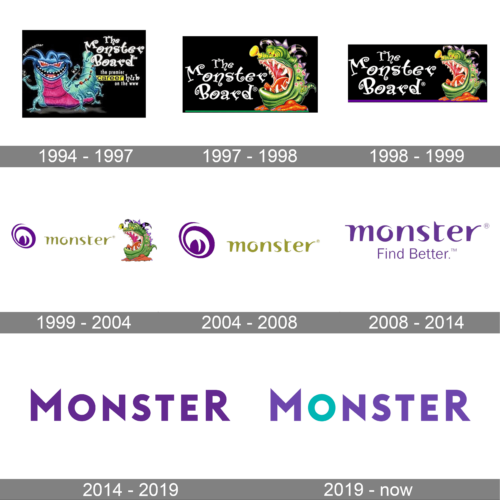
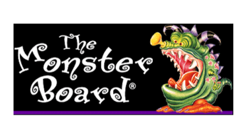
The first logo, from 1994, depicts a cartoonish, vibrant creature that appears joyous and friendly, perhaps aiming to soften the concept of a “monster” and make it approachable. They are set against a dark background that contrasts with their colorful depiction. Above the creatures is the name “The Monster Board” in a whimsical, serif font that has a classic feel, implying reliability and establishment. Accompanied by the tagline “the premier career hub on the www,” it suggests that this service is an early internet-era job search platform, using playful imagery to stand out in the digital landscape.
1997 – 1998
In the 1997 logo, there’s a transition towards a single, more detailed, and intense monster figure, radiating energy and confidence. The creature is bursting out of the confines of the logo’s border, symbolizing perhaps a breaking out of traditional job-searching norms. “The Monster Board” is written in an old-style serif font, which contrasts with the dynamic and modern image of the monster, creating a blend of traditional and contemporary elements to communicate the company’s established roots while signaling a forward-thinking approach.
1998 – 1999
The third logo, from 1998, presents the same monster but with a different color scheme against a black background with a purple lower border. This choice signifies sophistication and creativity, retaining the dynamic energy of the previous design. The monster’s open mouth and active pose symbolize the eagerness and readiness to help job seekers and employers connect.
1999 – 2004
The 1999 logo for Monster features a playful and modern look with creative integration of the monster motif. The use of the monster’s eye to form the letter “o” in the word “monster” adds a unique and clever twist to the logo, emphasizing the brand’s name. The design extending from the letter “o” reflects a theme of individual identity, much like how each job seeker has a unique set of skills and experiences. The color palette of muted green tones against a white background gives the logo a fresh and contemporary feel, potentially appealing to a diverse audience in the job market.
2004 – 2008
Transitioning to the 2004 logo, there’s a shift towards simplicity and minimalism. The monster is no longer a part of the typography but stands alongside the text, now reduced to a more stylized and abstract version. The purple and beige color scheme exudes professionalism and can be interpreted as a move towards a more corporate and refined brand identity. This indicates a period of growth and establishment, positioning Monster as a mature and leading platform in the online career industry.
2008 – 2014
The 2008 logo retains the simplicity of the previous iteration but with a significant change in the typeface and color. The word “monster” is in a solid, bold purple color, exuding confidence and stability. This design does away with any pictorial elements, relying solely on the strength of the name, which could be an attempt to emphasize the company’s authority and prominence in the industry.
2014 – 2019
By 2014, the Monster logo seems to have undergone a subtle but meaningful transformation. The font has shifted to a more contemporary and streamlined typeface, with purple used to add depth. The removal of any extraneous elements, focusing solely on the word “MONSTER,” showcases a mature and confident brand. The solid color and the strong, straightforward font reflect a commitment to professionalism and efficiency in the evolving digital job market.
2019 – Today
The logo is a contemporary representation of the Monster brand, with a bold and minimalist design. The company name is rendered in a modern sans-serif font, showcasing clean lines and a professional demeanor. The capitalization of “MONSTER” conveys strength and prominence, which is often the goal for a brand looking to establish authority and reliability in its market.
The color scheme is a blend of deep purple and a contrasting teal for the letter ‘O,’ which symbolizes innovation and approachability. This choice of a standout color for the ‘O’ is a subtle nod to the brand’s previous use of a monster’s eye in earlier logos, maintaining continuity with the past while presenting a refreshed image.
This design that the company has evolved into a sleeker, more corporate identity, emphasizing its role as a serious and significant player in the job search and recruitment industry. The use of white space around the text indicates clarity and focus, suggesting a user-friendly approach and straightforwardness in the brand’s services.


