Monday.Com is the name of a collaboration and project management service, created in Israel in 2020. In other words, it is a project management tool designed for both teams and individual users, for managing, monitoring, and exchanging data with employees, partners and customers.
Meaning and history
Monday Com is the service that allows you to manage projects as well as individual operational or personal tasks, coordinate activities in teams and with partners. The service helps both small and large organizations improve team communication, project work, task setting, and action planning. At Monday.Com, the workspace can be customized for different departments.
The service has a huge number of features and is very easy to use for a variety of needs (both team and individual). The organization and employees can view real-time progress reports, mark finished work, and communicate via chat.
What is Monday.Com?
Monday.Com, created in 2020, is the Israeli service for collaboration and project management, which today has already become one of the most popular in the world in its category. The service has a clear and easy-to-use interface and is available in several languages.
As for the visual identity, the young service hasn’t had many experiments with its logo yet. The badge of Monday.Com is light and bright, as is the mood of the platform and its convenience. The badge is composed of two parts: emblem and logotype and evokes a very friendly and progressive feeling.
2012 – 2015
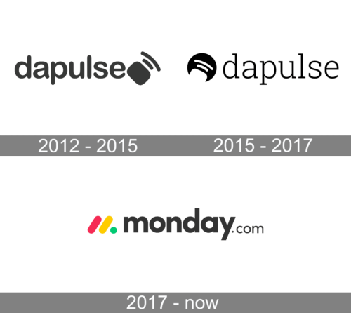
For the first five years after its foundation, the platform, which today is known as Monday Com, was called Dapulse, hence the first two badges for it featured that original name. The initial version of the logo was composed of smooth and bold lowercase lettering and a graphical emblem with a softened rectangle, placed diagonally after the wordmark, and two rounded and slightly arched lines of different lengths above it. The whole badge was drawn in dark gray and set against a plain white background.
2015 – 2017
The redesign of 2015 has introduced some modifications, even though the overall mood and idea remained the same. Now the emblem was placed on the left from the wordmark, which in its turn was completely rewritten, with lighter lines, and a typewriter-style serif font. As for the emblem, it was now a solid circle with its bottom part cut out in the shape of a softened rectangle, and two thin white lines, just like in the previous version. The color palette was switched from gray to black, which gave a stronger contrast and more distinction to the logo.
2017 – Today
The Monday Com logo, designed in 2020, is bright and cool, yet at the same time, it represents movement, progress, and professionalism. The emblem features a stylized letter “M” formed by two diagonal lines, slanted to the right and a solid dot on the left. The slash lines are colored in red and yellow, while the dot is green.
The graphical emblem is followed by a bold and stable logotype in dark gray, almost black. The lowercase inscription is executed in a modern sans-serif typeface with rounded shapes of the letters, thick lines, and straight cuts of the bars. The “.com” part of the wordmark is set in a smaller size and thinner lines of the same font.


