Milka is a Swiss chocolate brand, which was created in 1901. Today the label is a part of Mondelez Group and is one of the most well-known and popular chocolate manufacturers across the world.
Meaning and history
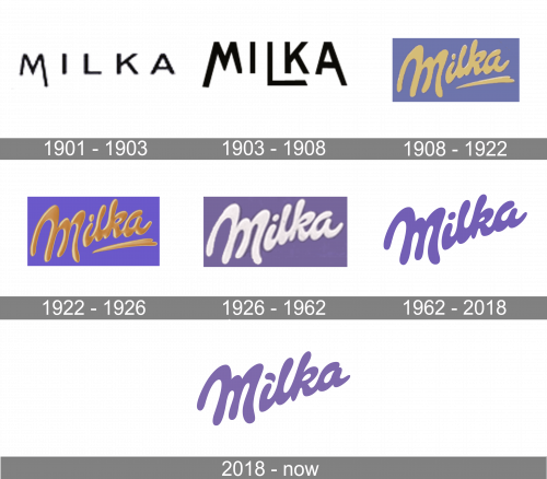
The company’s roots lead us to Switzerland, where the first chocolate under this name was packaged in the lilac-colored packaging in 1901. However, the logo and lilac cover were trademarked only in 1960.
Since 1990, the products have been produced internationally by the US confectionery company Mondelēz International.
What is Milka?
Milka is a famous chocolate brand, which was created in the beginning of the 20th century in Switzerland. Started with a simple classics, the mild chocolate bars, today the brand offers a huge variety of flavors, which are available to buy in dozens of countries across the globe.
1901 – 1903
The very first logo for the Milka chocolate brand was created in 1901, but only stayed active for two years. It was a very minimalistic and progressive for its times badge, composed of an uppercase sans-serif inscription in black, with the right bar of the letter “M” elongated, making the simple composition look cool and unique.
1903 – 1908
The redesign of 1903 has refined the lettering on the Milka badge, narrowing it a bit, and making the characters taller, and the lines — bolder. Now the right bar of the “M” was in its ordinary length, but the left one was elongated, as well as the right bar of the “A”, and the horizontal of the “L”. It looked line the starting and the finishing points of the wordmark, but with this design the badge lost its original uniqueness.
1908 – 1922
In 1908 the logo was redesigned again, and this is when the predecessor of the current iconic badge was introduced. The smooth golden wordmark in a custom cursive font was set across the lilac rectangle of the chocolate’s package. It looked very tender, representing the smooth and delicate taste of the brand’s chocolate.
1922 – 1926
The redesign of 1922 has refined the color palette of the Milka badge, adding deeper shades of golden-brown, and making the characters look voluminous and glossy. The shade of lilac was also deepened, creating a bright eye catching image, and making the brand stand out in the shelves.
1926 – 1962
In 1926 the beige and gold shades on the Milka logo were replaced by the plain white, making the badge look more professional and progressive. The typeface was also slightly refined, with the contours of the characters made cleaner and softer.
1962 – 2018
The history of the company has preserved examples of the original packaging. Here, the word “Suchard’s” could be seen in a gold script (it reminded of the Swiss chocolatier Philippe Suchard (1797–1884), whose company became the predecessor of the Milka brand.
The word “Milka” was smaller and black. It featured a different type. The color of the packaging was lilac. Soon, the company adopted a script wordmark where the name of the brand seemed to have been “written” by the flowing milk.
In addition to just looking friendly, this script implied the product was rich in milk.
By the way, the name of the brand was made up of the first letters of two Germany words: “milch” (“milk”) and “kakao“ (“cacao,” “cocoa”).
2018 – Today
Until 2018, the company used only a single version for all markets. In 2018, it introduced a different logo for Germany and Austria.
At first glance, it is the same but if you take a closer look, you will notice the difference. The original dot above the “i” has been replaced by a drop. Another notable distinctive feature of the German Milka logo is the “a” – it has a wider gap.
Cow and mountains
One of the brand’s symbols has been a purple mallow cow with a bell around her neck. The cow named Lila was first introduced in 1973. Since then, it has appeared in over a hundred TV adverts. The creature belongs to the Simmental race known for its quality milk.
Another important part of the visual brand identity has been the stylized white mountains. They represent the Alps. According to the marketing director of Kraft Foods France Anne-Lise Favet, this combination of visual symbols is supposed to show the consumers that the milk used in the chocolate bars can be traced to farms in the Alps.
Colors
The choice of the palette has been as important for the brand identity as the very shape of the Milka logo. The purple is distinctive, understated, and luxurious without being obtrusive. The fact that the candy bar wrappers contain little imagery and lots of purple surfaces only reinforce the role of the color.
Font
The smooth and elegant custom typeface of the Milka visual identity brilliantly represents the taste of the brand’s chocolate, its tenderness and sweetness. The closest fonts to the one, used in this insignia, are, probably, Notera 2 Black, or Genty Regular, but with the contours significantly modified.
As for the color palette of the Milka visual identity, it is based on a smooth and delicate shade of lilac, which is usually combined with white, creating a very unique style, and reflecting the company’s consistency, and attention to its customers and their taste buds.


