 Mid-American Conference Logo PNG
Nestled in the realm of collegiate sports, the Mid-American Conference (MAC) emerges not as a conventional company, but as a collaborative assembly of member universities. This conference, devoid of a singular owner, orchestrates a symphony of intercollegiate athletic competitions, enriching the collegiate sports landscape. Central to its mission is the cultivation of athletic prowess and academic excellence among its member institutions. The MAC’s influence stretches across the heartland of the United States, predominantly in the Midwest and Northeast. Here, in states like Ohio, Michigan, Indiana, and Illinois, the conference has cemented its presence, weaving a network of spirited rivalries and fostering a community bound by a shared passion for sports.
Meaning and history
In the year 1946, a visionary group from five educational institutions laid the cornerstone of what would become the Mid-American Conference. This collaborative endeavor was driven by the ambition to regulate and enhance collegiate athletics. As the years unfurled, the MAC blossomed, both in its membership and its achievements. Notably, its expansion beyond its initial roster of universities marked a significant growth phase. The conference etched its name in the annals of NCAA Division I athletics, particularly distinguishing itself in football. Its member teams frequently graced bowl games, elevating the conference’s stature. Basketball, too, became a bastion of the MAC’s athletic prowess. The MAC stands as a beacon in collegiate athletics, not just as a competitive arena but as an incubator of academic and athletic brilliance, shaping student-athletes into well-rounded individuals ready to excel beyond the sports field.
What is Mid American Conference?
Mid-American Conference is the name of the collegiate association, which includes 12 members from the mid-American states, competing in the First division of the National Collegiate Athletic Association. The conference was established in 1946 in Ohio.
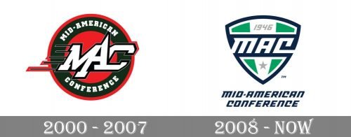
2000 – 2007

The Mid American Conference logo, created in 2000, stayed with the association for seven years. It was a circular emblem in green and orange, with white and black lettering on it. The lettering was split into two parts — the full inscription in white square serif capitals, set along the perimeter of the badge, and the stylized “MAC” in white, with a thick black outline, where the letters were sharp and italicized. This sense of motion, given by the “MAC’ wordmark was elevated by the five black horizontal lines coming out of the left bar of “M”.
2008 – Today

The redesign of 2008 completely changed the style and shape of the MaC badge. The circle was replaced by a modern shield, and the orange shade was removed from the badge. The new color palette consists of white, green, and blue, the colors standing for growth, development, and confidence. The crest is vertically divided into three segments — two green and one white in the center. The “MAC” lettering is written in white on a dark blue horizontal banner. Above the banner, the “1946” datemark in light gray was set, and a solid five-pointed star was added to the bottom part of the logo. The crest is complemented by a dark blue inscription under it. It is set in the same typeface, as the white monogram on the blue banner.


