Microsoft Office is a package of software and services designed for Microsoft. The first Office was released in 1999 and today it is available in over 100 languages and has more than one billion users across the globe.
Meaning and history
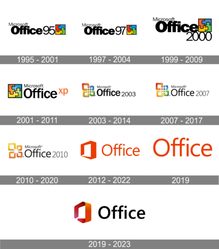
The rich Microsoft Office visual identity history can be divided into three main stages: puzzle, squares and an “O”.
What is Microsoft Office?
Microsoft Office is the name of the main Microsoft software pack, which includes the basic and most essential programs for the operation of any computer. The Office is getting constant updates and upgrades and offers more and more functions to millions of users all over the globe.
1995 – 2001
The puzzle era of Microsoft Office logo started in 1995 and finished in 2003. It was slightly changed during eight years, but the composition was always the same — a “Microsoft Office” inscription with a square emblem, placed into a rectangle with rounded angles.
The square emblem features a four-colored puzzle pattern, composed of red, blue, yellow and green details. During the first years, the colors were bright and intense, enclosed in a thick black frame, but in 1999 the frame became thinner and the colors — lighter.
1997 – 2004
The Microsoft Office logo from 1997 looked pretty much the same as the one from 1995, with just one difference — the “95” number was replaced by “97”, to point to the new version of the software. The contours of the letters got slightly refined and the digits became a bit taller than on the previous badge.
1999 – 2009

In 1999 the new version of the Microsoft Office was introduced and the logo was changed again. This time instead of only two digits, there were four. The “2000” was placed under the square emblem of the logo, and the emblem was glued to the “Office” wordmark, which got its letters enlarged and emboldened.
2001 – 2011

In 2001 the emblem was moved to the left part of the logo and got its color palette lightened up, gaining some white gradients to each of the four fragments. The new logo had no numbers on it, but the orange “XP” letters were added after the black “Office” wordmark. The new inscription was set in the lowercase and written with simple straight lines.
2003 – 2014
In 2003 Microsoft changed the Office visual identity. The puzzle emblem was replaced by four squares of different sizes, keeping the original logo’s colors. The squares featured gradient shades and were three-dimensional.
2007 – 2017
The redesign of 2007 made the shadow of the emblem thinner, yet balanced the look of the graphical part by adding gloss and gradients to its fragments. Now the iconic square looked sleek and modern. As for the next part of the Microsoft Office visual identity, it remained untouched, just “2003” was changed to “2007”, written in thinner lines.
2010 – 2020
In 2010 the squares’ contours were modified and the Office logo now resembles a flower with four petals. Orange is the only color of the product’s palette now. These were the last two years of the four squares logo era.
2012 – 2022
The completely new emblem was designed in 2012. Now it is a box, placed in a half-turn and resembling a letter “O”. It looks modern and fresh, reflecting the new generation and approach. The orange color became more intense and deep, making the company’s product stand out.
The wordmark in sans-serif can be executed both in orange and black colors, depending on placement.
2019
2019 – 2023
In 2019 the box emblem was modified into a more three-dimensional image. The orange color gained gradient red and pink shades, while the wordmark is mainly black or white now and has bolder and stronger lines.


