Mercadona is Spain’s largest supermarket chain with over 1.640 stores across Spain and twenty in Portugal (as of the fall of 2021). The company still remains family-owned. The staff exceeds 95.000 employees.
Meaning and history
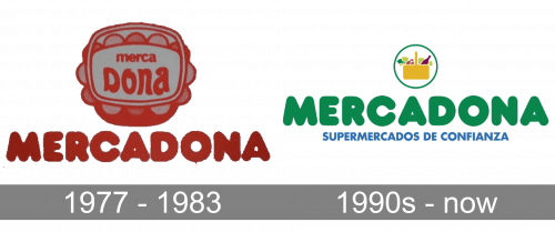
The visual brand identity has remained pretty consistent over the years. Even when the Mercadona logo was modified, it preserved some of its heritage.
1977 – 1990s
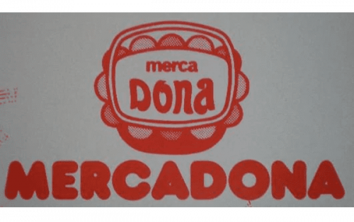
If you take a look at one of the earliest logos, which is shown on this page, you will notice that the overall concept looks pretty familiar.
First, you can see a shopping basket. It is highly stylized here and, in a way, doesn’t look very much like a shopping basket. So, on the one hand, the logo is meaningful, but on the other, it’s not meaningful enough. At least, those who didn’t know that Mercadona was a store wouldn’t have guessed this just by the logo.
Another disadvantage of the old logo was that the name of the brand was written twice. First, you could see it inside the basket. Here, it was set in a unique type that helped to make the wordmark recognizable. The word “merca” was small, whereas “Dona” occupied far more space. The only problem here was that the wordmark wasn’t very legible, especially the small word “merca”.
To solve this issue, the authors of the logo added the full name in larger letters below. To begin with, it was clearly legible and visible at any size. Also, it created a certain mood – plump, bold letters with rounded ends connoted friendliness and a healthy appetite.
In addition to it, the rounded ends in a way echoed the shape of the elements of the basket above. This made the wordmark and the emblem merge, which was another advantage of this design.
1990s – present
The designers responsible for the update preserved some of the heritage but made the logo look more professional and modern. Also, it better reflects the company’s values now.
The plum typeface of the wordmark remained virtually unchanged. This helped to make the Mercadona logo recognizable to its loyal customers. There was no confusion and somewhere on the subliminal level, the customers knew that they would still get the same quality of service and products there.
What is Mercadona
Mercadona was started as a butcher shop in 1977. Its founders were Francisco Roig Ballester and his wife, Trinidad Alfonso Mocholi. Today, it is the biggest chain of supermarkets in the country, where customers can buy products both in a physical supermarket and online.
However, this time, red was replaced by green. It alluded to the fact that the company now had a “natural” emphasis. When describing its vision on the official website, the brand mentions “Achieving a Sustainable Agri-Food Chain”. Green, which is the color of the leaves, the grass, stems, etc., is a great way to convey sustainability and agriculture.
On a deeper level, this can be interpreted as a promise of safe food. This is why the basket above has been redrawn and now houses what looks like vegetables or fruit, as well as what appears to be a glass bottle. No plastic, no processed food.
Colors
In addition to two shades of green, the Mercadona logo features yellow and red. Both the colors have a natural feel here. These shades can be more or less often seen in the nature. Together with green, which is the dominating color, they contribute to the promise of safe, clean food, which is of paramount importance for the brand.


