McLaughlin Motor Car Company was a Canadian automotive manufacturer founded in 1869 by Samuel McLaughlin. It is no longer an independent entity but was absorbed into General Motors Canada. Initially focused on carriages, the company transitioned to automobiles, collaborating with the Buick brand in its early years. Operating primarily in Canada, McLaughlin eventually formed a deal with General Motors, becoming part of the multinational automotive corporation.
Meaning and history
Founded in 1869 by Samuel McLaughlin in Oshawa, Ontario, the McLaughlin Motor Car Company began its journey as an independent Canadian automaker. Initially, it operated in the horse-drawn carriage sector before venturing into the automotive world. In its early years, McLaughlin had a productive collaboration with Buick, leading to the creation of luxury vehicles specifically designed for the Canadian market. A significant milestone for the company was its 1918 merger with General Motors, after which it functioned as General Motors Canada. Some of its key achievements include being among the pioneers in Canadian automobile manufacturing and having a significant role in wartime production during both World Wars. As of today, McLaughlin no longer exists as a standalone brand but remains an integral part of Canadian automotive history, its legacy living on through General Motors Canada.
What is McLaughlin?
McLaughlin Motor Car Company was a Canadian automaker founded in 1869 by Samuel McLaughlin. The company initially specialized in carriages before transitioning to automobiles. It later merged with General Motors in 1918 and became part of General Motors Canada.
1869 – 1907
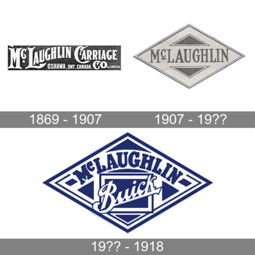
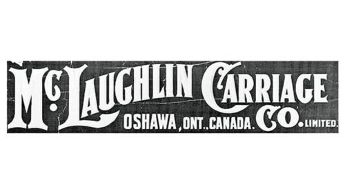
The earlier version of the McLaughlin logo was quite minimalistic but the font choice gave it a sophisticated appearance. A bold font with serifs and custom capital letters was used to print the name – McLaughlin Carriage Co. The logo also had the location of the headquarters, specifying that the company was founded in Oshawa, Ontario, Canada. This was added at the bottom of the logo using a smaller, bold, sans0serif font. The white color of the inscriptions contrasted well against the darker background and enhanced the elegant look of the logo.
1907 – 19??
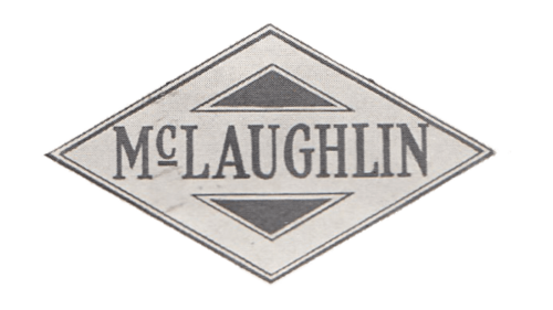
For this version, the company used a more reserved serif font that resembled Benicia Medium Condensed or Duke Thin Bold font. The name was now printed in a straight line, running across a horizontally elongated rhombus. The rhombus had a double dark line serving as a frame. The blank space above and below the inscription was filled by two inverted triangles of black color with a thin frame. Although the logo did not look as grand as the earlier version, it presented the company as a solid and trustworthy automotive brand.
19?? – 1918
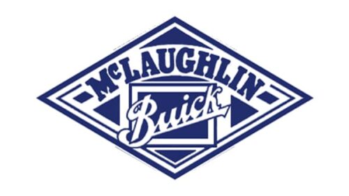
The previous logo was modified and acquired a few more details. It was used by the company until it merged with General Motors. The most notable change was the color palette, which now included dark blue and white. The name, McLaughlin, was arching across the top of the rhombus shape, which is the only element that remained unchanged. Right underneath, it had a rectangular base with “Buick” printed diagonally across it using a cursive font of a white color with a thin blue outline. This logo looked professional, while the blue color represented reliability, loyalty, and stability.


